neuraderm
Medytox
2023
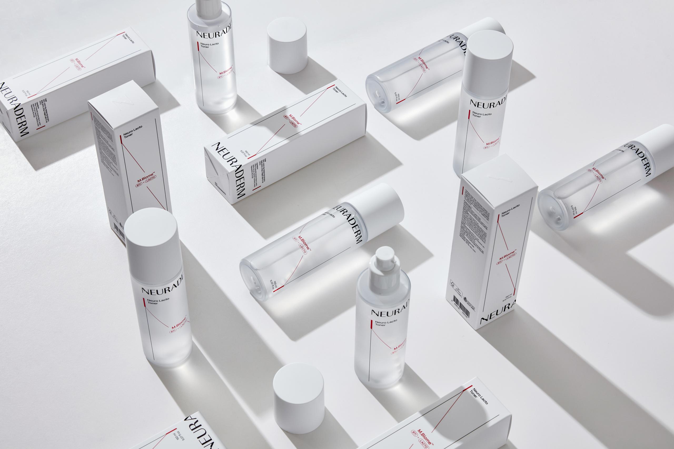
뉴라덤은 메디톡스의 신경과학 기술을 스킨케어에 접목시킨 더마 스킨케어 브랜드입니다. 신경과학과 스킨케어의 '연결'을 사선의 라인으로 표현하였고, 이 모티브를 심볼을 비롯한 웹사이트, 브로셔, 아이콘 등 모든 매체에서 일관되게 적용하였습니다. 클리닉라인은 병원에서 주로 쓰는 제품으로, 고효능의 이미지를 전달하기 위해 베이직라인과 CMF에 차등을 주어 패키지에 적용하였습니다.
- 인터뷰
- 브랜드 컨셉 개발
- 브랜드 스토리 개발
- 브랜드 가치 개발
- 브랜드 아이덴티티
- 브랜드 무드 제안
- 브랜드 응용물 개발
- 로고 디자인
- 포장 디자인
- 편집 디자인
- 그래픽 디자인
- 웹 와이어프레임
- 웹 디자인
- 브랜드 디자인 가이드
- 인쇄 감리
OUR GOAL
Expanding Neuraderm business from B2B to B2C
세계적인 메디톡스의 기술로 만든 Medical Aesthetics를 근간으로 더마 코스메틱의 전문성을 강화하여 뉴라덤을 iconic 브랜드로 육성합니다. 이를통해 Bio beauty 사업을 B2C시장으로 확대하고자 합니다.
The medical aesthetics made based on the global Medytox technology strengthen the dermacosmetic’s specialty and foster NEURADERM into an iconic brand. This will further expand the bio-beauty industry toward the B2C market.
DESIGN CONCEPT
New connection between NEURo And DERMatology
뉴라덤은 NEURo science And DERMatology의 연결입니다. 뉴라덤을 통해 더마톨로지와 화장품을 연결하고, 화장품과 고객의 일상생활이 연결될 수 있도록합니다.
NEURADERM is an abbreviation of NEURo science And DERMatology. NEURADERM links dermatology and cosmetics together and connects cosmetics with customer’s daily lives.

LOGO CONCEPT
Mood and professionalism in skincare
모브랜드인 메디톡스의 전문적인 이미지를 유지하며, 스킨케어의 무드를 보여줄 수 있는 뉴라덤 만의 브랜드 로고를 개발합니다.
Develop NEURADERM’s original brand logo to show skin care image, while maintaining the professional image of its parent company, MEDYTOX.

LOGO MOTIF
Neurocience and Connecting
신경과학을 기반으로 한 뉴라덤의 특허성분을 강조하며, 동시에 뉴라덤을 통한 더마톨로지에서 데일리뷰티까지의 연결성을 NEURADERM의 N에 계단형태의 조형으로 표현하였습니다. 이는 또한 신경 세포끼리의 연결을 위한 움직임을 내포합니다.
모던산세리프체를 사용하여 만든 로고는 현대적이며, 과학적인 무드를 동시에 전달합니다.
The NEURADERM logo is designed to emphasize Neuraderm's patented ingredients rooted in neuroscience while also portraying the connectivity from Dermatology to Daily Beauty through the step-like formation in the 'N' of NEURADERM. This formation also embodies the movement necessary for the connections between nerve cells.
The logo, created using a modern sans-serif typeface, conveys a contemporary and scientific mood simultaneously.


BRAND COLOR
Red and black on a medical white background
레드와 블랙을 메인컬러로 활용하여 Cosmeceutical 브랜드 무드를 강조합니다.화이트컬러는 의학적인 룩앤필을 완성합니다.
Use red and black as the main colors to emphasize cosmeceutical brand. Use white color to complete medical look and feel.

BRAND ASSET
The diagonal shape derived from the logo's 'N'
뉴라덤의 그래픽 에셋은 로고의 N 에서 파생된 대각선의형태로, 세포의 연결을 모티브로 만들어졌습니다. 적용 어플리케이션에 따른 다양한 레이아웃에 맞게 유동적으로 활용됩니다.
NEURADERM’s graphic asset has a diagonal shape from logo’s N, and it is inspired by connection of cells. It is applicable flexibly for various layouts depending on applications.


PACKAGE SYSTEM
A system that can be applied to various ratios
대각선 연결 그래픽 모티프를 레이아웃 구성의 핵심 요소로 사용합니다. 여러 비율에 적용될 수 있도록 시스템을 구축하였습니다.
Use a diagonally connected graphic theme as the main element for layout. The system is applicable in different sizes.

ICON SYSTEM
An icon system that can capture the essence of Neuraderm's identity
브랜드 에셋으로 활용되는 육각 모티브와 사선 라인 구조를 적극적으로 활용하여 뉴라덤의 아이덴티티를 살렸습니다.
Emphasize NEURADERM’s identity by actively utilizing brand asset’s hexagonal design and diagonal line structure.


CLINIC DERMA Line
The Core of NEURADERM Root in M.Biome Technology
메디톡스 R&D의 기술이 집약된 프리미엄 에스테틱 스킨케어 라인입니다. 홀로그램 텍스쳐를 적극적으로 활용하여 혁신적인, 차별화된 기술의 이미지를 전달하고 있습니다.
It is a premium aesthetic skin care line made with R&D technologies by MEDYTOX. It actively utilizes hologram texture to deliver the images of innovative and distinguished technologies.


ohSeven
- Executive director 배수규
- Project Manager 박윤제
- Package Designer 연보연, 이자희, 오유진, 김진주, 김채린
- Brand Designer 이자희, 김진주, 김채린, 오유진
- Designer 김채린
- 3D/ Motion Designer 김채연
Medytox
Gynolax
