Binggrae Superboost renewal
binggrae
2023

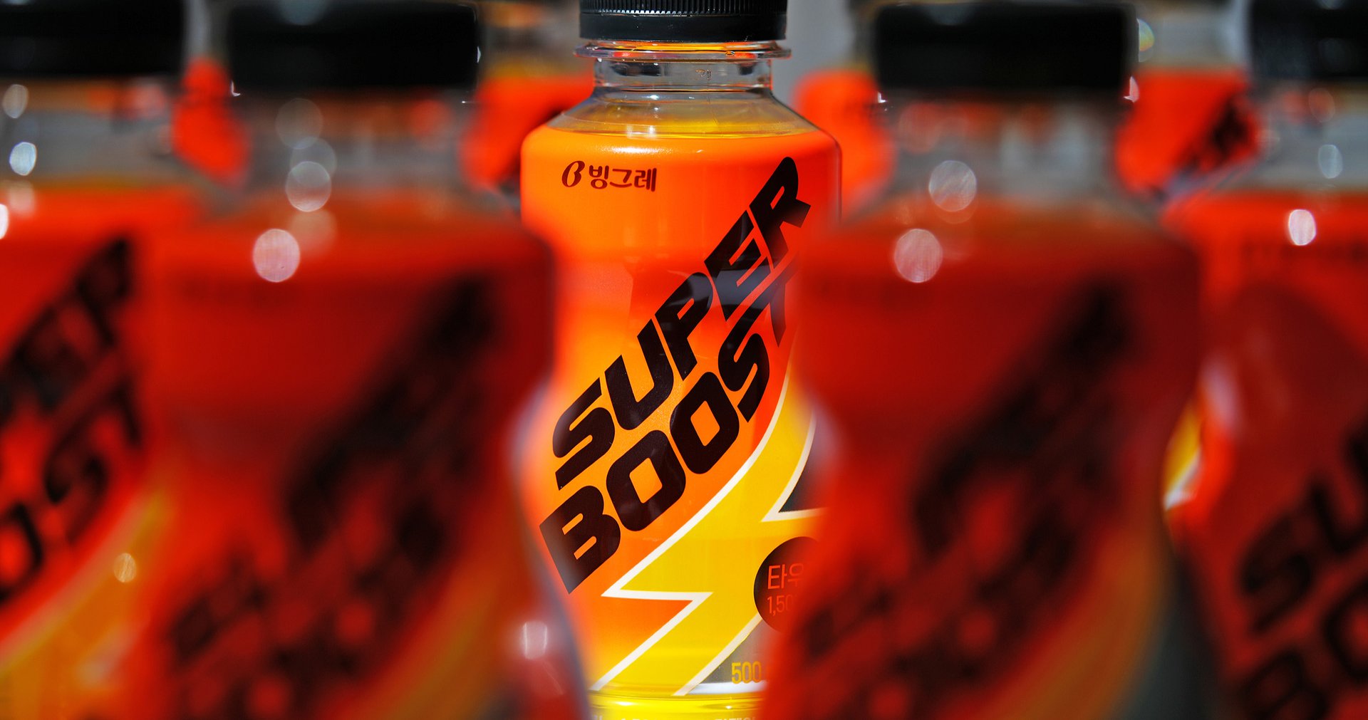
When the zero-calorie beverage market was expanding, Superboost emphasized "zero" to differentiate itself from other drinks. However, as the market quickly grew, focusing on "zero" became less effective. The original Superboost packaging featured a minimalistic and clean design to highlight the zero aspect, but this approach also lost its impact. As a result, Superboost shifted its focus away from the "zero" image to emphasize the essence of energy drinks: "energy."
- package
- logo

Project overview
빙그레의 제로칼로리 에너지드링크 슈퍼부스트의 리뉴얼 프로젝트를 진행했습니다.
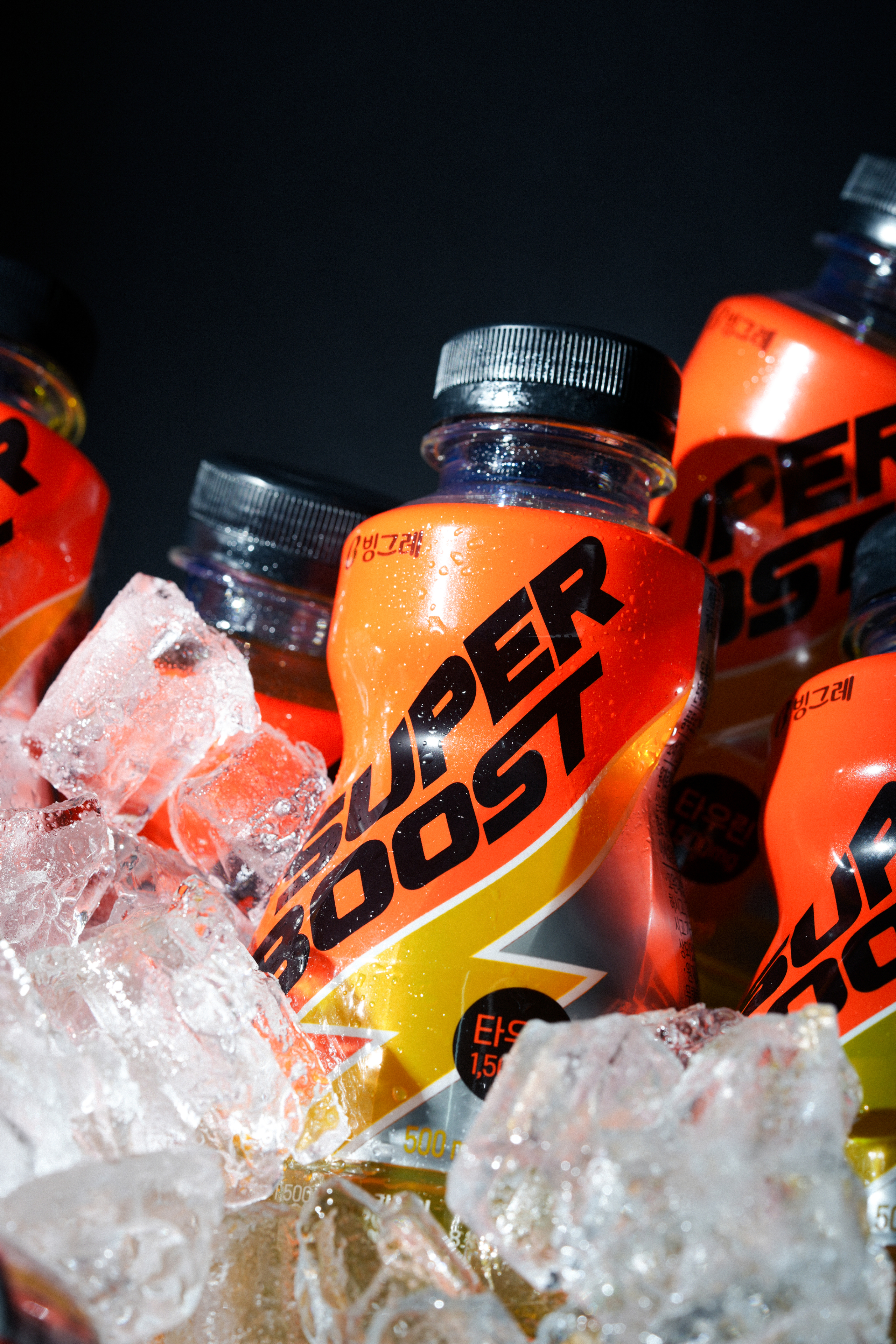
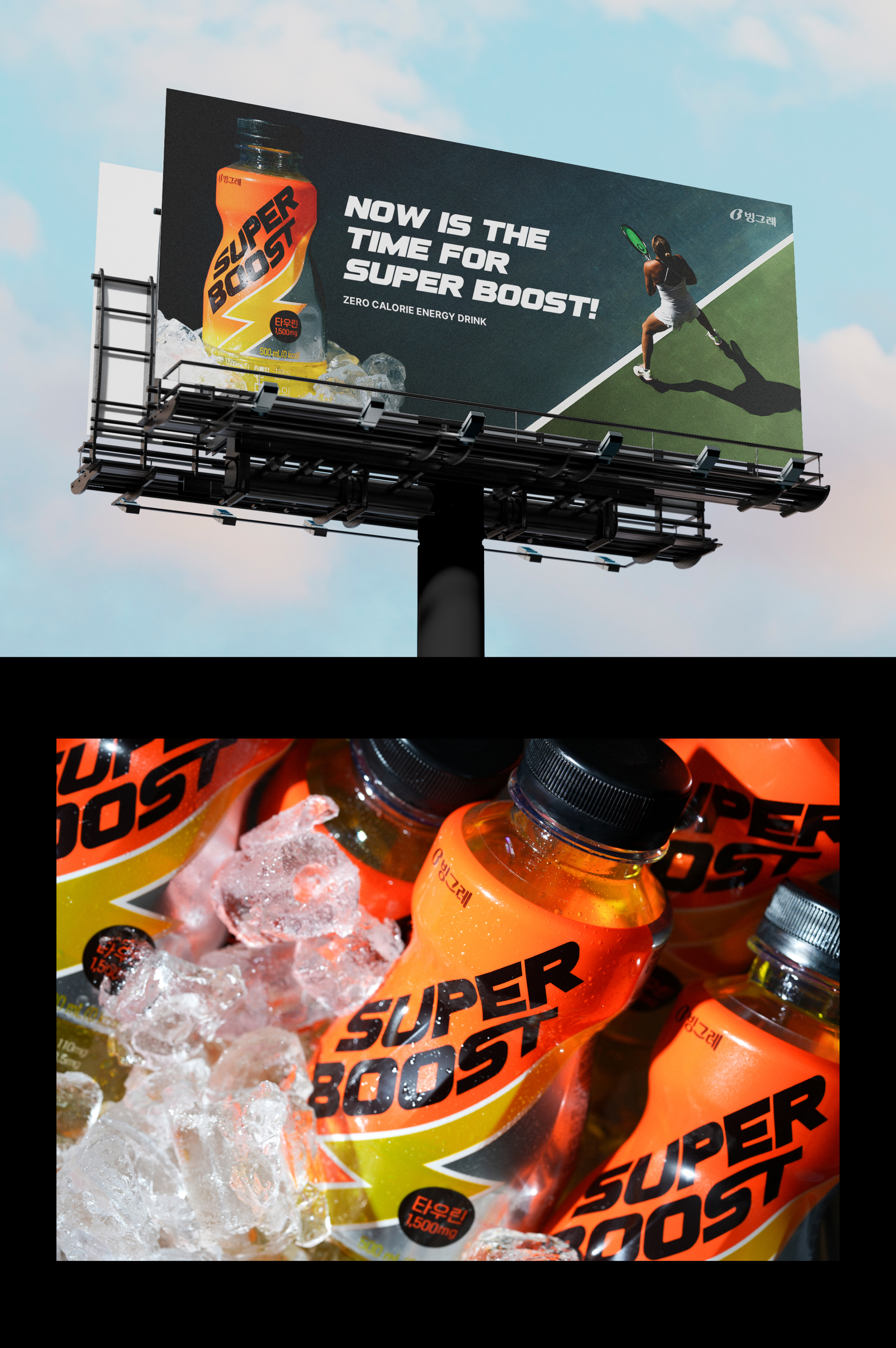
슈퍼부스트라는 브랜드 네임에 맞게 스포티하며 에너제틱한 느낌을 살려 활력 충전, 부스트업을 패키지에서 직관적으로 느낄수 있도록 하였습니다.
We worked on the renewal project for BINGGRAE's zero-calorie energy drink, Super Boost.
To align with the brand name Super Boost, I incorporated a sporty and energetic feel into the packaging to provide an intuitive sense of vitality recharge and boost.


Logo
브랜드 네임에서 느껴지는 강한 느낌을 볼드한 폰트로 풀어냈으며 이탤릭체의 사용과 BOOST의 S와T의 연결로 빠른 속도감을 느낄 수 있도록 하였습니다. 그와 함께 패키지 적용시 사선방향의 배치로 더욱 강한 힘과 높은 가시성을 담도록 디자인을 진행했습니다.
We expressed the strong sensation felt in the brand name with a bold font. The use of italics and the connection between the S and T in BOOST create a sense of speed. Additionally, when applied to the package, We designed it with a diagonal arrangement to convey even stronger force and higher visibility.


ohSeven
- Executive director Daine Bae
- Project Manager Song-yi Gu, Boyeon Yeon, Yunje Park
- Designer Jinju Kim, Jahee Lee, Chaeyeon Kim
- Photography Sungwoong Yoon
binggrae
- Designer jeongsin Park, gayeon Seo
