Derma:B
2025
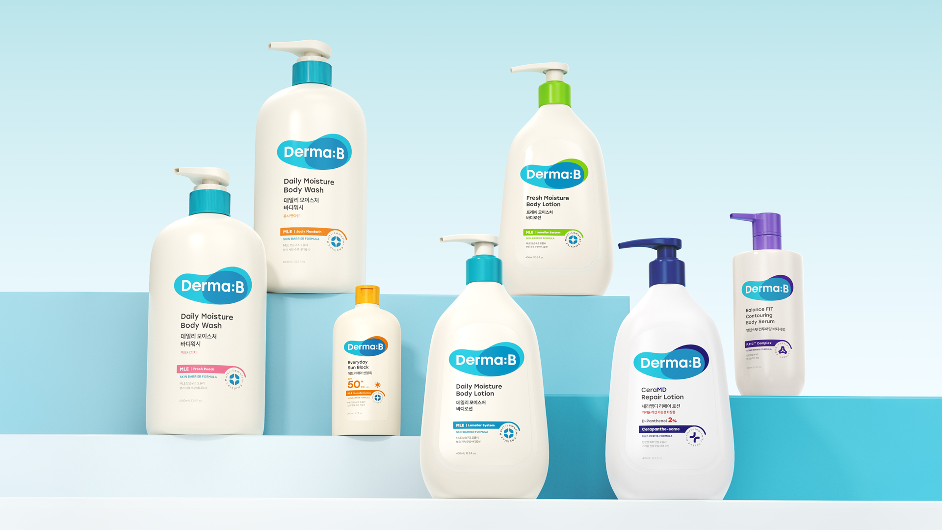
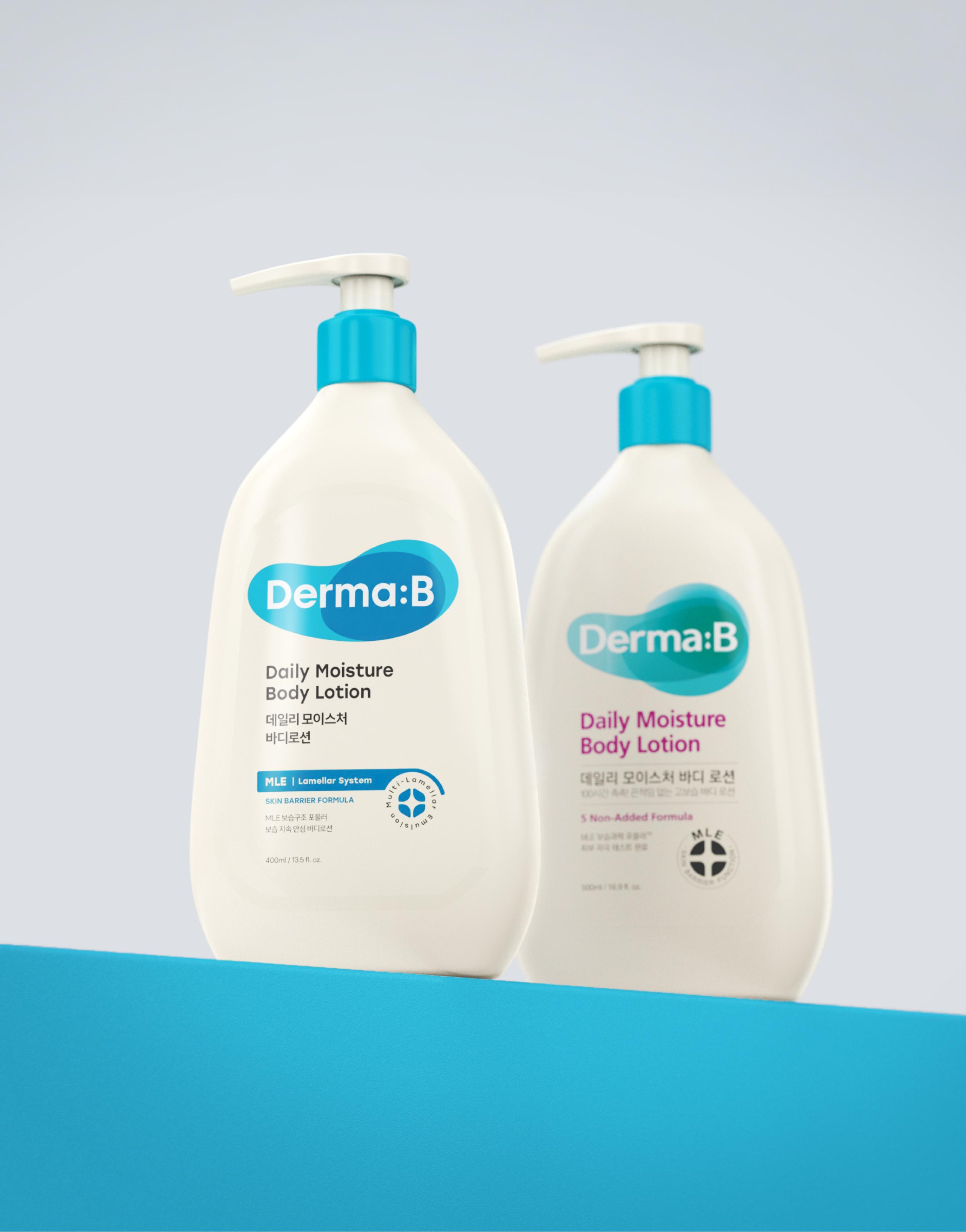
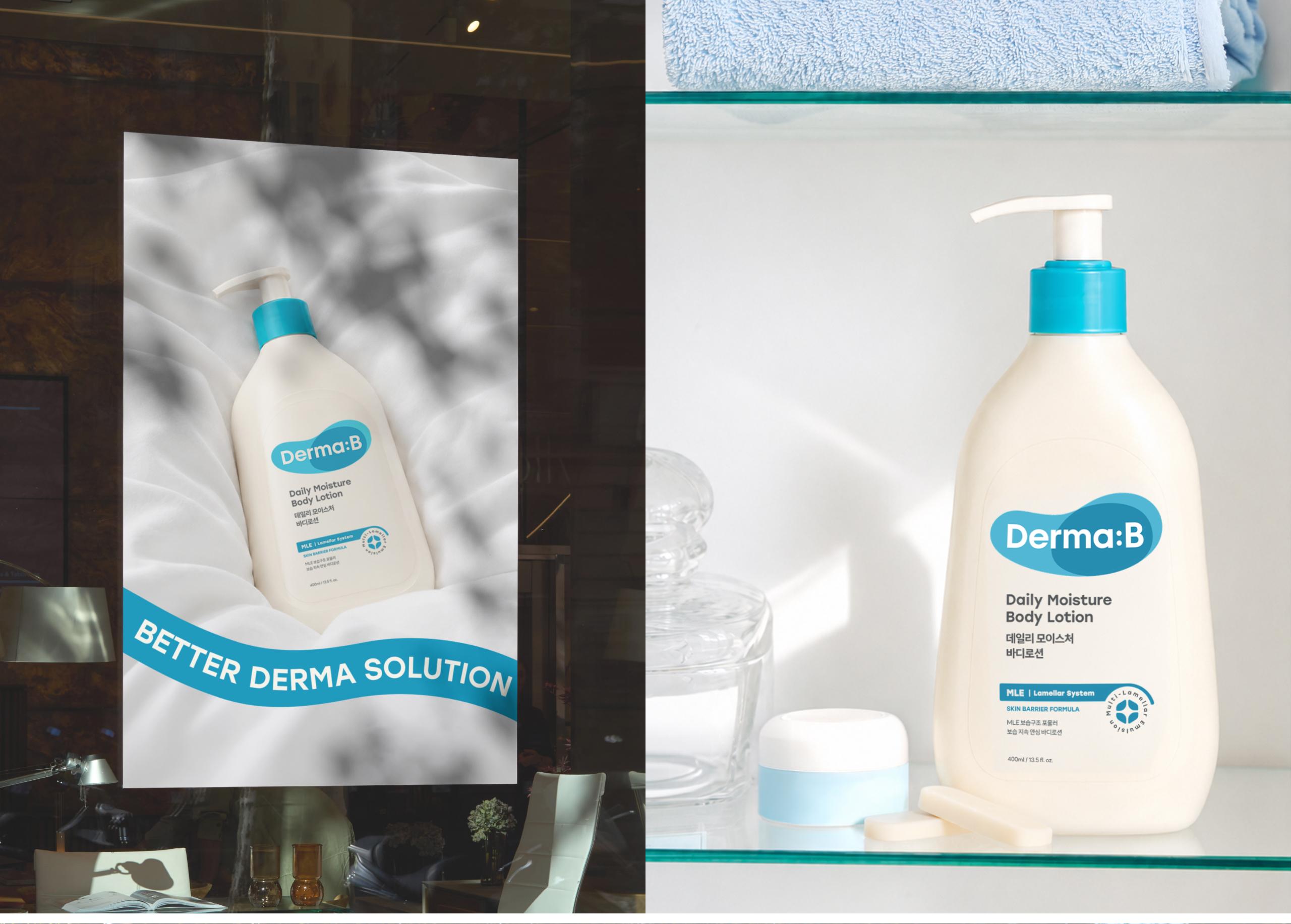
Derma B, a brand you have likely encountered at Olive Young, is a household name widely celebrated as the "national moisturizing essential." In leading the brand renewal for this highly familiar brand, OHSEVEN took a thoughtful and deliberate approach, carefully balancing its well-known identity with a fresh strategic direction and design evolution. This renewal strikes a perfect visual balance between Derma B’s inherent emotional warmth and its medical-backed, rational expertise.
- market research
- brand concept
- logo
- package
- graphic
- brand identity
- brand applications
DERMA B
올리브영에서 한 번쯤 보셨을 ‘더마비’는 국민 보습템이라 불릴 만큼 대중적인 인지도를 가진 브랜드입니다. 오세븐은 많은 이들에게 친숙한 더마비의 브랜드 리뉴얼을 진행하며, 익숙함 속에 담긴 새로운 방향성과 디자인적 변화를 깊이 고민하며 조심스럽게 접근했습니다.
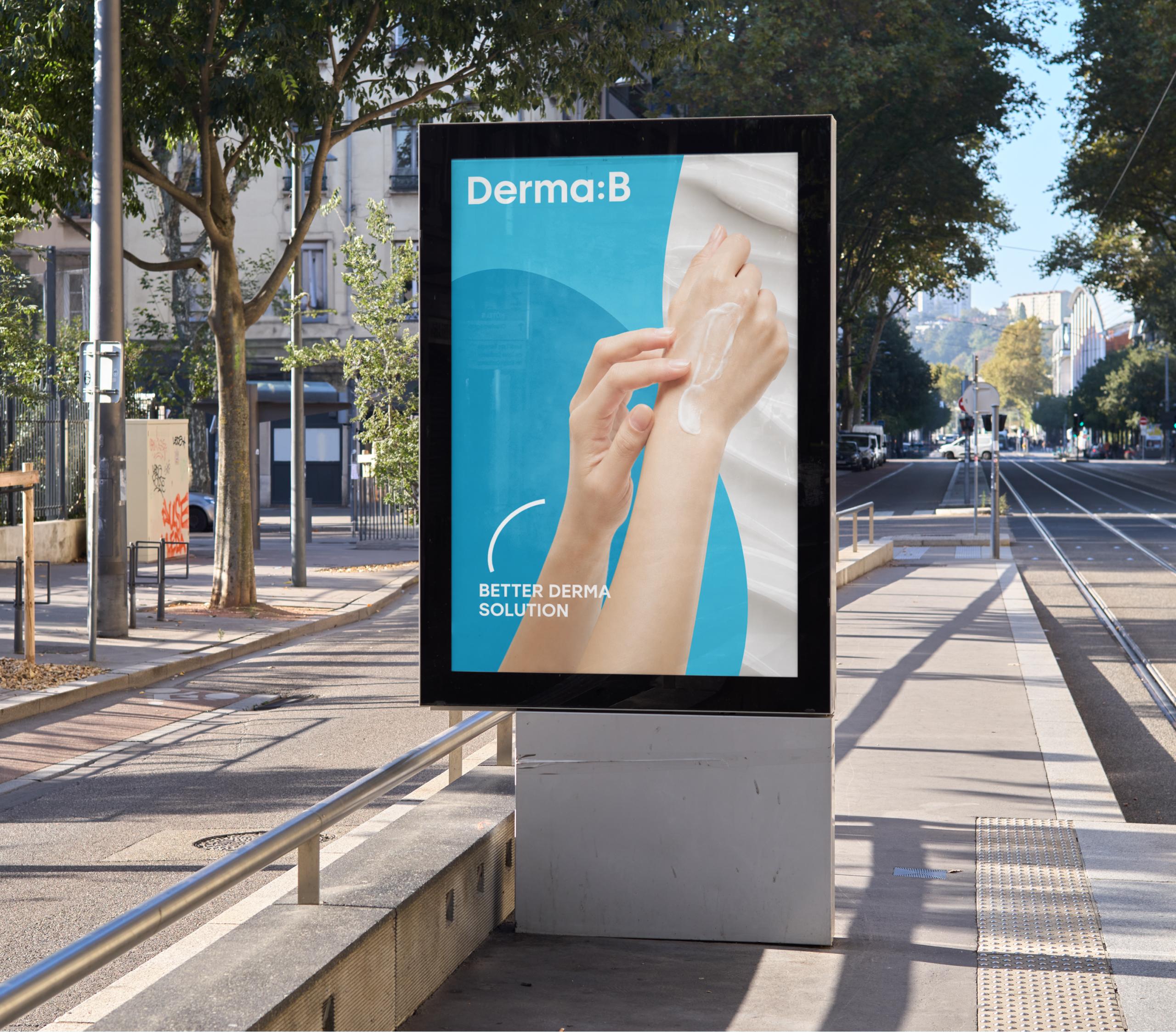
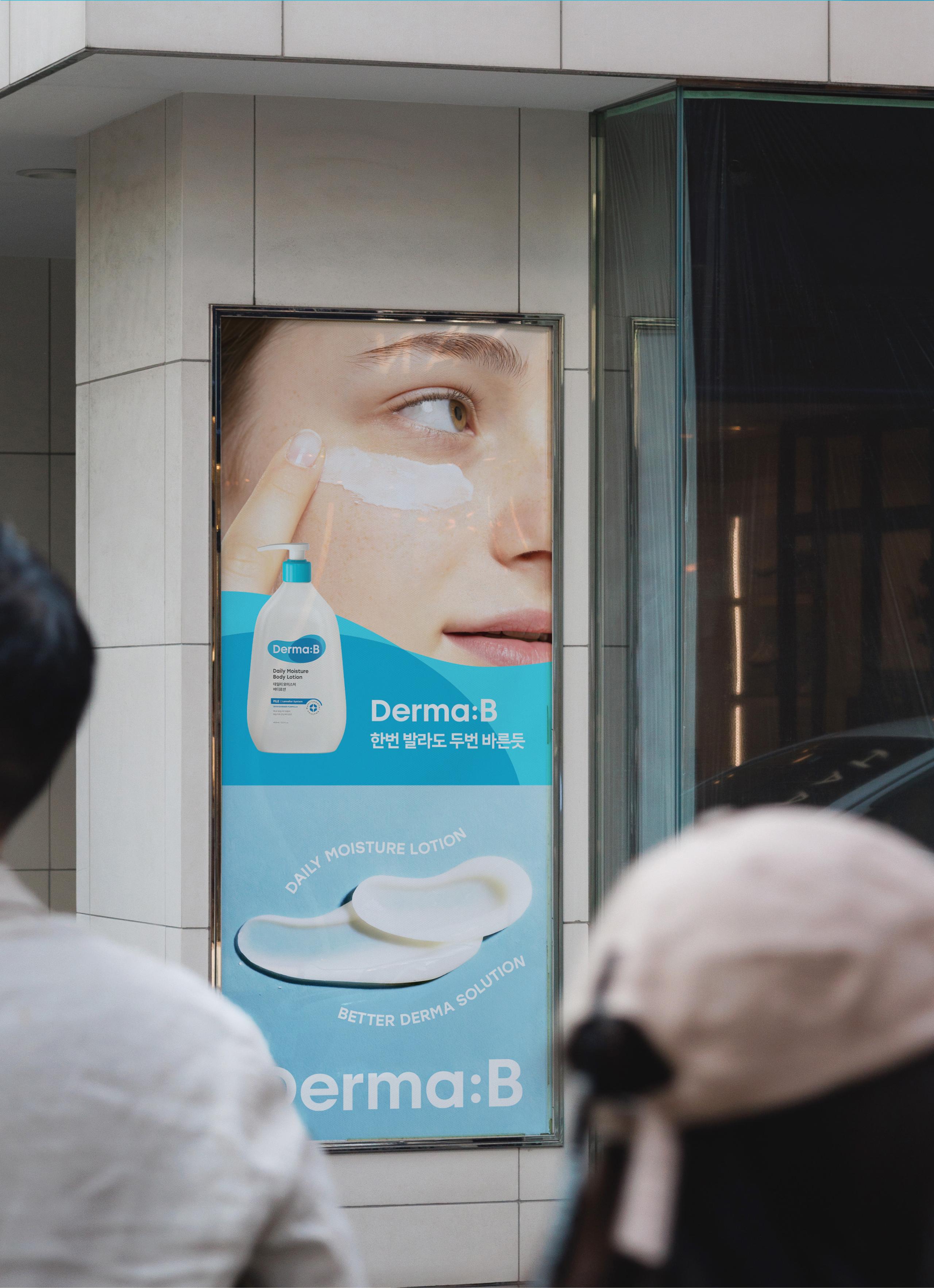
‘한 번 발라도 두 번 바른 듯’이라는 브랜드 슬로건에 맞춰, 새로운 그래픽 모티프는 피부에 닿는 부드러운 터치감을 시각적으로 전달합니다. 또한, 로고에서 교집합처럼 맞물리는 형태는 더마비만의 기술력을 바탕으로 개개인의 바디 컨디션에 맞춘 ‘전문적인 케어 솔루션’을 의미합니다.
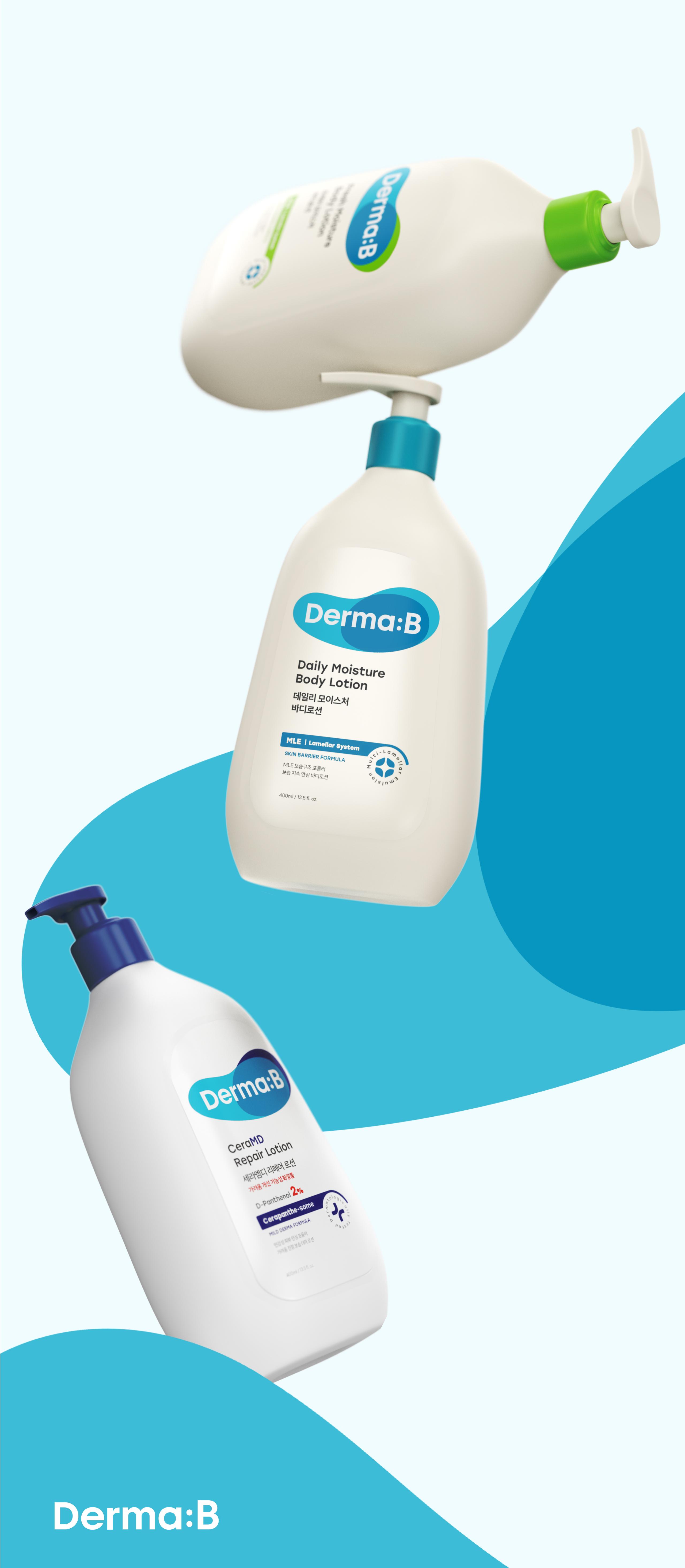
로고 리뉴얼과 더불어 전체 패키지 디자인 시스템의 체계도 새롭게 정립했습니다. 특히 기존 라인업은 물론, 향후 출시될 신규 라인까지 유연하게 적용할 수 있는 체계적인 시스템화에 가장 방점을 두었습니다.
로고의 변화 폭을 최소화하고 ‘온 가족이 함께 쓰는 더마 케어’라는 교집합의 가치에서 출발한 만큼, 패키지 디자인에서는 한층 더 이성적이고 구조적인 비주얼 라이징을 시도했습니다.
결과적으로 이번 리뉴얼을 통해 더마비가 지닌 고유의 감성적인 따뜻함과, 메디컬 기반의 이성적인 전문성이 시각적으로 완벽한 균형을 이루도록 했습니다.
Derma B, a brand you have likely encountered at Olive Young, is a household name widely celebrated as the "national moisturizing essential." In leading the brand renewal for this highly familiar brand, OHSEVEN took a thoughtful and deliberate approach, carefully balancing its well-known identity with a fresh strategic direction and design evolution.
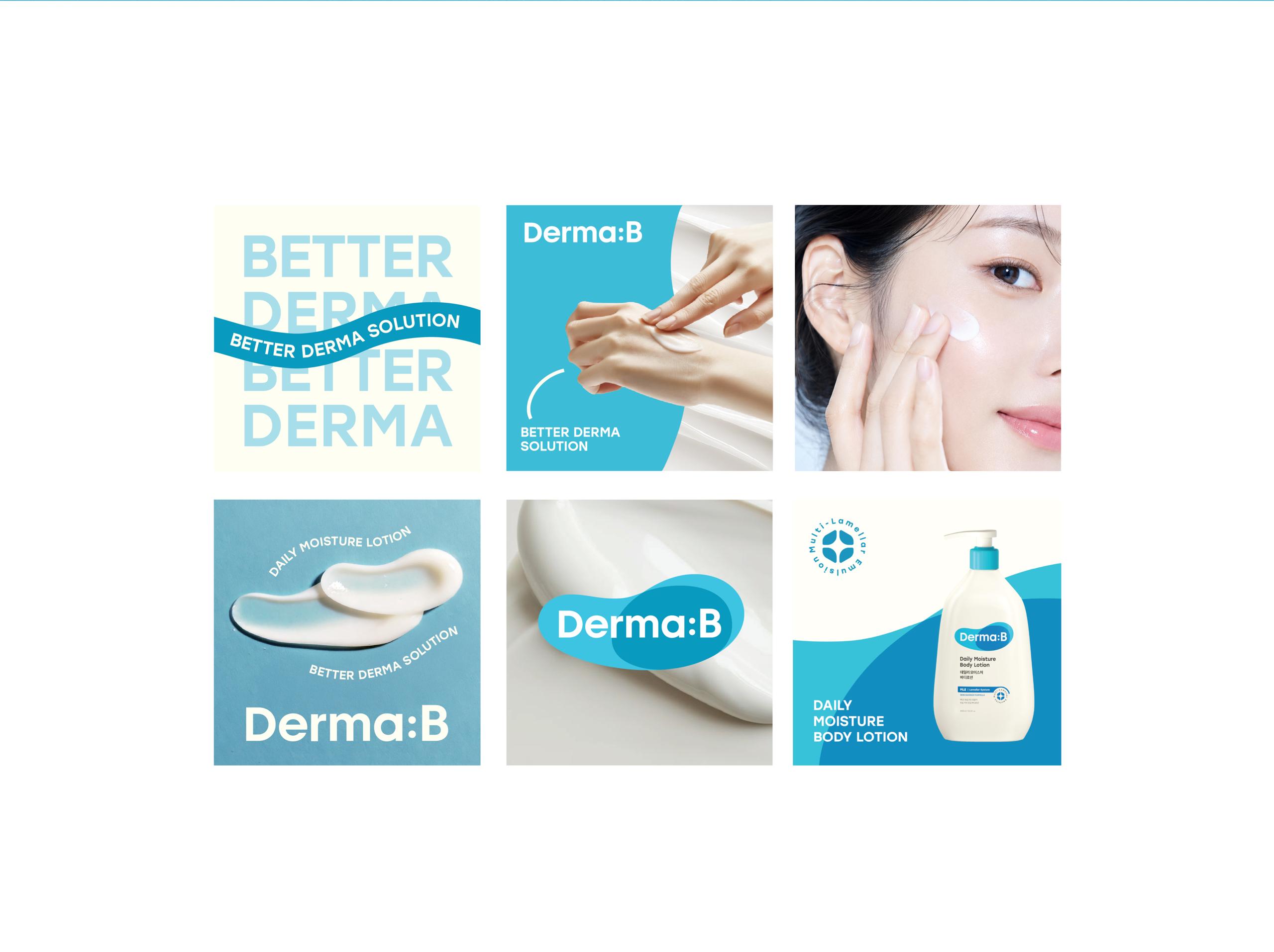
Aligned with the brand slogan, "As if applied twice with just a single touch," the new graphic motif visually captures the sensation of a gentle, soothing touch on the skin. Furthermore, the intersecting forms within the logo symbolize an "expert care solution" tailored to individual body conditions, powered by Derma B's proprietary technology.
Alongside the logo renewal, we restructured the entire packaging design system. The primary focus was placed on creating a structured, highly scalable system that seamlessly accommodates both the existing lineup and future product extensions. Since we kept the logo adjustments subtle and rooted the concept in the shared value of "derma care for the entire family," we explored a more rational and structured visual approach for the packaging design.
Ultimately, this renewal strikes a perfect visual balance between Derma B’s inherent emotional warmth and its medical-backed, rational expertise.
Logo
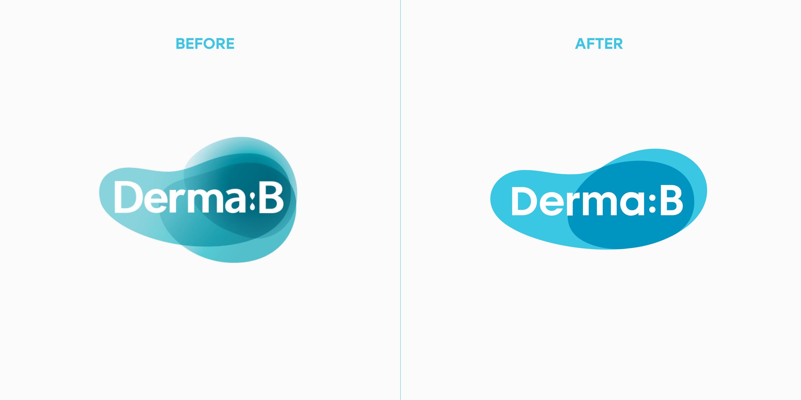
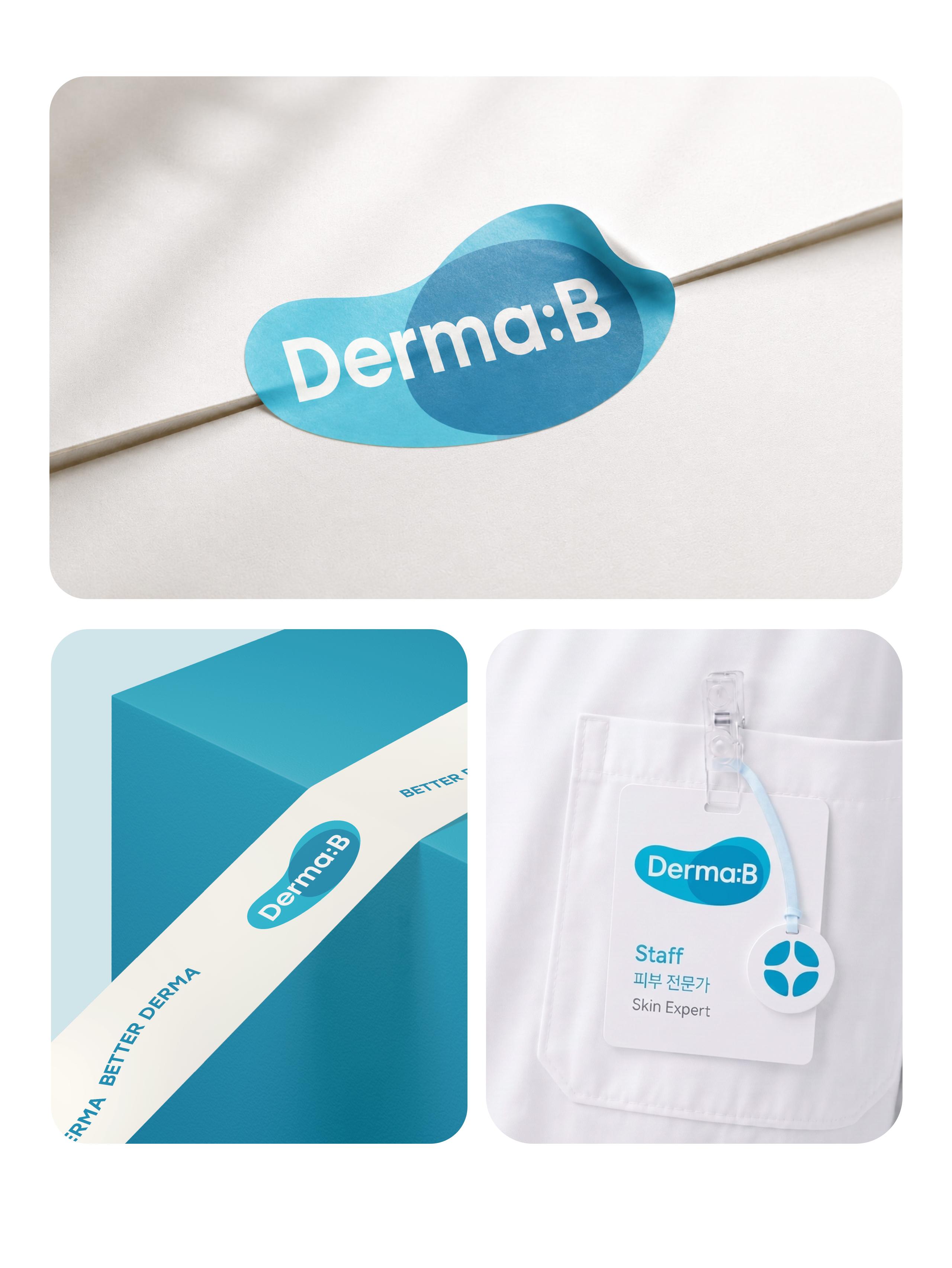
기존 더마비 고유의 형태를 최대한 유지하여, 브랜드가 가진 높은 인지도와 기존 사용자의 익숙함을 훼손하지 않으면서도 한층 이성적이고 정제된 톤으로 발전시키고자 했습니다.
이 과정에서 더마비의 시각 언어를 명료하게 정제하는 동시에 ‘교집합’이라는 디자인 콘셉트를 부여했습니다. 이를 통해 ‘온 가족이 공통으로 사용하는 제품’이라는 대중적 가치부터, ‘더마비만의 기술력을 바탕으로 개개인의 바디 컨디션에 맞춘 전문적인 케어 솔루션’이라는 기능적 가치까지 다각도의 내러티브를 포용할 수 있도록 표현했습니다.
We sought to evolve the logo into a more rational and refined tone while maximally preserving Derma B's inherent form, ensuring the brand’s high recognition and consumer familiarity remained intact.
In this process, we clearly refined Derma B’s visual language while imbuing it with the design concept of an 'intersection.' This allows the visual identity to encompass multi-layered narratives—bridging the universal value of 'a product shared by the entire family' with the functional value of 'an expert care solution tailored to individual body conditions' powered by Derma B's proprietary technology.

Color
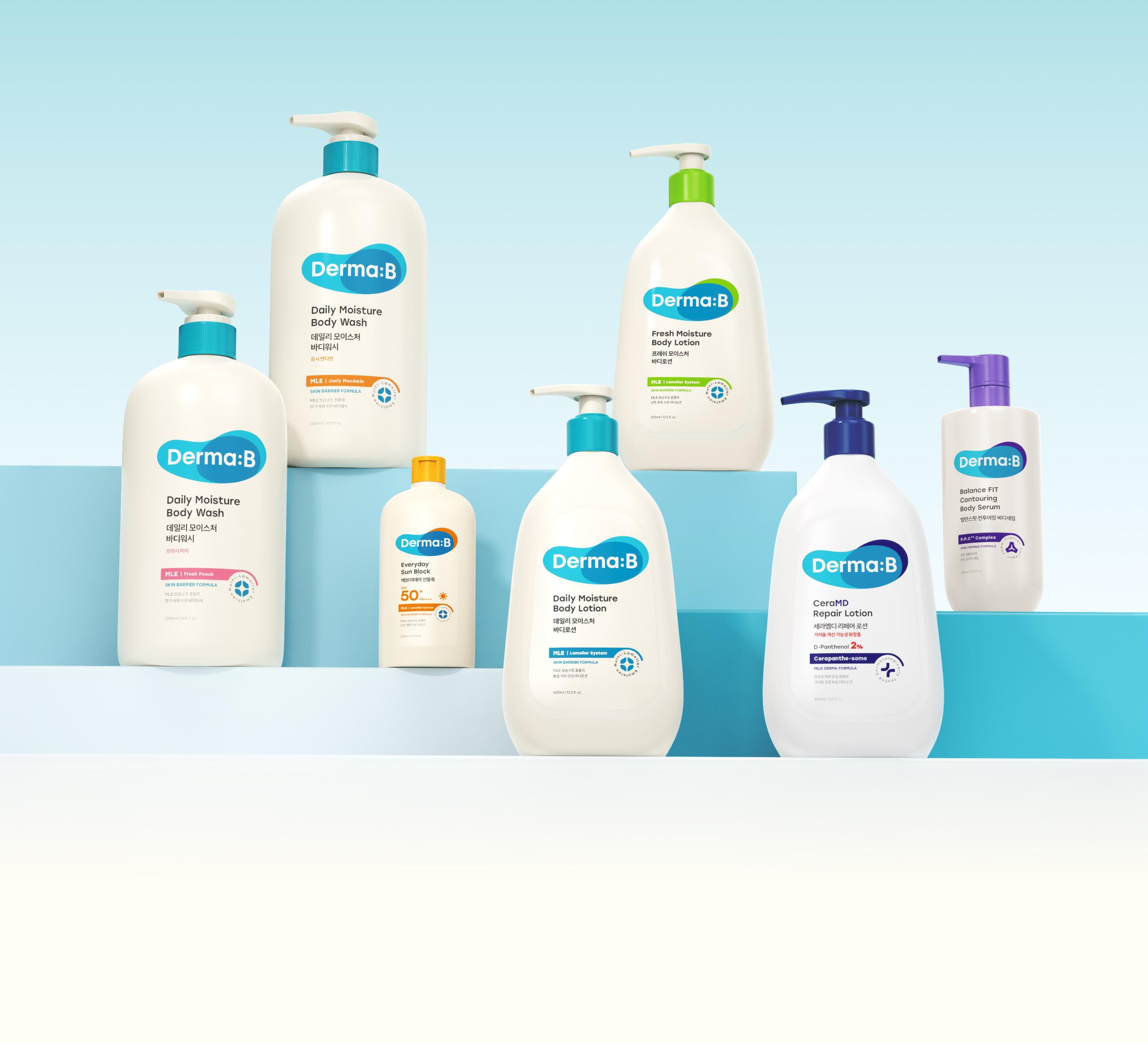
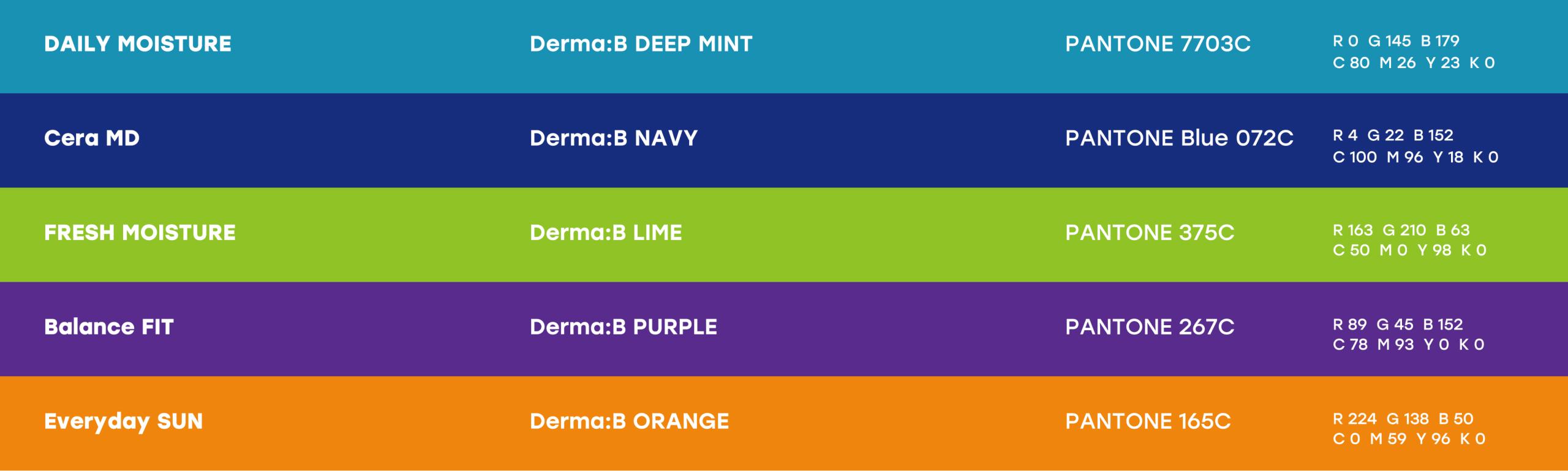
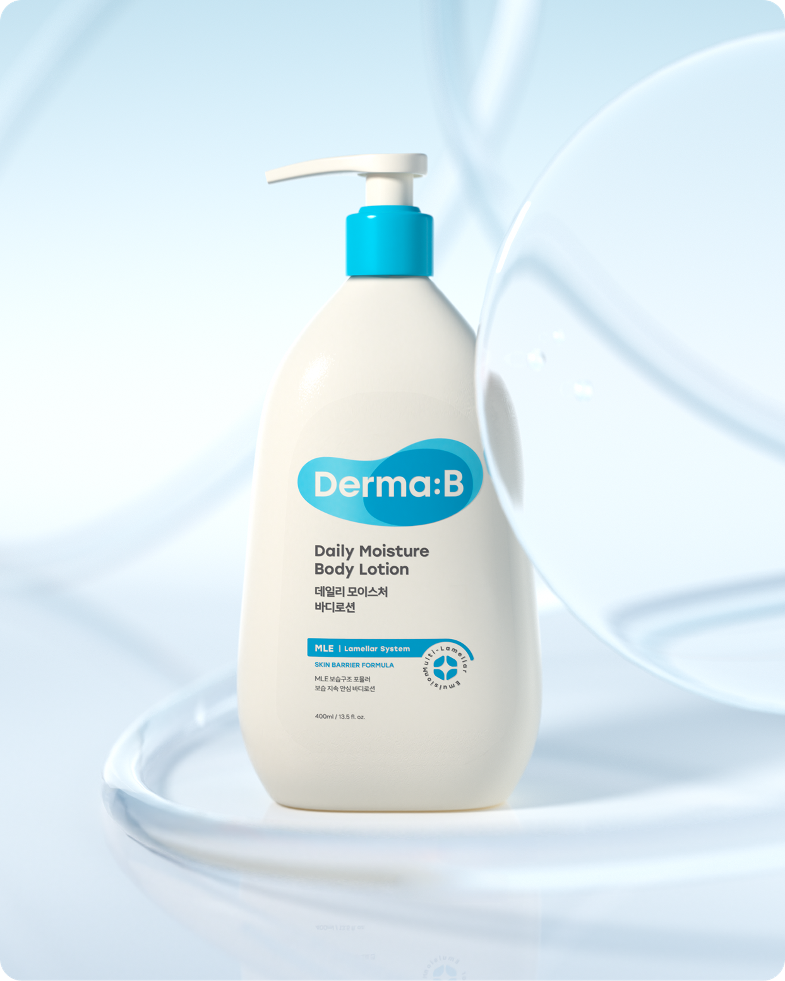
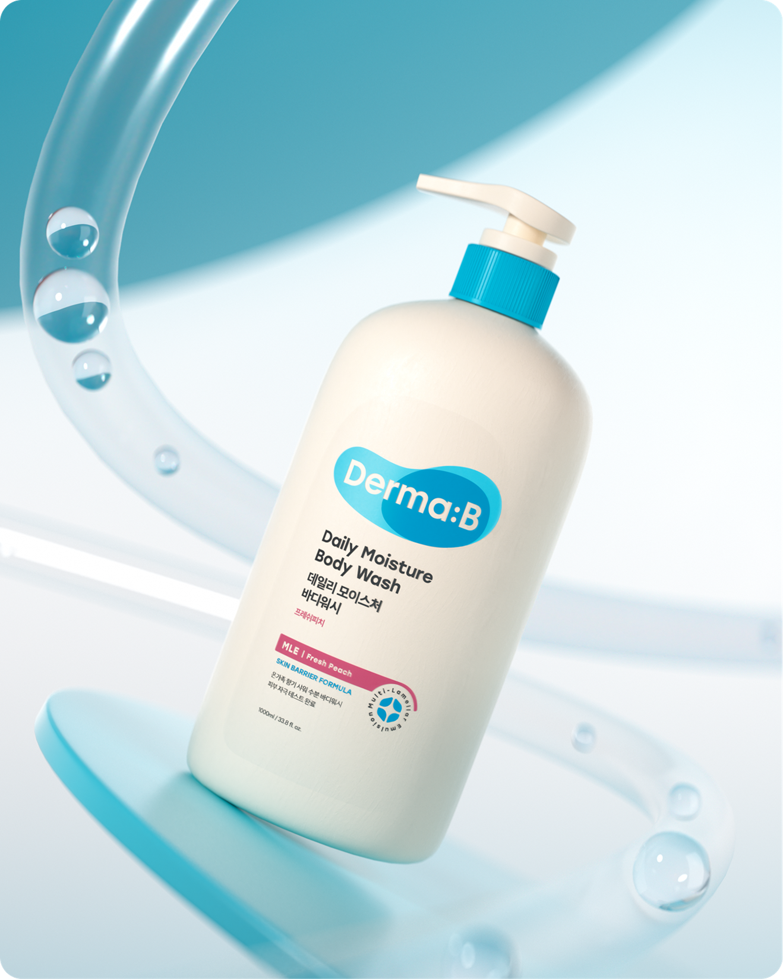
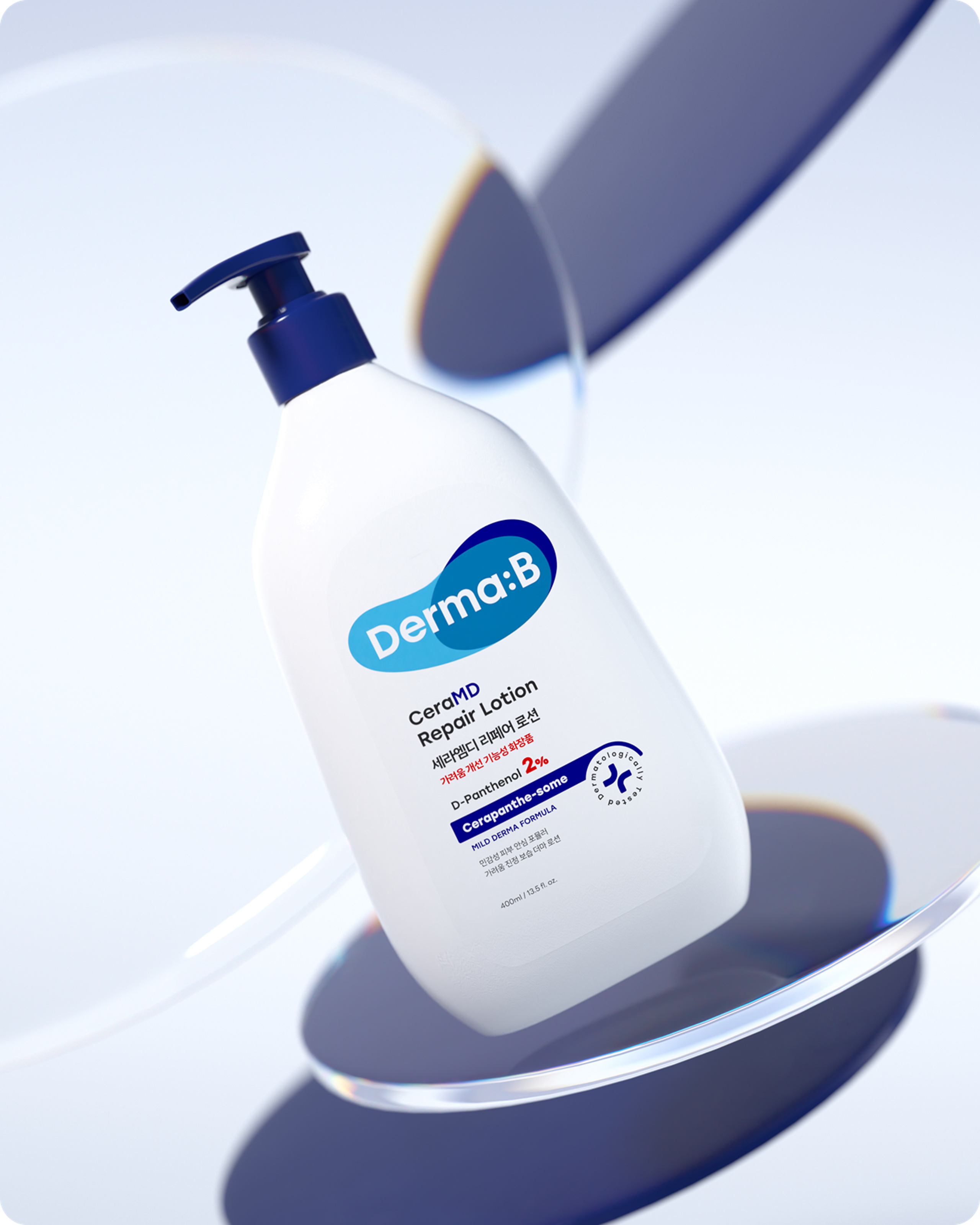
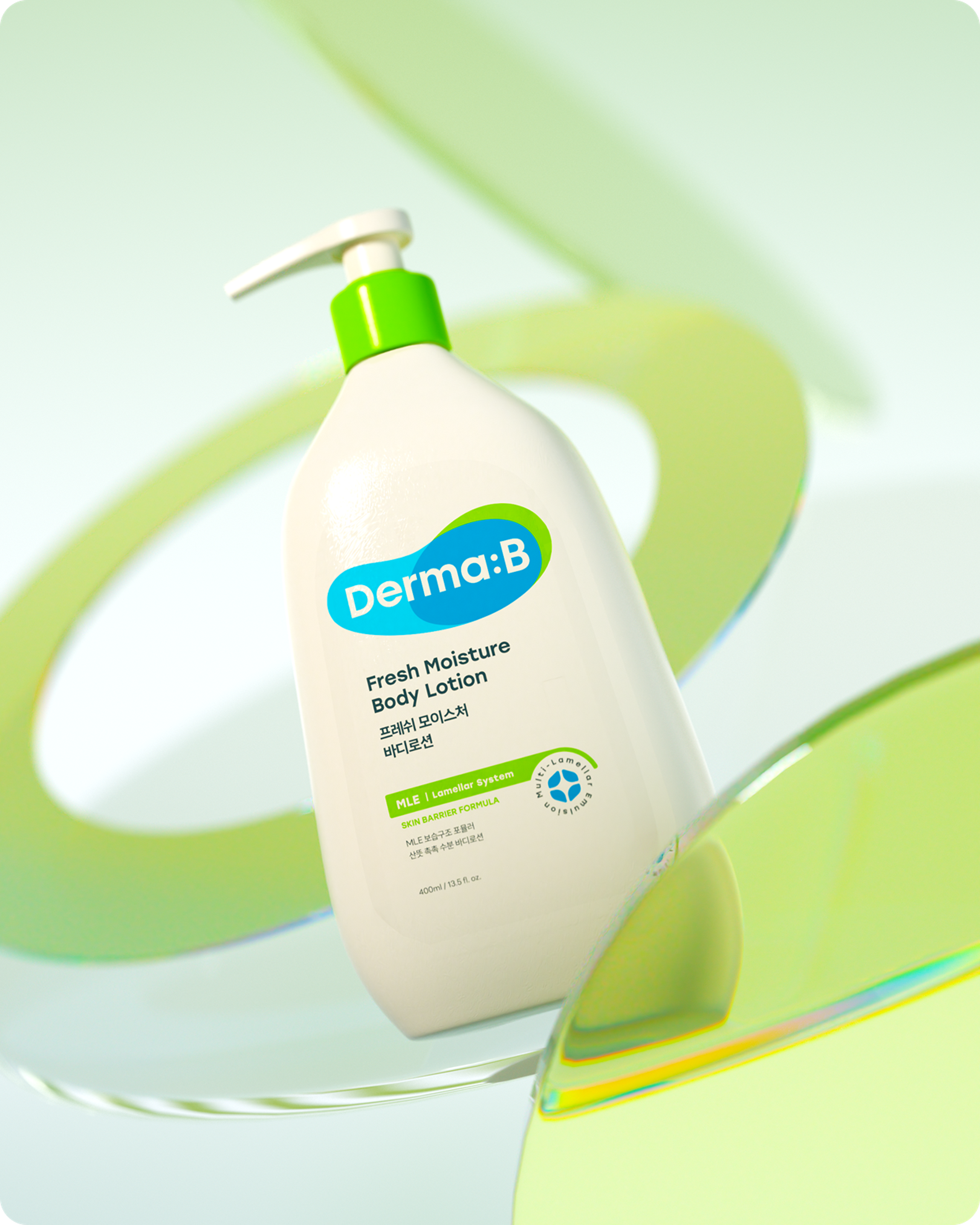
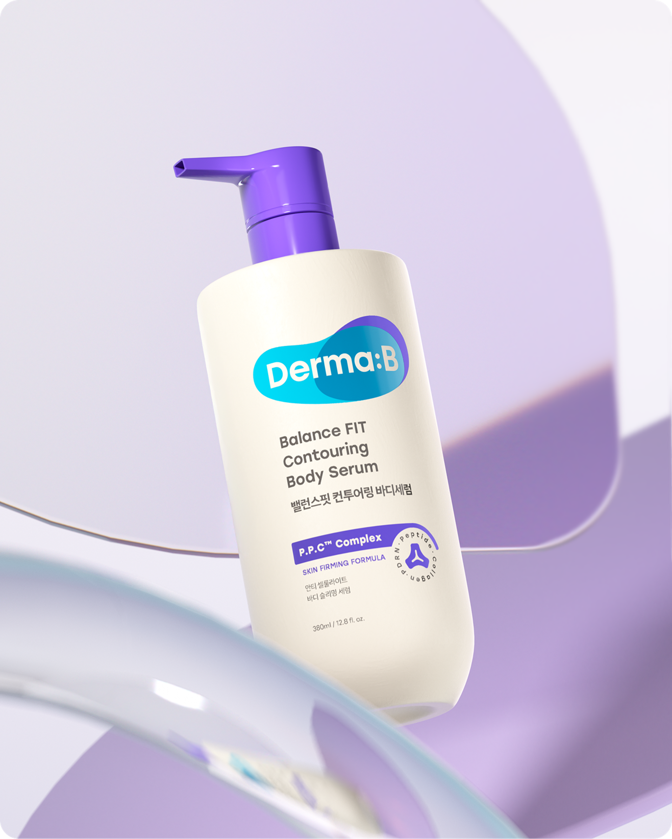
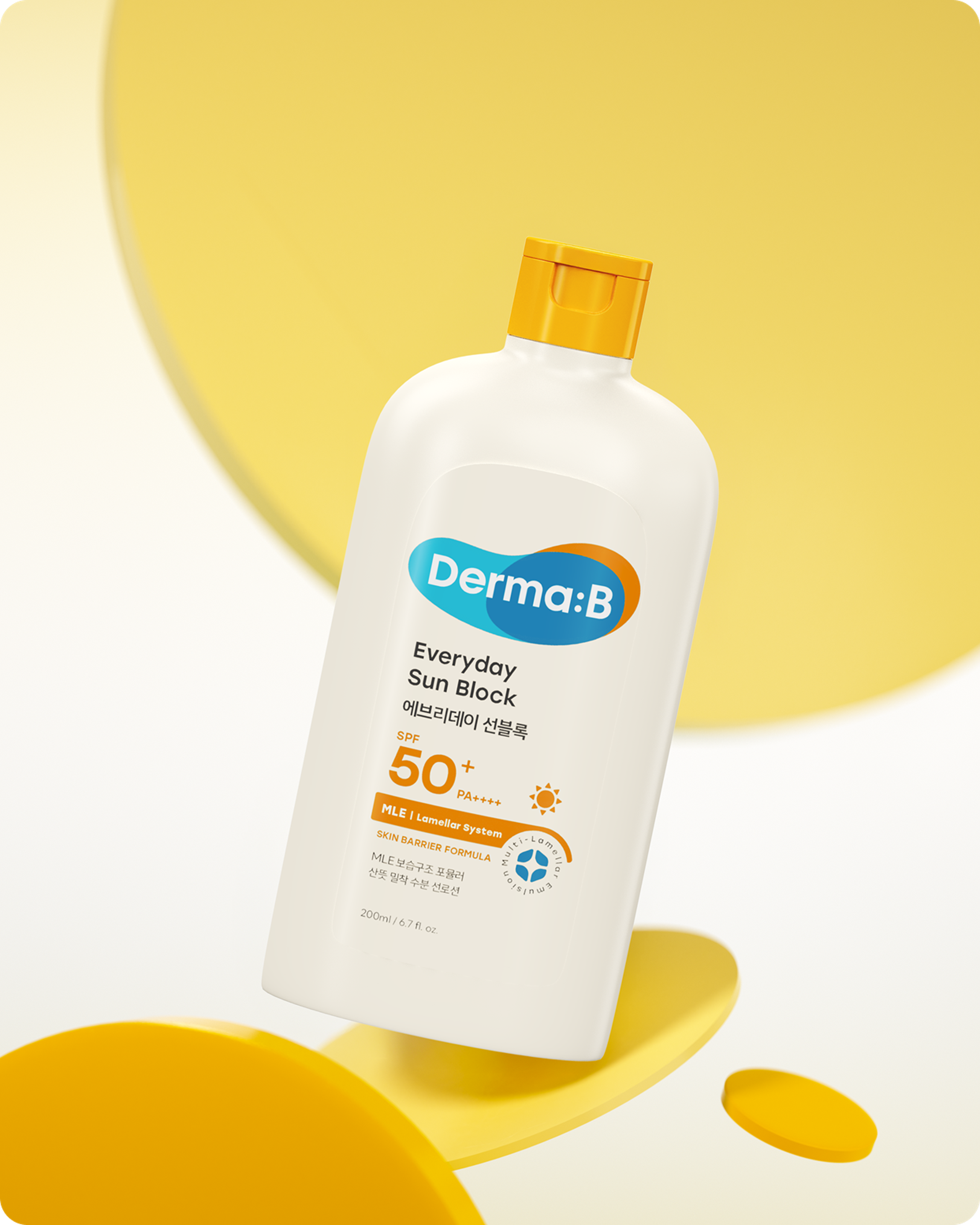
더마비는 매우 방대한 SKU를 보유한 브랜드입니다. 이를 직관적으로 분류하기 위해 정교한 컬러 시스템을 구축하여 라인업을 체계적으로 정돈했습니다.
새로운 로고의 3개의 면으로 분할된 솔리드 그래픽 구조를 중심축으로 삼고, 우측 면의 컬러 변화를 가변적으로 적용함으로써 수많은 라인업이 고유의 아이덴티티를 유지하면서도 효과적으로 구분되도록 시도했습니다.
Derma B is a brand with a highly extensive range of SKUs. To categorize them intuitively, a sophisticated color system was established to systematically organize the product lineups.
Centered around the new logo's solid graphic structure—which is divided into three facets—we flexibly applied color variations to the right plane. This approach allows the numerous lineups to be effectively differentiated while successfully maintaining their unique identities.
Icon
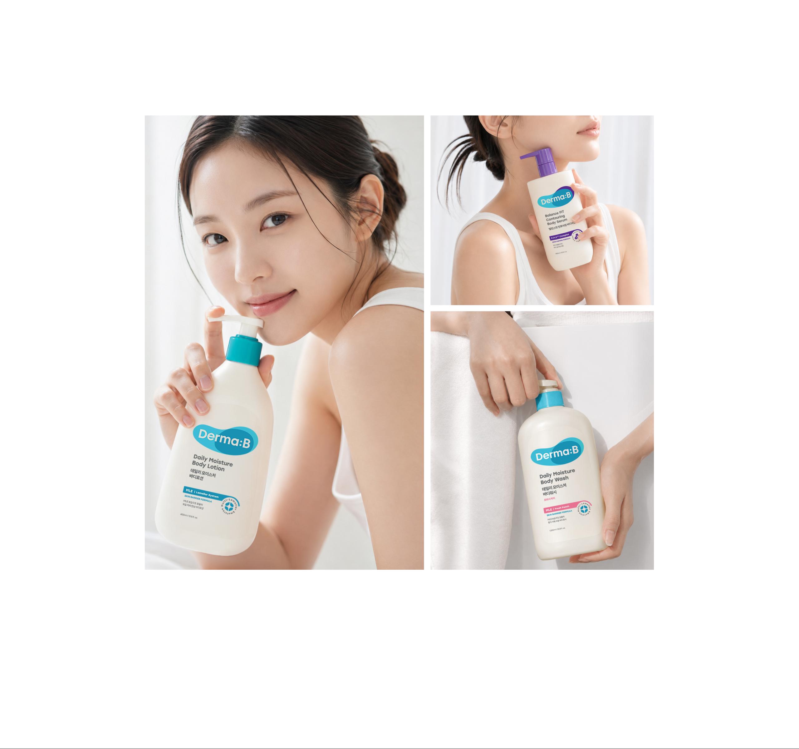
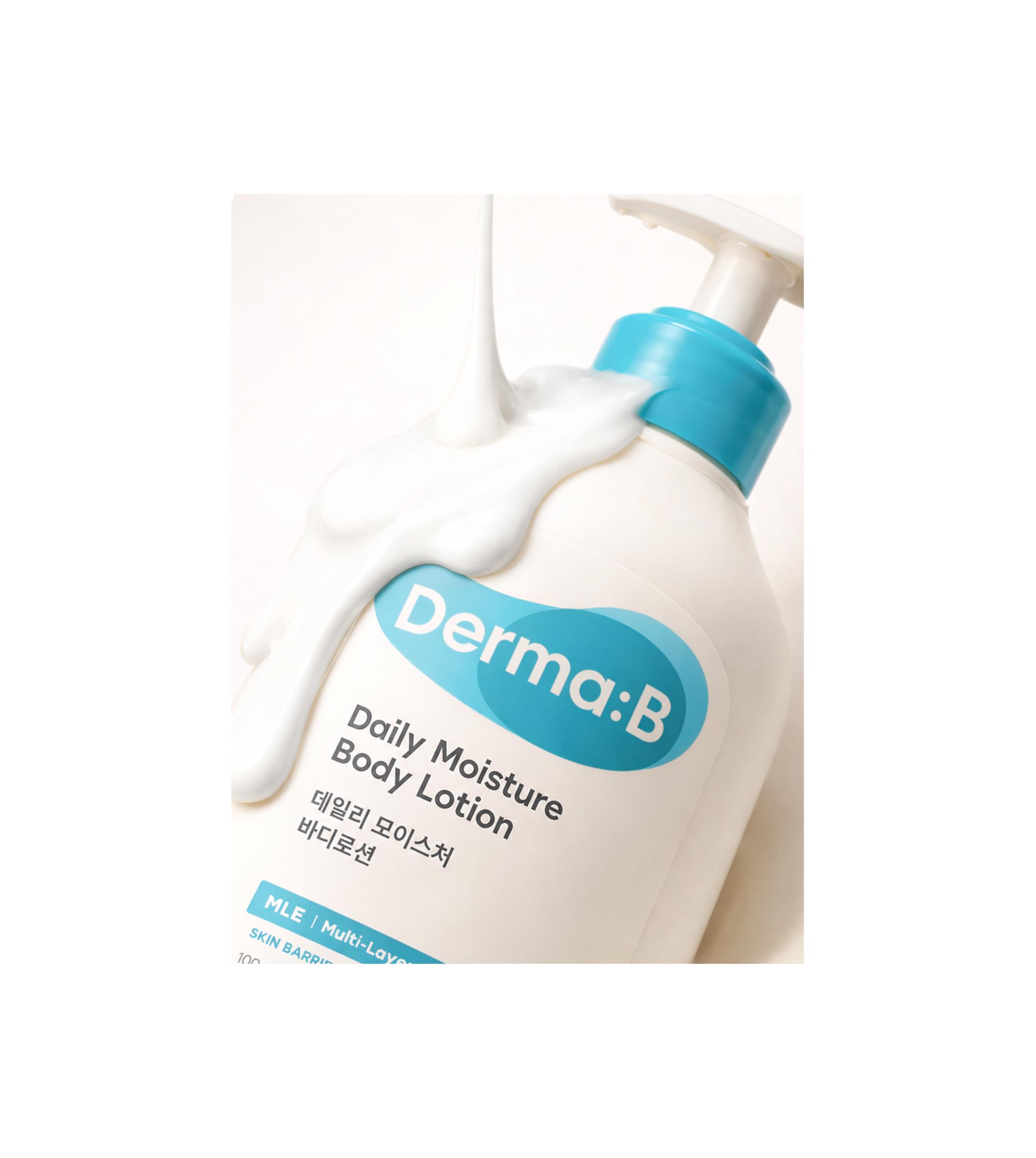
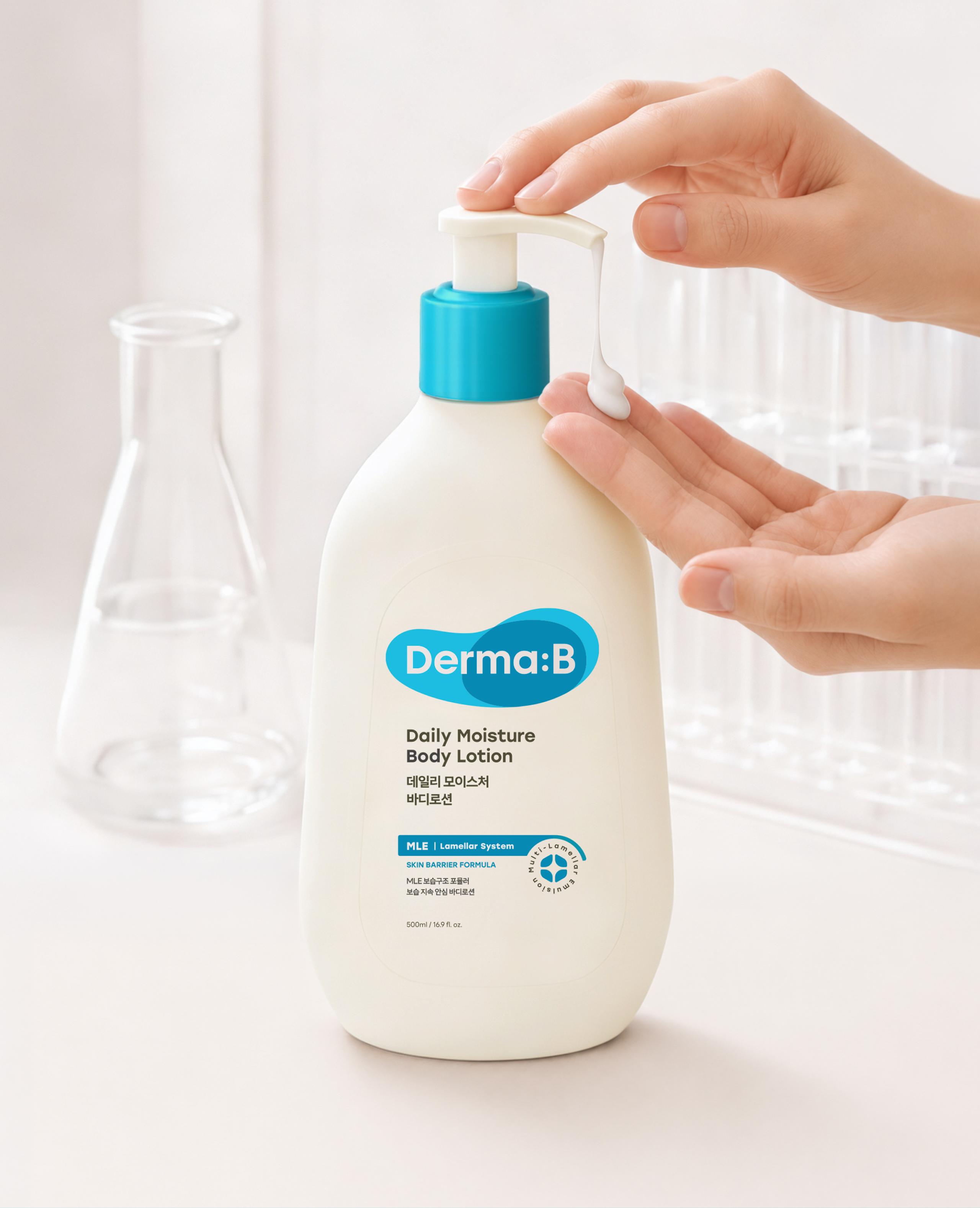
더마비의 가장 큰 핵심 경쟁력은 독자적인 피부 장벽 강화 기술인 MLE 보습 기술을 보유하고 있다는 점입니다. 그러나 기존 패키지에서는 이러한 핵심 USP가 직관적으로 드러나지 않는 아쉬움이 있었습니다.
새로운 패키지 시스템에서는 데일리 라인의 중심이 되는 MLE 심볼을 정교하게 유지하는 한편, 각 기능성 라인의 특성에 맞춘 전용 아이콘을 새롭게 개발하여 브랜드의 전문성과 기술적 자산을 효과적으로 부각하고자 했습니다.
Derma B’s greatest competitive edge lies in its proprietary skin barrier-strengthening technology, "MLE® Moisturizing Technology." However, the previous packaging design faced a challenge in that this crucial USP was not clearly emphasized.
Within the new packaging system, we refined and maintained the core MLE symbol for the daily line, while developing dedicated icons for other functional lines to effectively highlight the brand's expertise and key technical assets.

- Executive director Daine Bae
- Project Manager Yunje Park
- Lead Designer Song-yi Gu, Boyeon Yeon
- Designer Hee Sun Kim, Jahee Lee, Minji Kang, Hye Jin Pyeon, Hwa Yeon Shin, Eun Bin Kim, Eun Bin Kang
- 3D/ Motion Designer Chaeyeon Kim
- Archiving Sungwoong Yoon, Chaeyeon Kim, Eunji Choi
MISSHA DESIGN SYSTEM