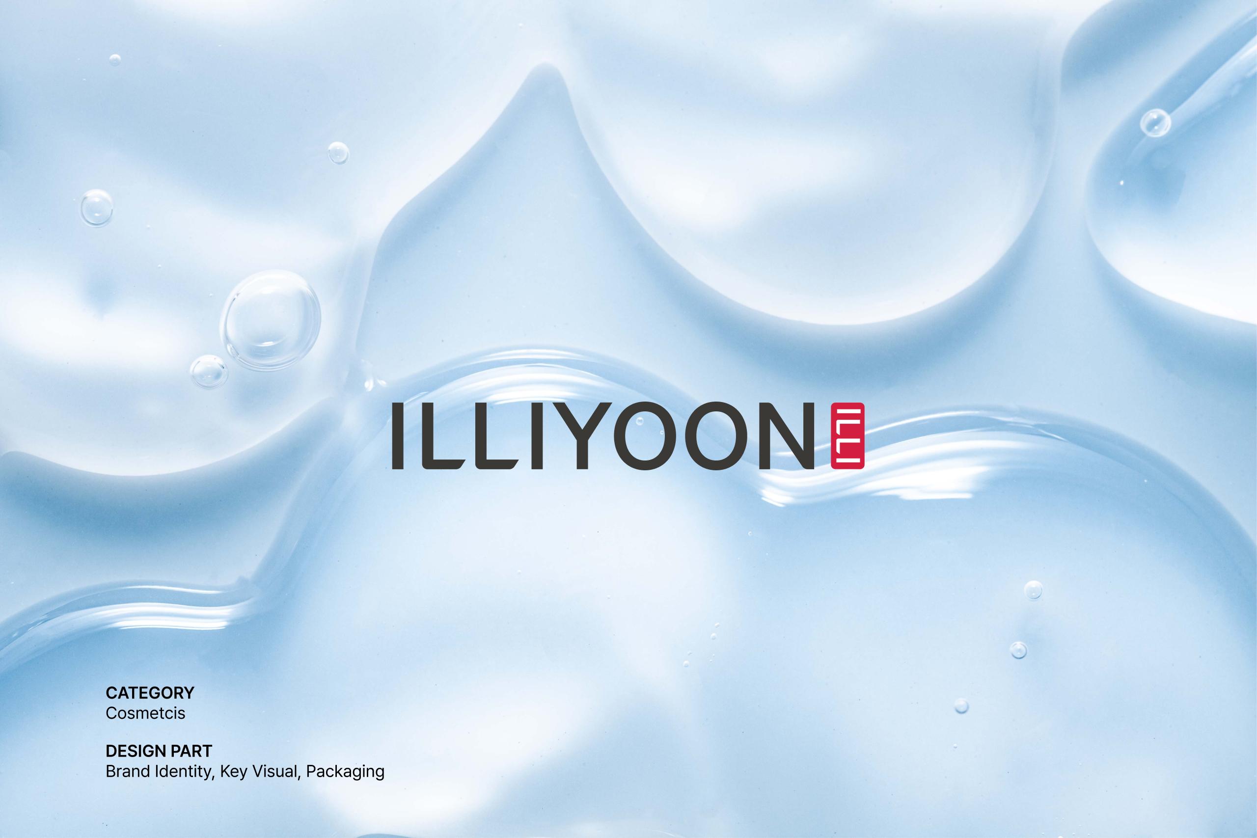
ILLIYOON
amore pacific
2025
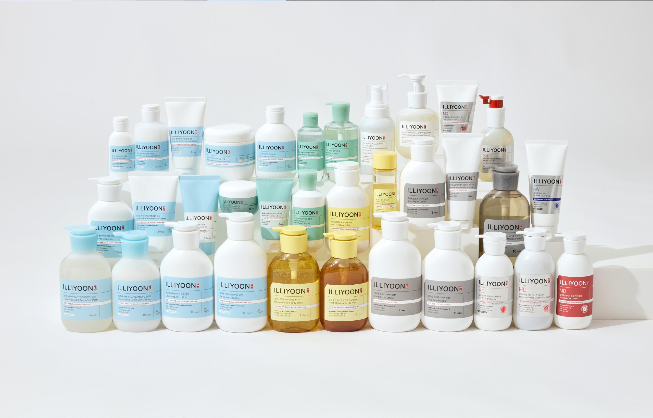
일리윤은 글로벌 시장으로의 도약과 더욱 강력한 브랜드 발신을 위해 새롭게 리뉴얼 되었습니다. 기존의 본연의 건강함을 찾아주는 저자극 고보습 전문 바디케어 브랜드로서의 헤리티지를 계승하며, 이전보다 더욱 전문적인 무드를 전달하기 위해 ‘Comfort Derma by Lab’을 컨셉으로 하여 브랜드의 비주얼을 강화했습니다.
- 브랜드 컨셉 개발
- 로고 디자인
- 브랜드 응용물 개발
ILLIYOON
일리윤은 글로벌 시장으로의 도약과 더욱 강력한 브랜드 발신을 위해 새롭게 리뉴얼 되었습니다.
기존의 본연의 건강함을 찾아주는 저자극 고보습 전문 바디케어 브랜드로서의 헤리티지를 계승하며, 이전보다 더욱 전문적인 무드를 전달하기 위해
‘Comfort Derma by Lab’을 컨셉으로 하여 브랜드의 비주얼을 강화했습니다.
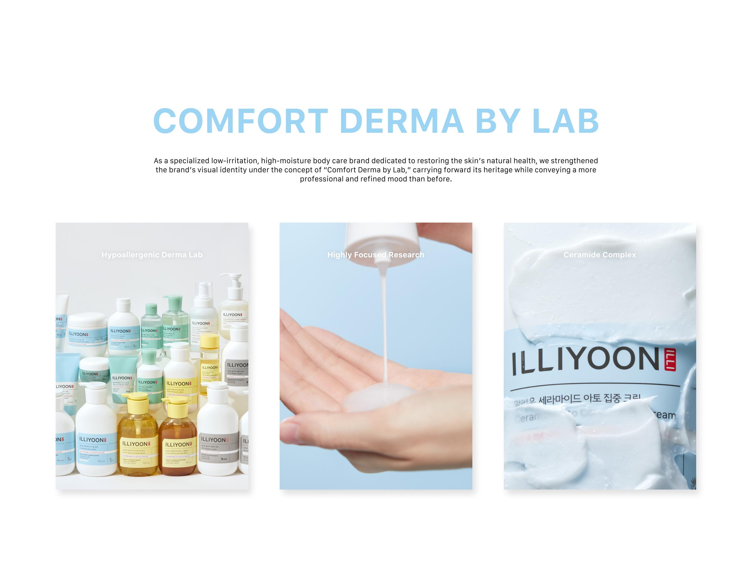
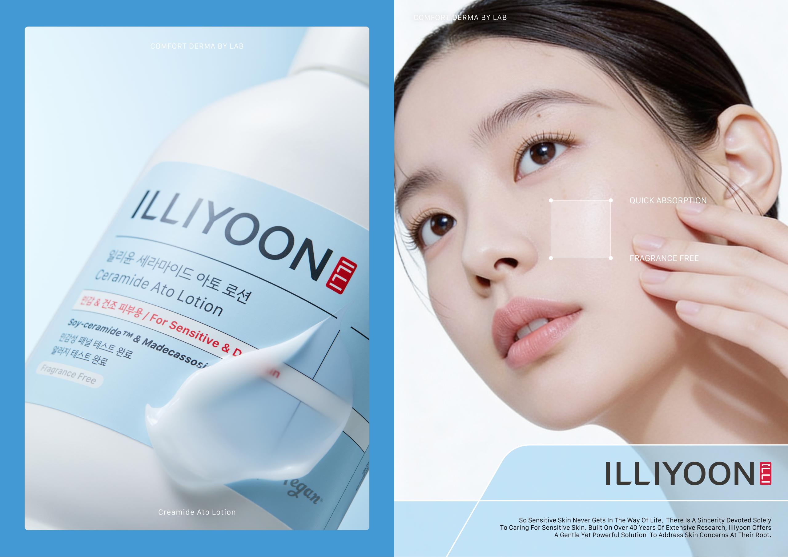
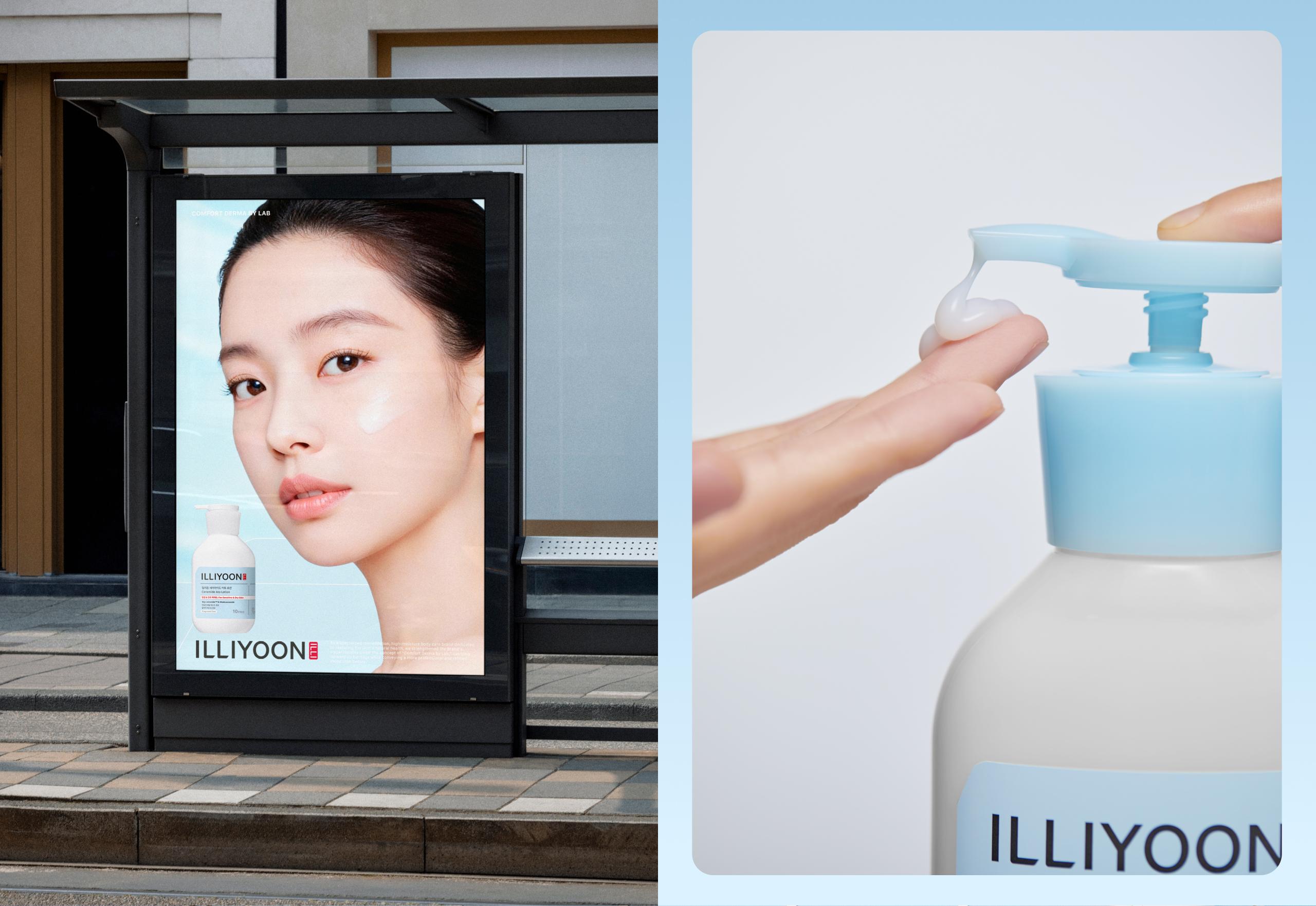
Illiyoon has been newly renewed to take a leap into the global market and deliver a stronger brand presence.
Carrying forward its heritage as a specialized low-irritation, high-moisture body care brand dedicated to restoring the skin’s natural health, the brand’s visual identity has been strengthened under the concept of
“Comfort Derma by Lab” to convey a more professional mood than before.
Logo & Symbol
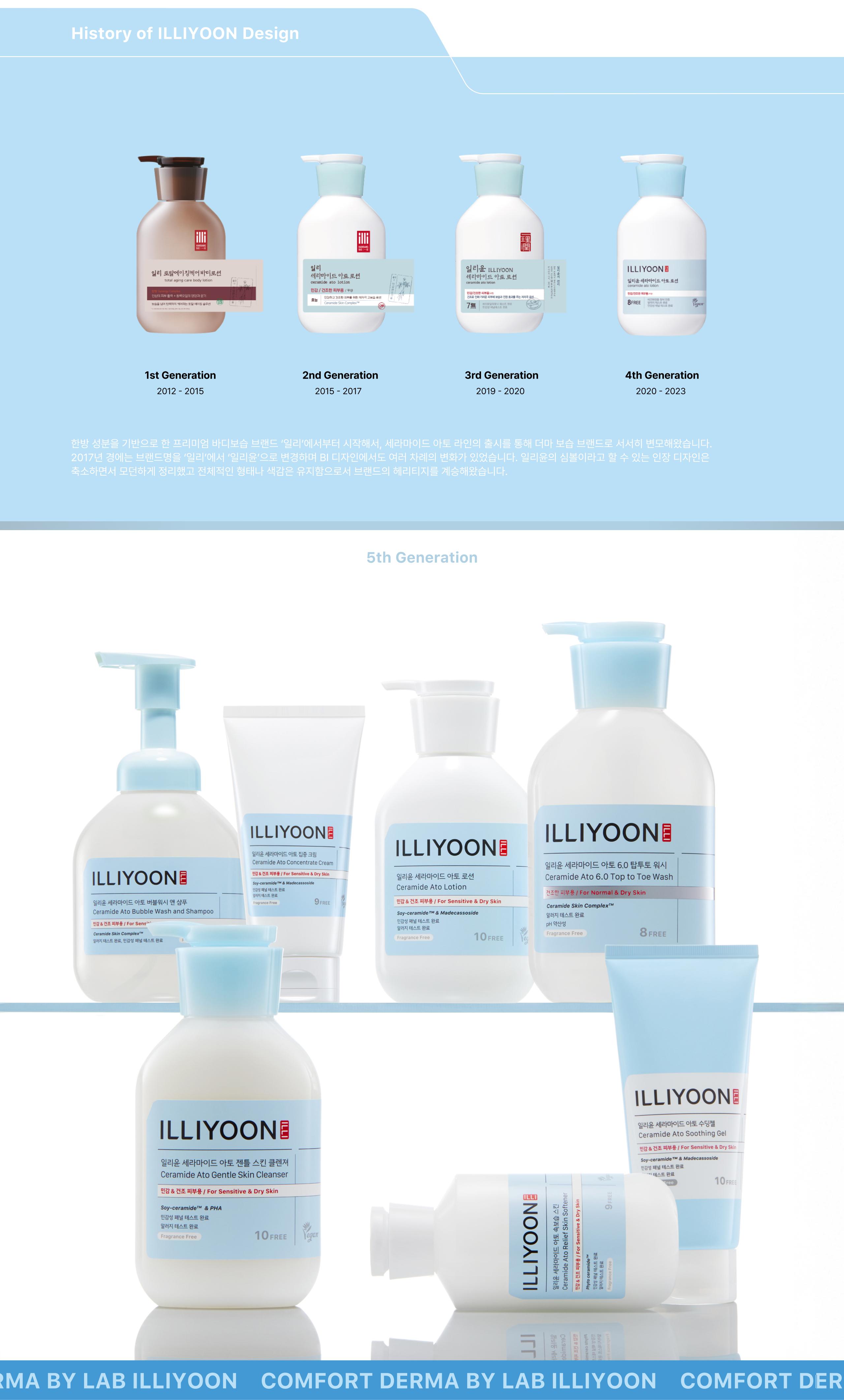
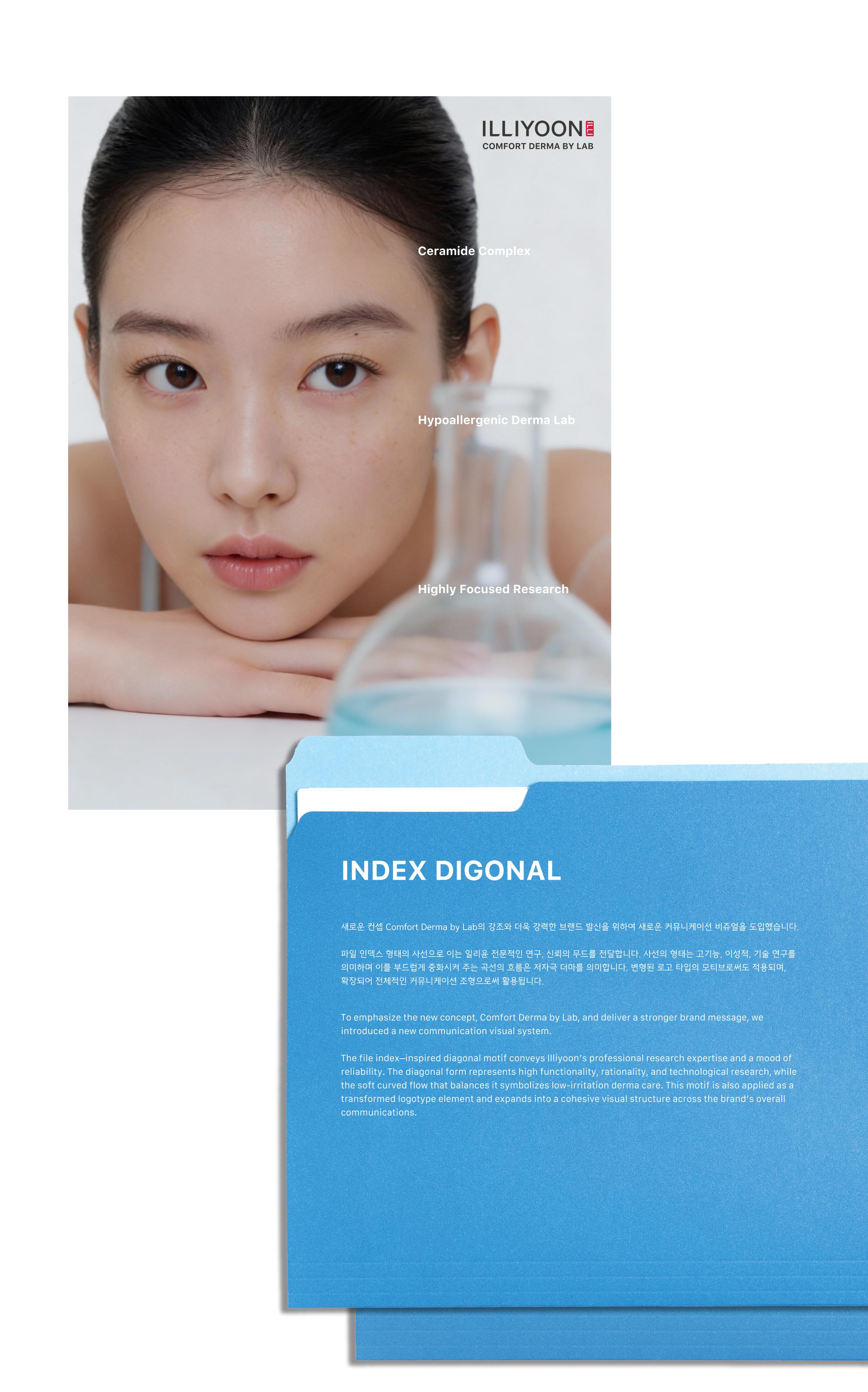
로고의 마무리 부분에서 연구차트 인덱스 형상의 조형적 영감을 받은 그래픽 모티브를 반영했습니다. 사선의 형태는 고기능, 이성적, 기술 연구를 의미하며 이를 부드럽게 중화시켜주는 곡선의 흐름은 저자극 더마 브랜드를 의미합니다.
일리윤의 인장 심볼은 기존의 한자가 들어간 형태에서 일리윤이 강조하는 한 가지의 이치 ‘일리(ILLI)’를 넣은 형태로 변화했습니다.이는 인지하기 쉬운 직설적인 접근이며, 영문 심볼로 글로벌 시장에서의 인식 개선을 기대해 볼 수 있습니다.
전통이 느껴지는 인장형태를 유지하여 일리윤의 헤리티지를 계승합니다.
The finishing detail of the logo incorporates a graphic motif inspired by the form of a research chart index. The diagonal element signifies high functionality, rationality, and technological research, while the soft curved flow that balances it represents the brand’s low-irritation derma care philosophy.
Illiyoon’s seal symbol has evolved from the previous version featuring Chinese characters to a new design incorporating the core principle emphasized by the brand — “ILLI.”
This change provides a more direct and easily recognizable approach, while the use of an English symbol is expected to improve recognition in the global market. By retaining the traditional seal form, the design continues to honor and carry forward Illiyoon’s heritage.
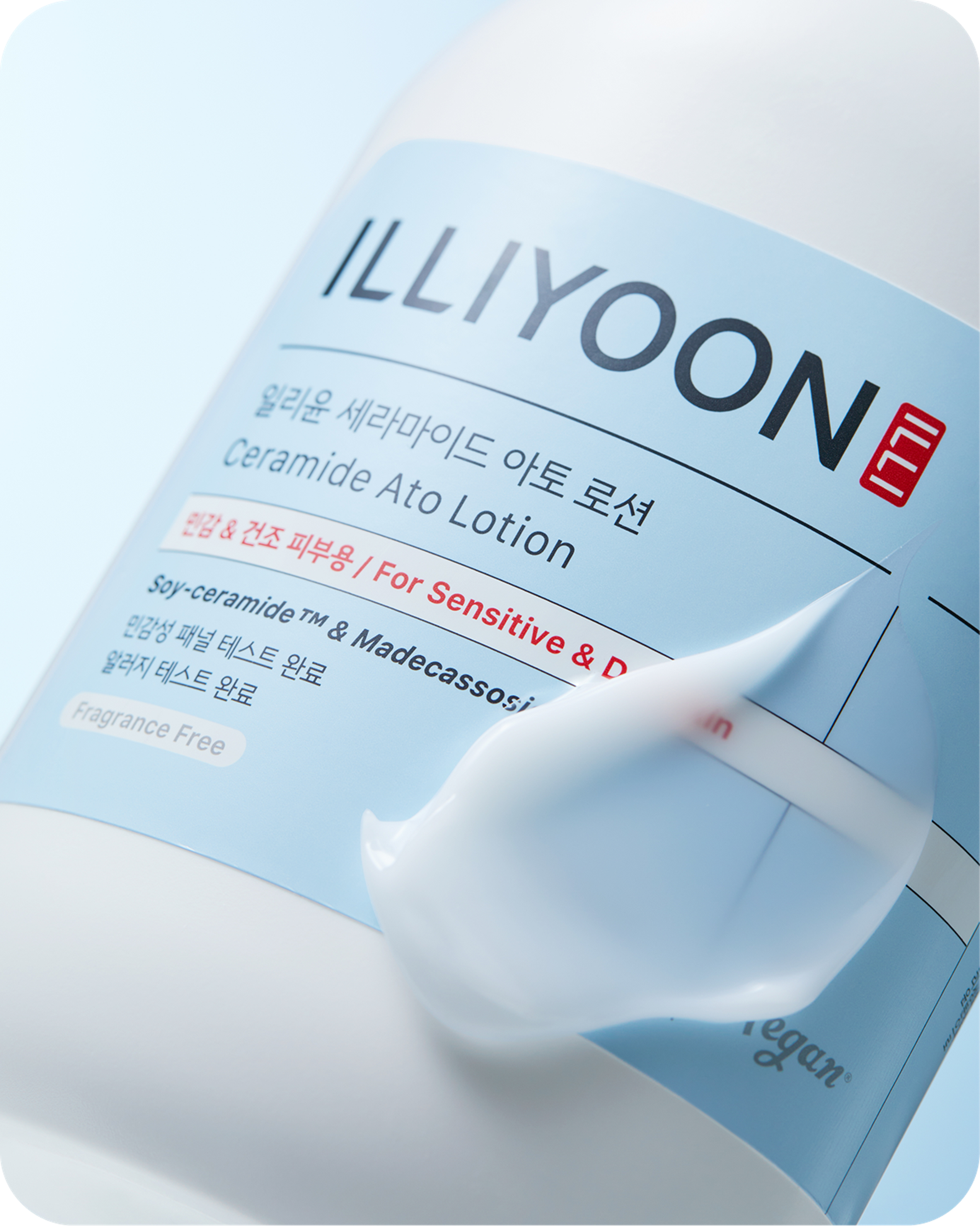
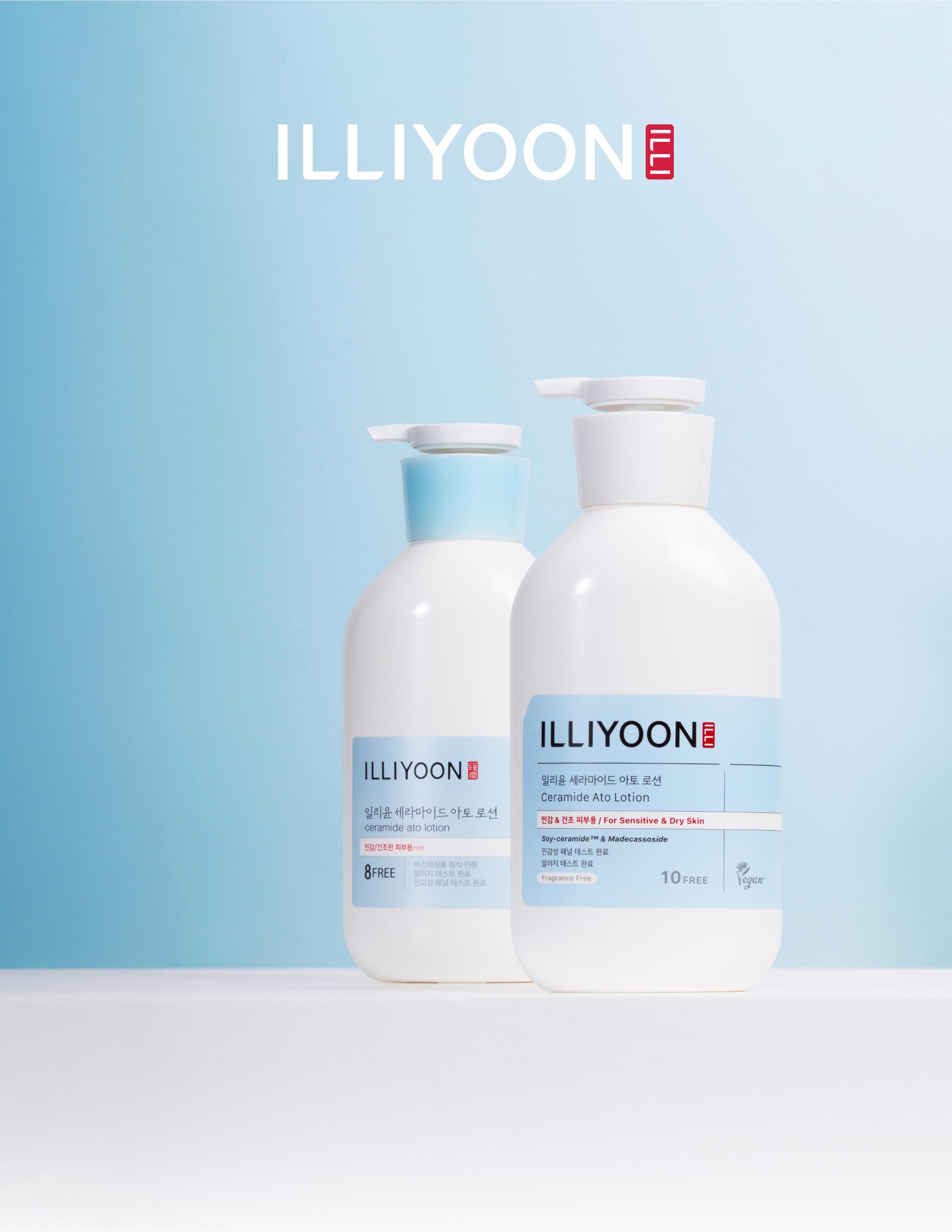
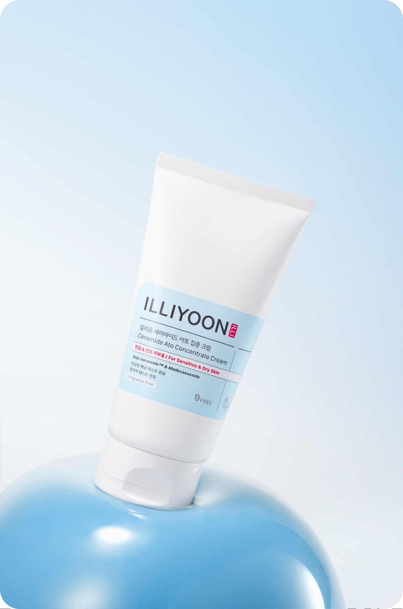
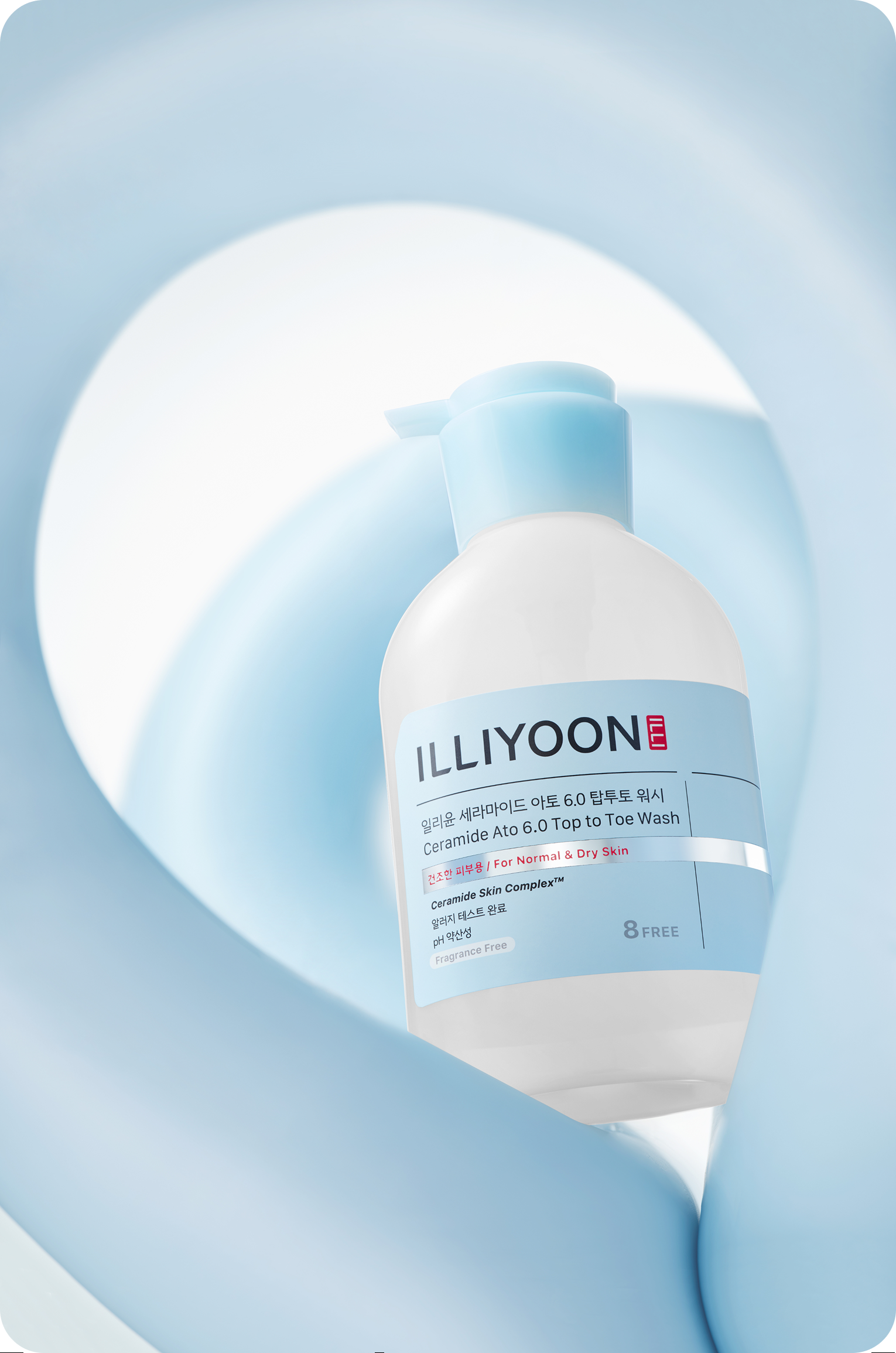
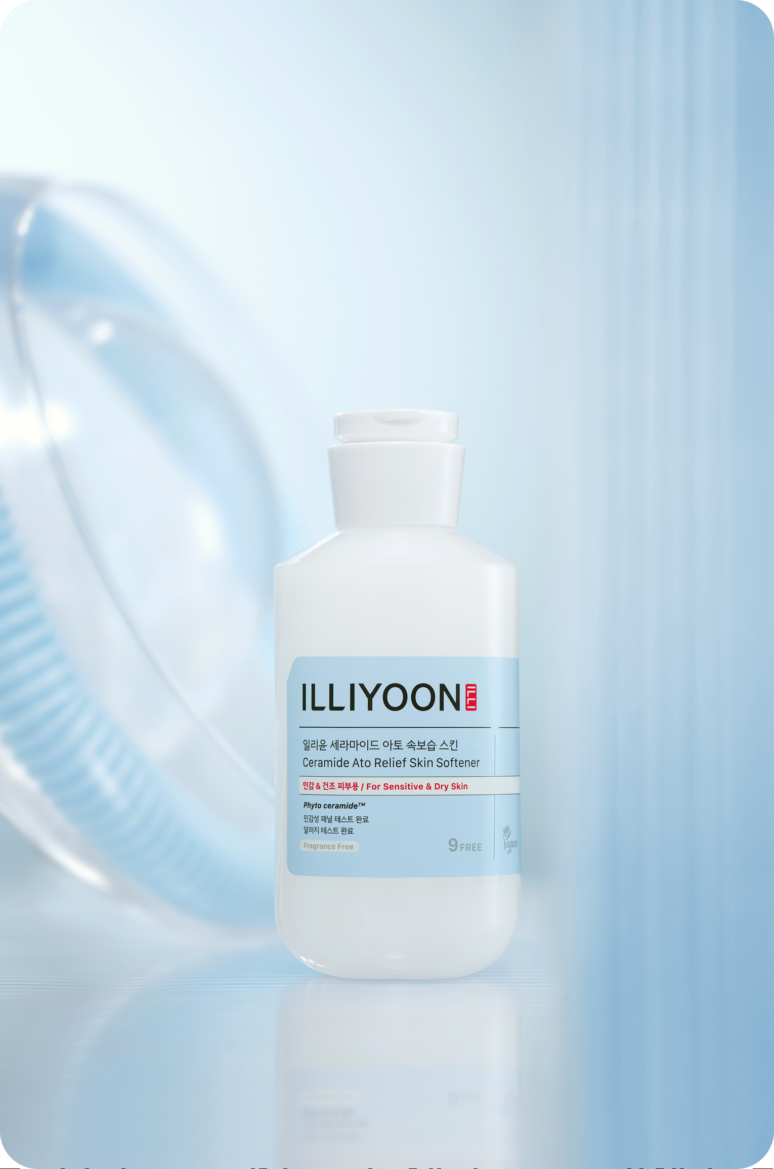
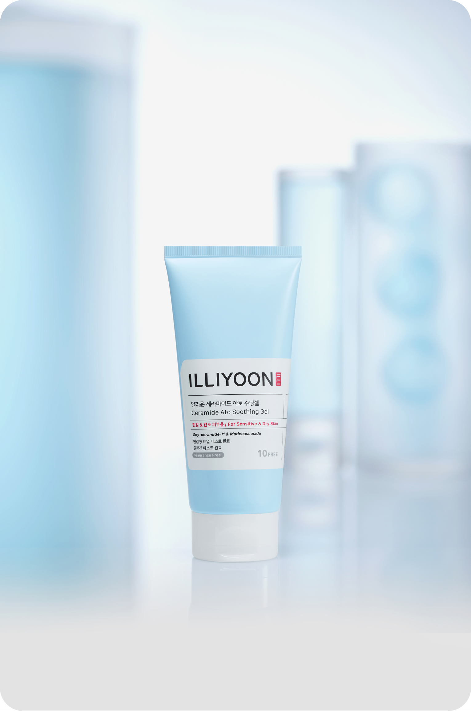
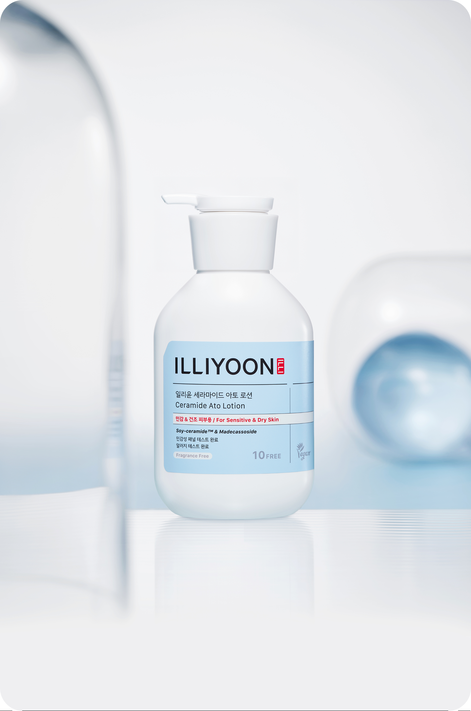
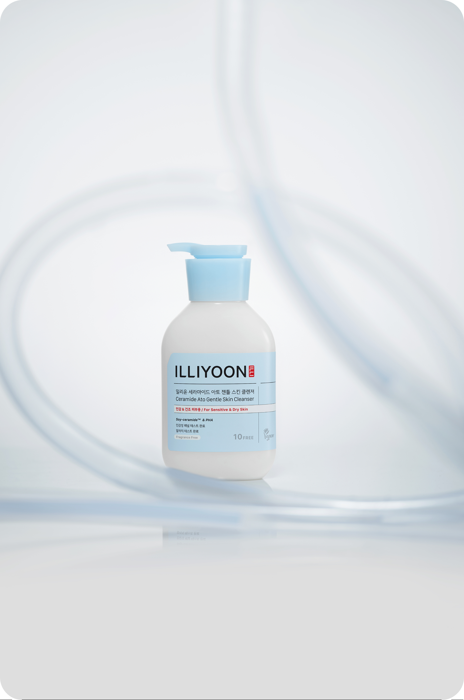
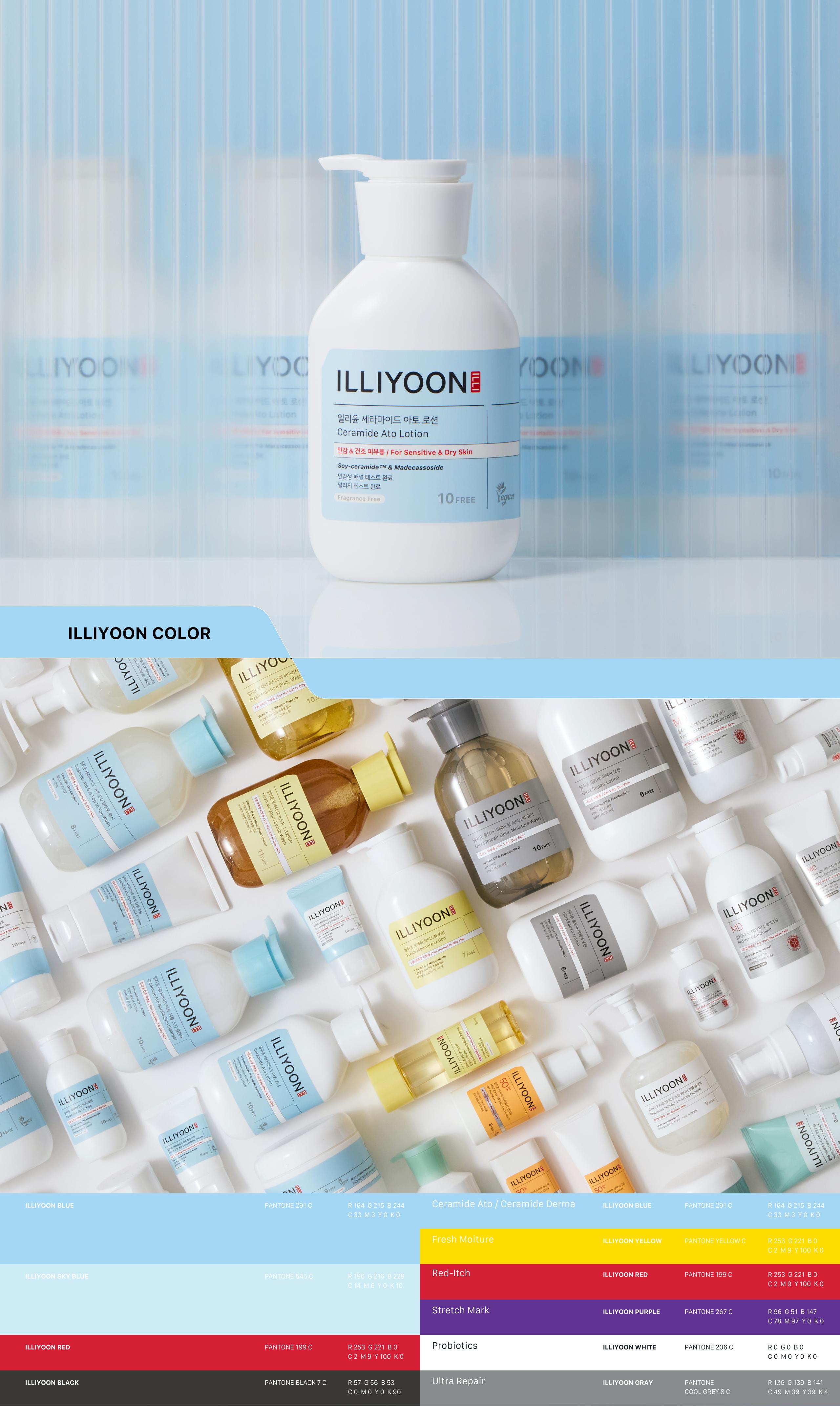
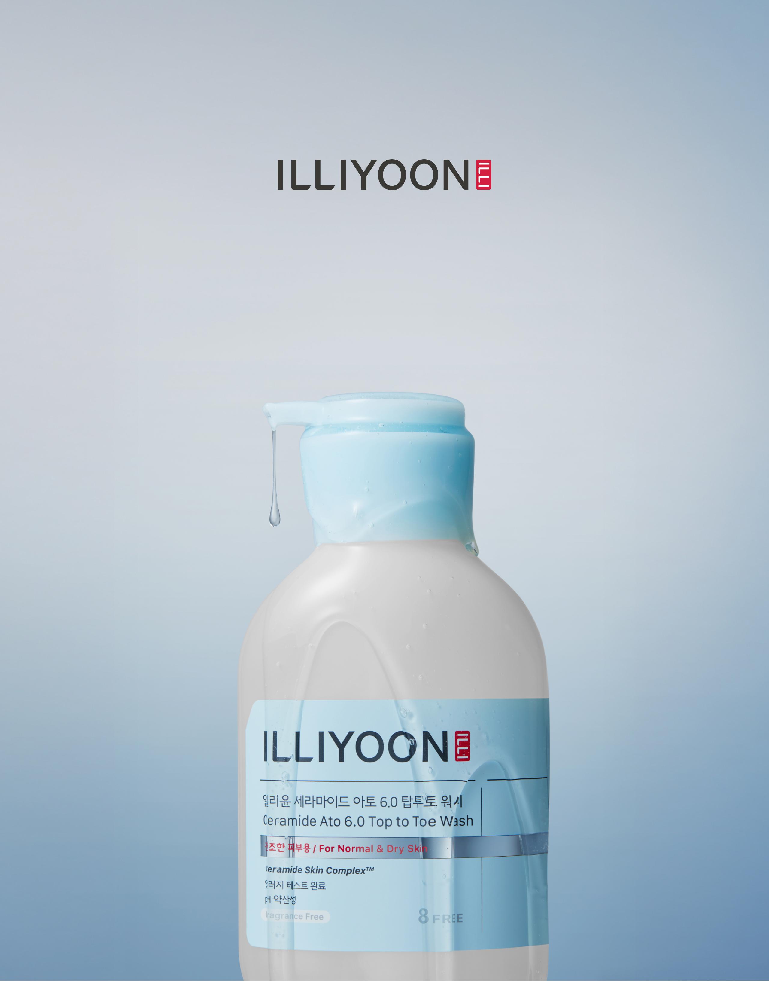
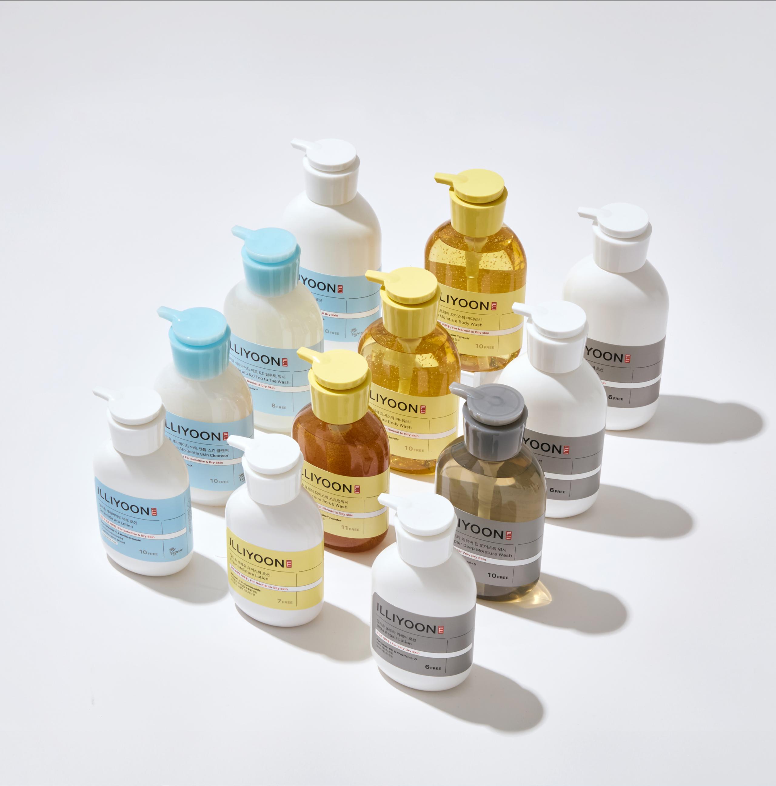
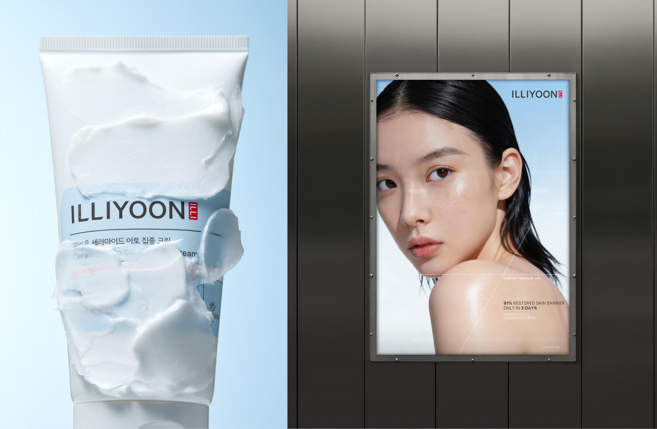
Packaging Design
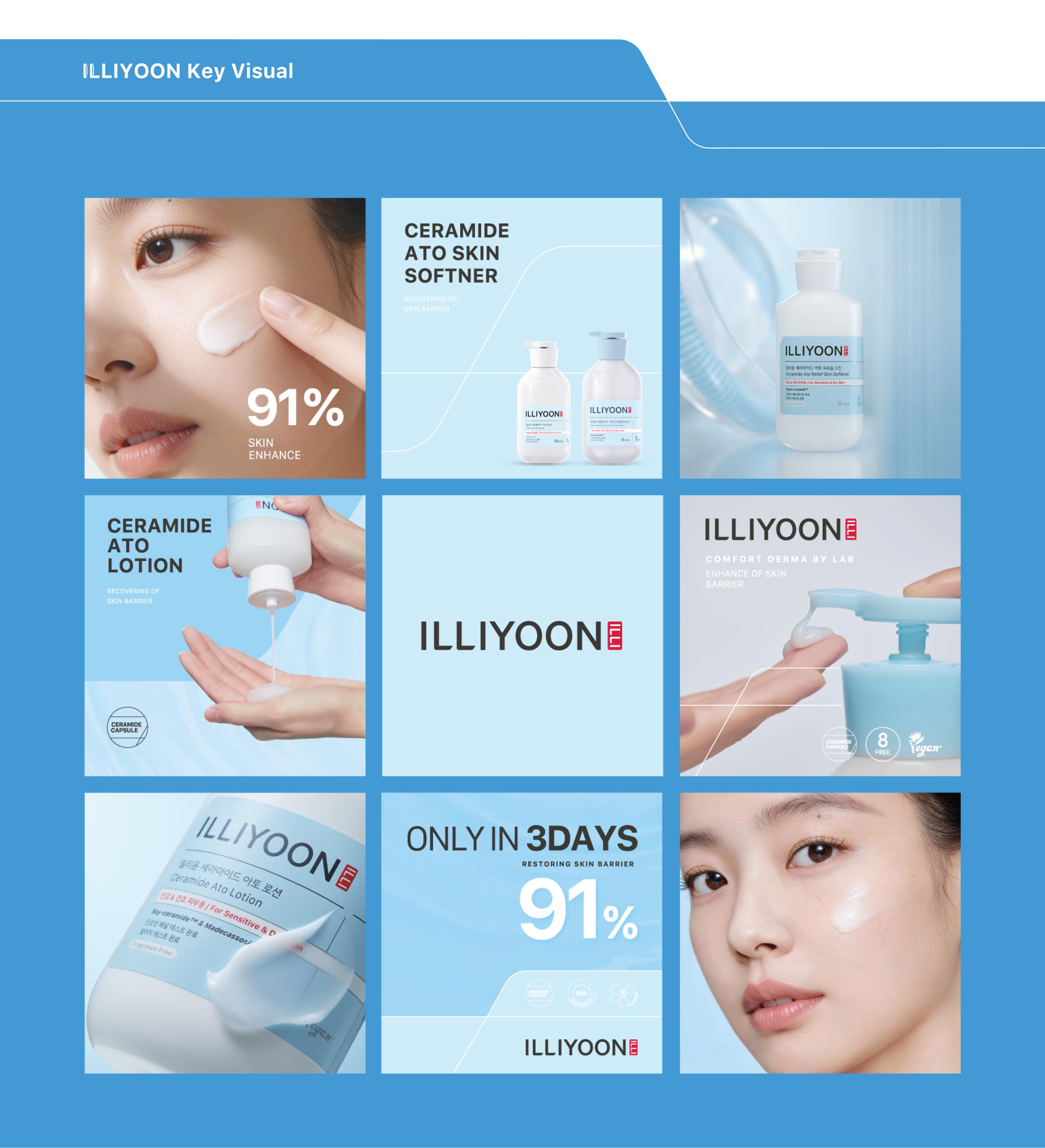
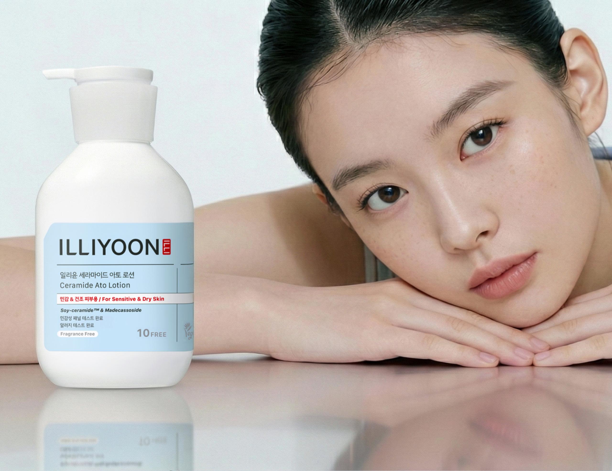
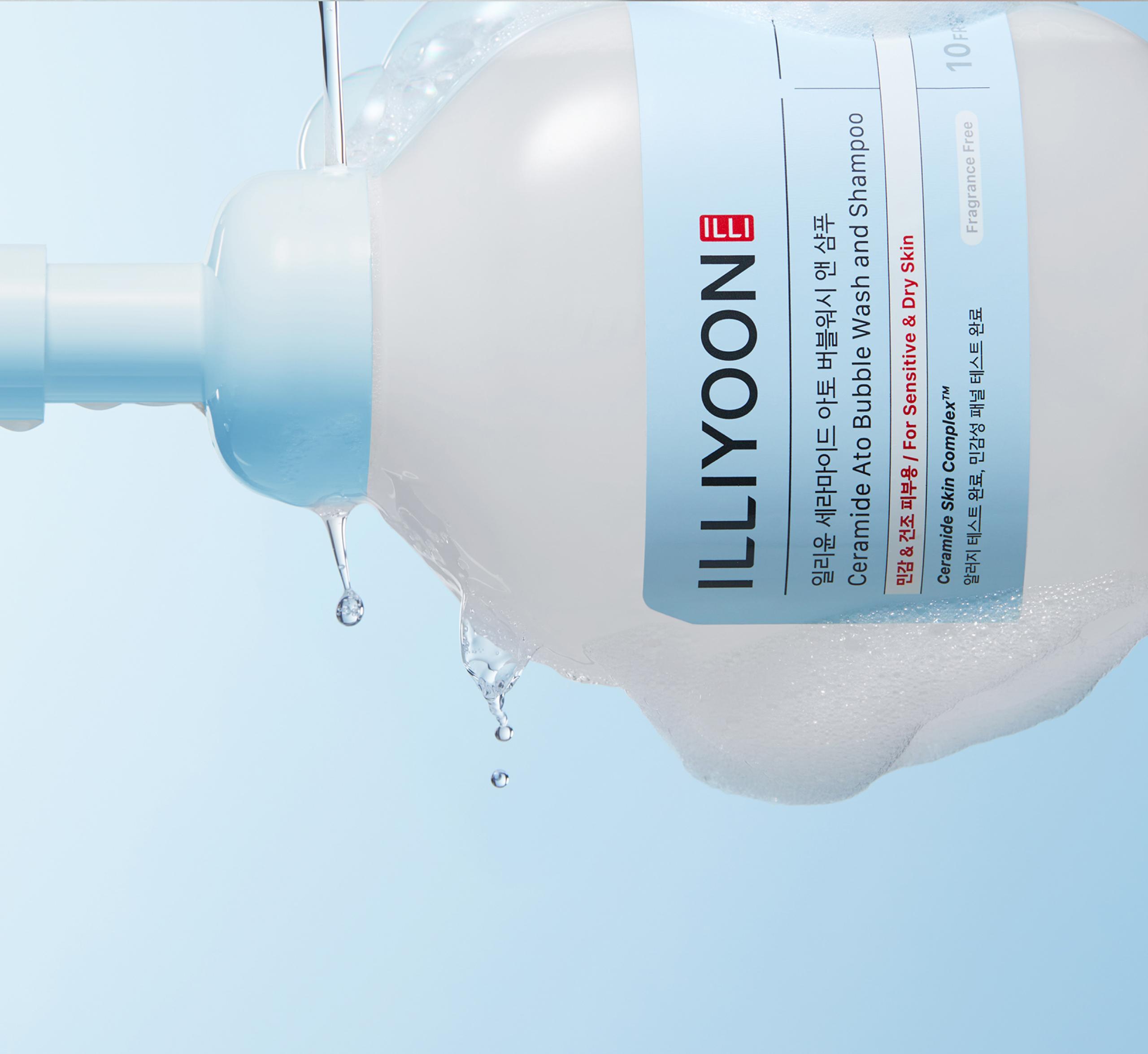
연구소에서 사용하는 차트의 전문적인 무드를 전달하기 위해 라인을 활용하고 보다 정돈된 레이아웃으로 정리했습니다. 좌측 상단의 사선 커팅은 ‘Comfort Derma Lab’ 컨셉을 기반으로 한 인덱스 모티브 조형을 활용했습니다.
연구 논문같은 자료들에서 과학적인 내용을 강조하기 위해 라틴어를 이탤릭체를 사용하듯 라인별로 대표할만한 성분이나 기술명을 이탤릭체를 사용하였습니다. 또한 로고의 크기를 키워 로고의 가독성을 높이고, 라벨의 면적을 키워 로고 위치를 상단으로 이동해서 가시성도 확보했습니다.
To convey the professional mood of laboratory charts, line elements were utilized and the layout was organized in a more structured and refined manner. The diagonal cut at the upper left applies an index-inspired motif based on the “Comfort Derma Lab” concept.
Just as scientific papers use Latin in italics to emphasize technical content, representative ingredients or technologies for each line are also set in italics. In addition, the logo size has been increased to improve readability, and the label area has been expanded with the logo repositioned toward the top to enhance overall visibility.


일부 사진은 아모레퍼시픽으로부터 제공받았습니다.
ohSeven
- Executive director 배수규
- Project Manager 박윤제
- Lead Designer 구송이, 연보연
- Designer 김진주, 이자희, 김채린
- 3D/ Motion Designer 김채연
- Archiving 윤성웅