DR.DIFFERENT
2026
- 브랜드 아이덴티티
- 로고 디자인
- 포장 디자인
- 브랜드 무드 제안
Project Overview
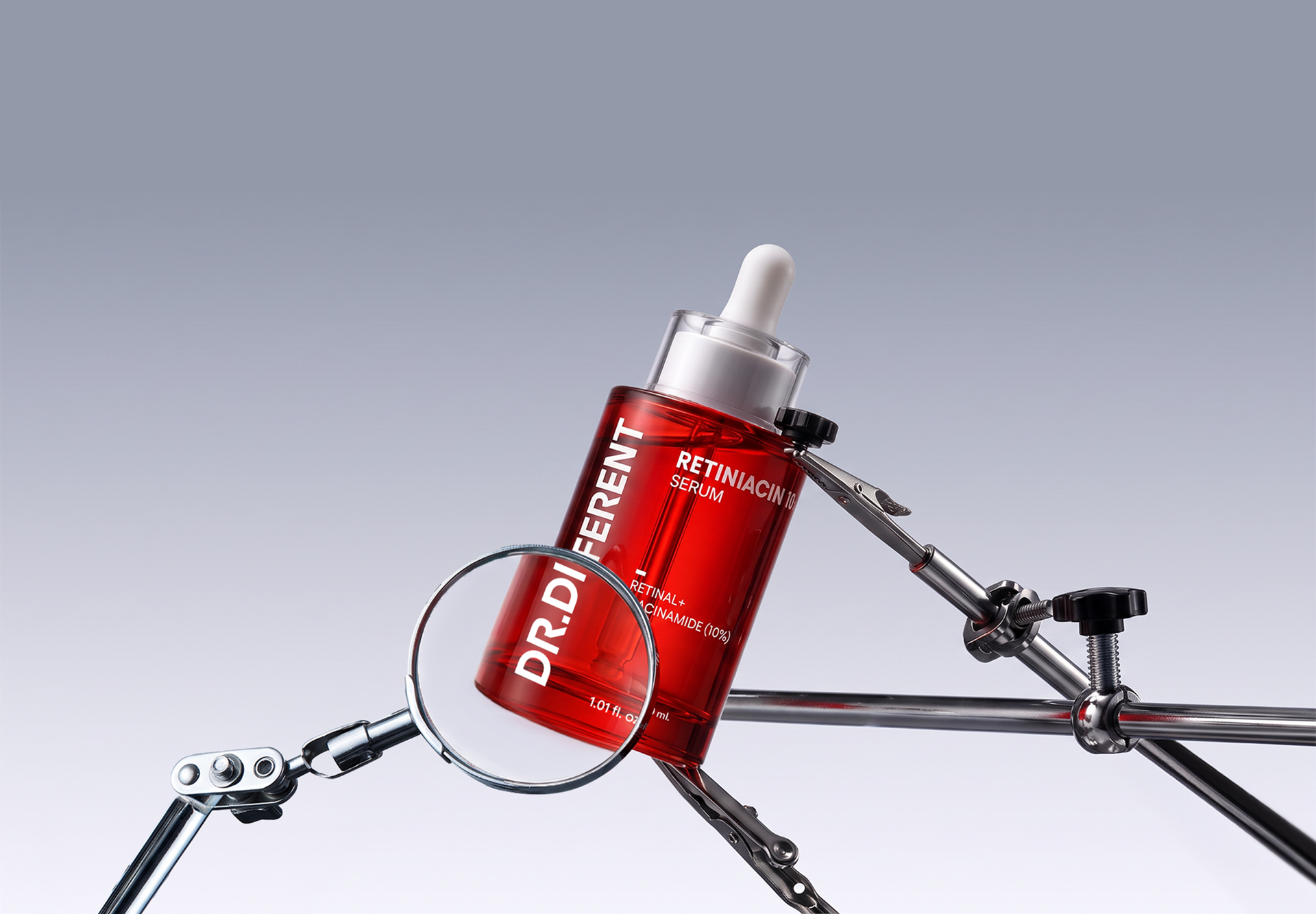
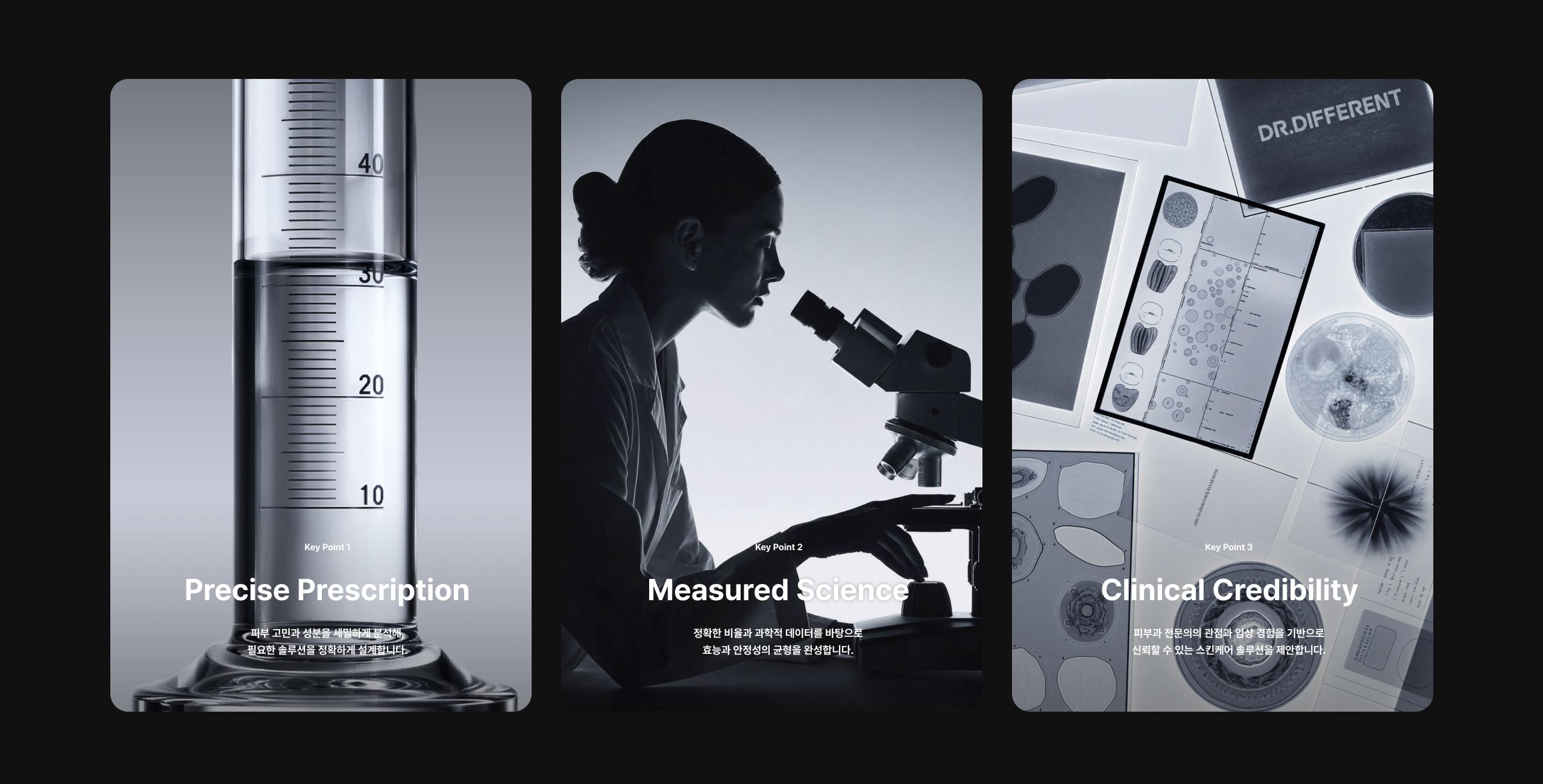
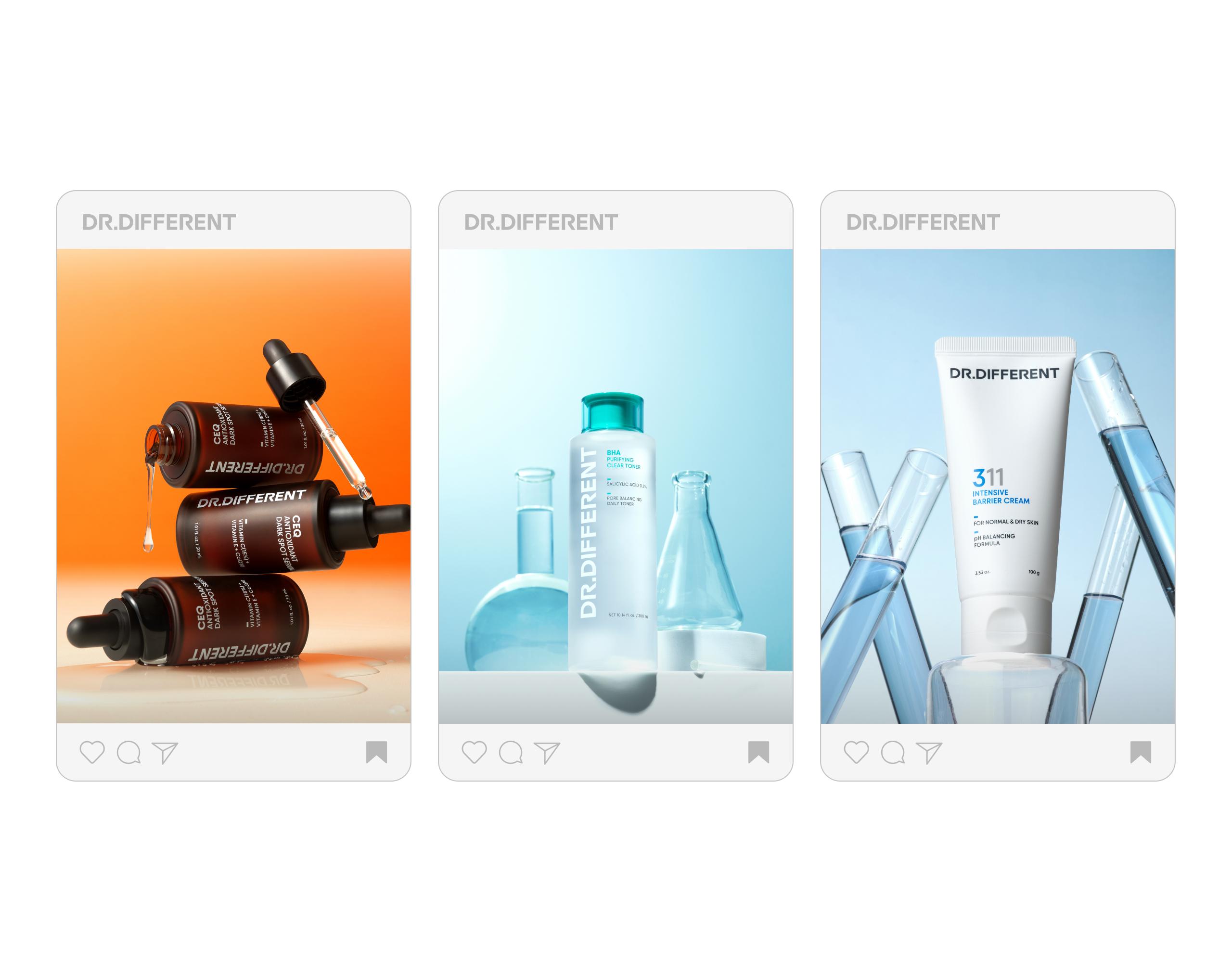
DR.DIFFERENT is a high-performance skincare brand built on skin science, clinical experience, and scientific data. By addressing the root of skin concerns, the brand delivers carefully formulated solutions that balance efficacy and stability.
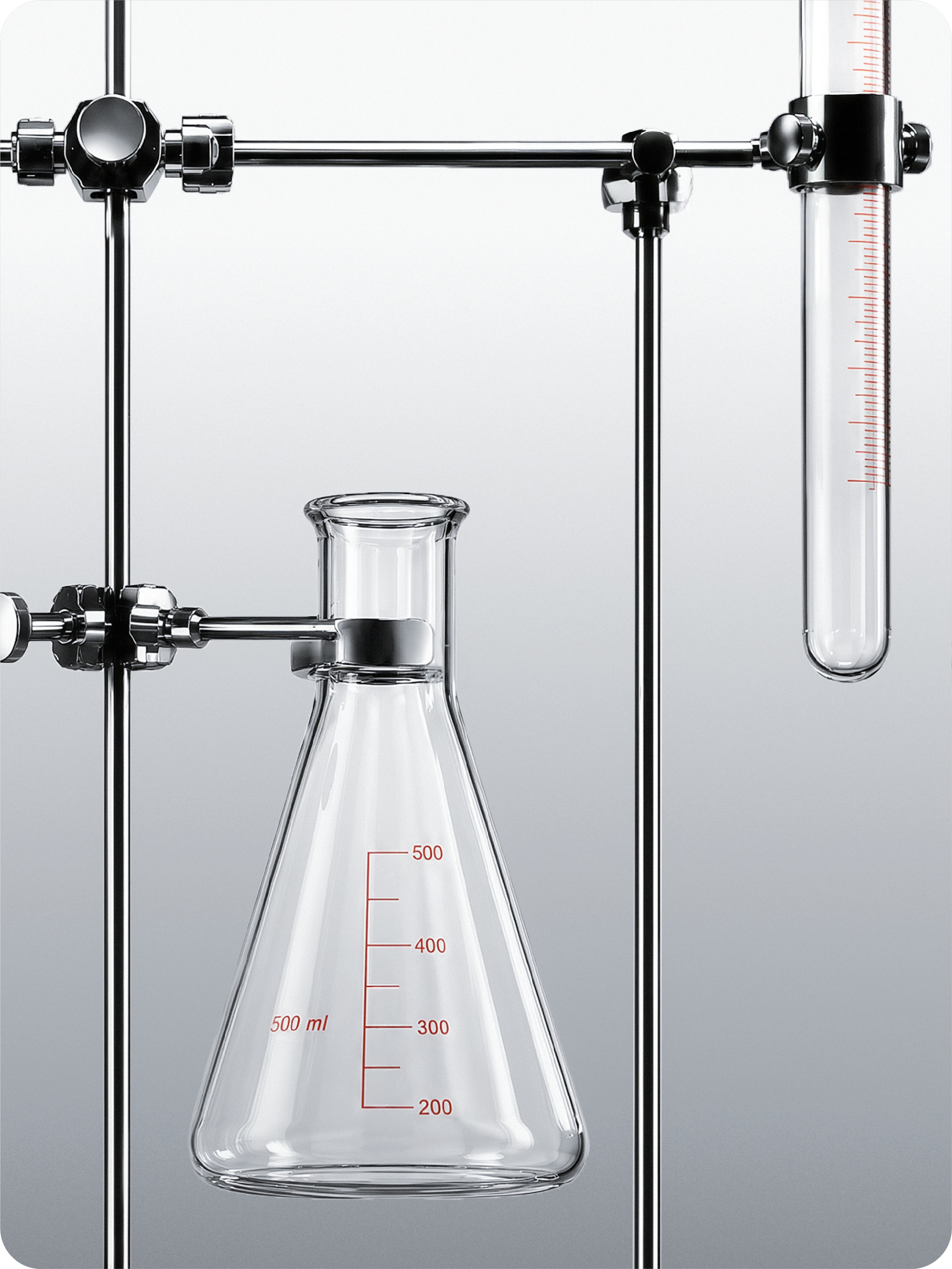
Its philosophy of precise prescription and accurate proportion is translated into a visual language inspired by laboratory scales and flask forms, clearly expressing the brand’s professionalism and credibility.
닥터디퍼런트는 피부과학과 임상 경험, 과학적 데이터를 바탕으로 설계된 고효능 스킨케어 브랜드입니다. 피부 고민의 근본 원인을 바라보고, 효능과 안정성의 균형을 갖춘 솔루션을 정교하게 제안합니다.
정밀한 처방과 정확한 비율이라는 브랜드 철학은 실험도구의 눈금과 플라스크에서 영감을 받은 시각 언어로 확장되며, 닥터디퍼런트만의 전문성과 신뢰감을 명확하게 전달합니다.
Brand Logo
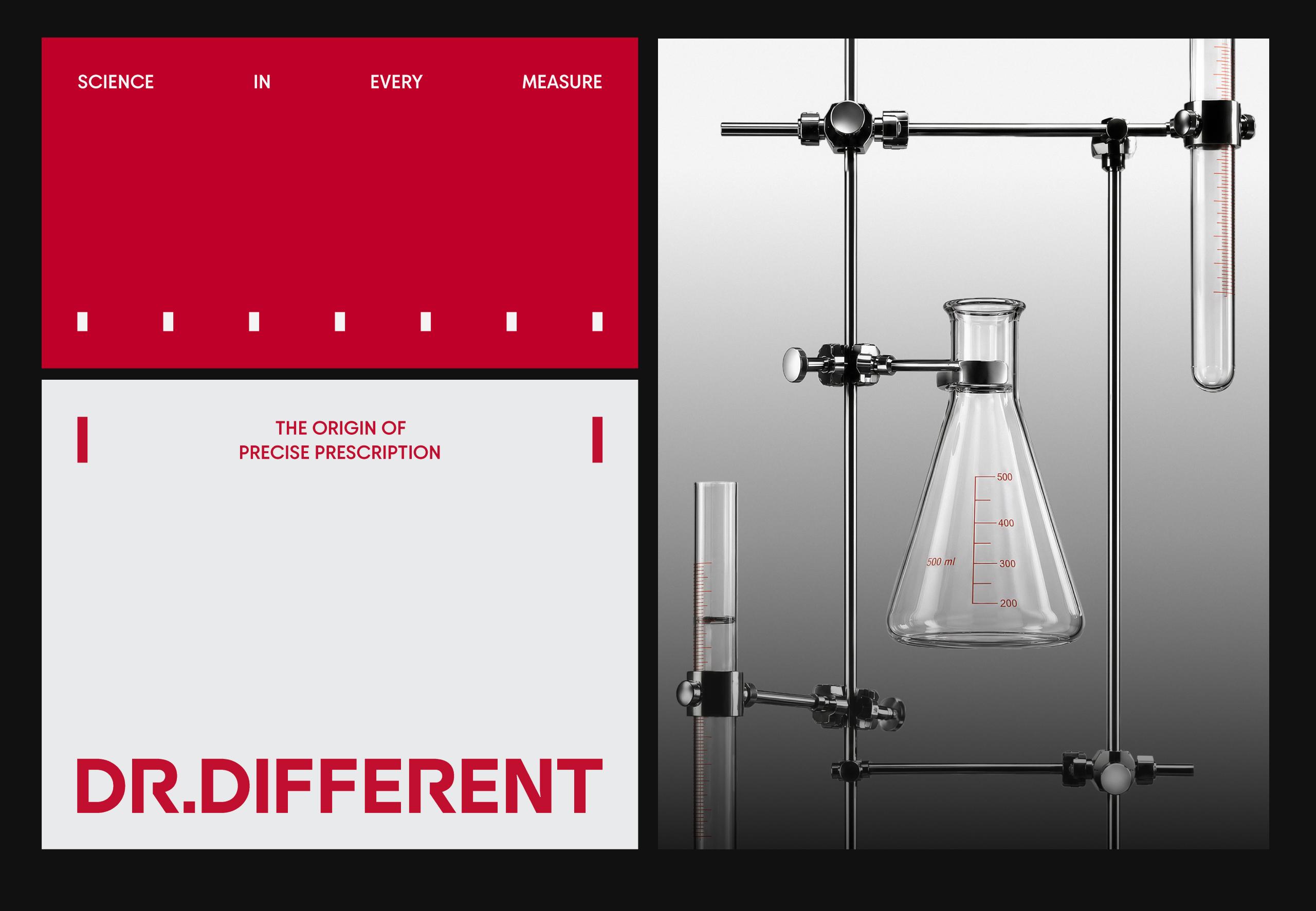
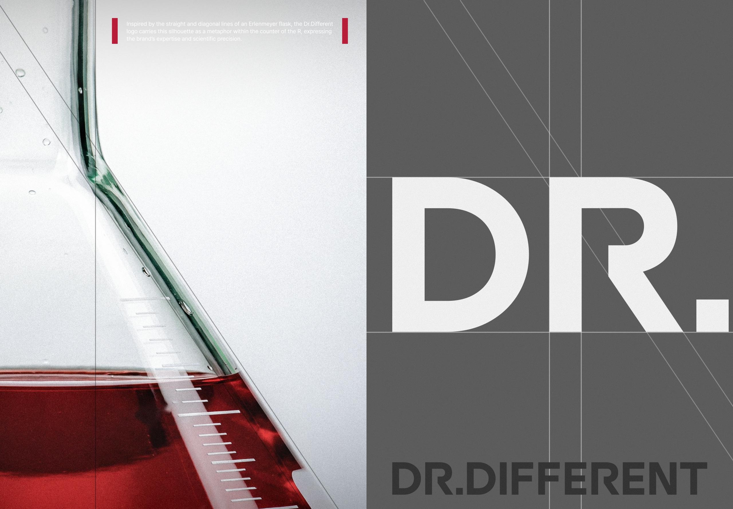
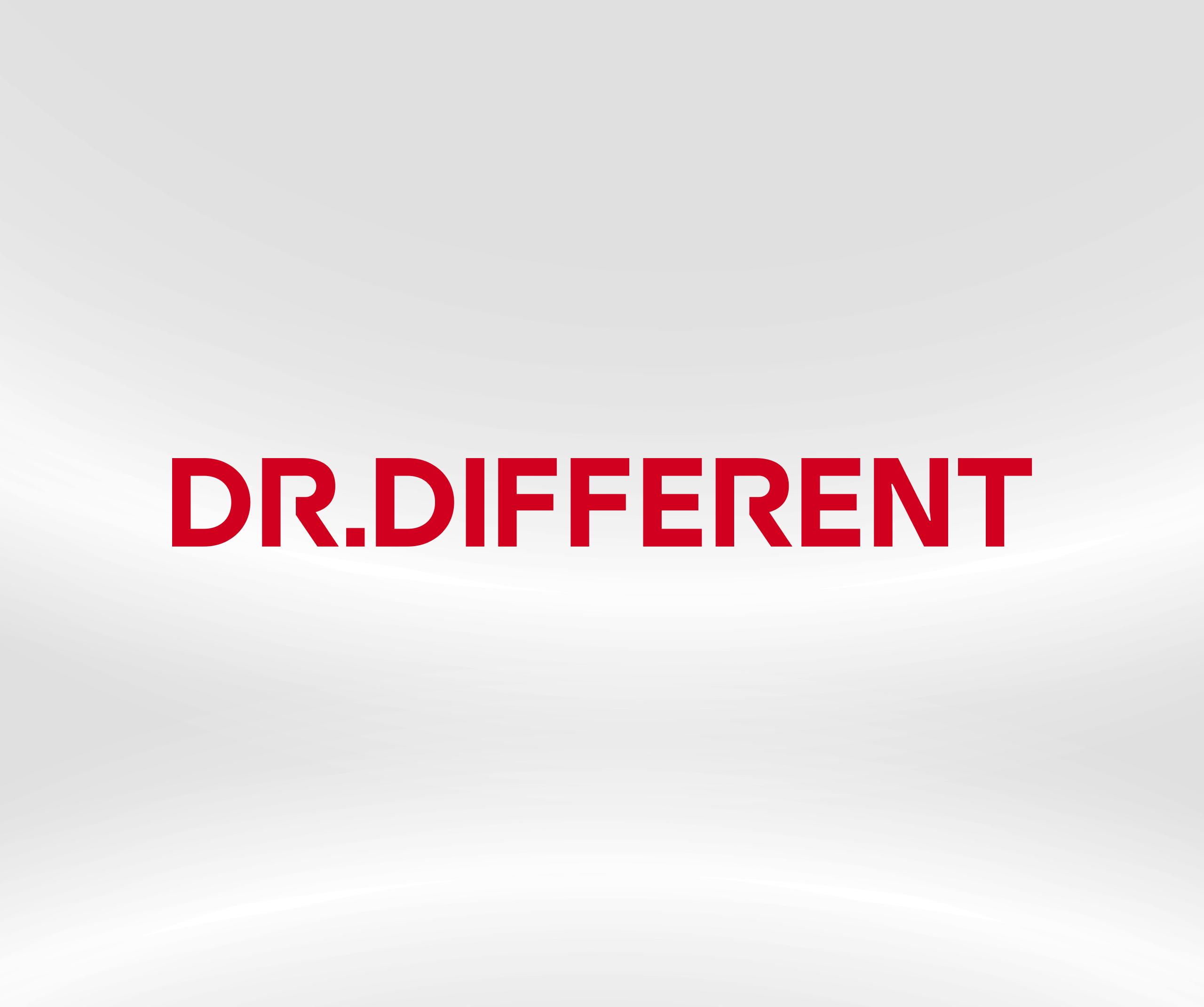
The DR.DIFFERENT wordmark features a bold sans-serif typeface that conveys clinical credibility and expertise, while its restrained forms and balanced proportions create a precise, contemporary impression.
The inner curve of the “R” evokes a beaker’s opening, symbolizing a scientific approach rooted in experimentation and measurement. Together, these elements express the brand’s commitment to creating meaningful difference through research and expertise.
DR.DIFFERENT의 워드마크는 볼드하고 견고한 산세리프 서체를 사용해 임상 기반의 전문성을 명확하게 전달합니다. 절제된 형태와 균형 잡힌 비례는 정밀하면서도 현대적인 인상을 완성합니다.
알파벳 ‘R’의 내부 곡선은 비커 입구의 실루엣을 형상화한 것으로, 실험과 측정에 기반한 과학적 접근 방식을 상징합니다. 이를 통해 연구와 전문성을 바탕으로 의미 있는 차이를 만들어가는 DR.DIFFERENT만의 브랜드 철학을 담았습니다.
Key Visual & Color System
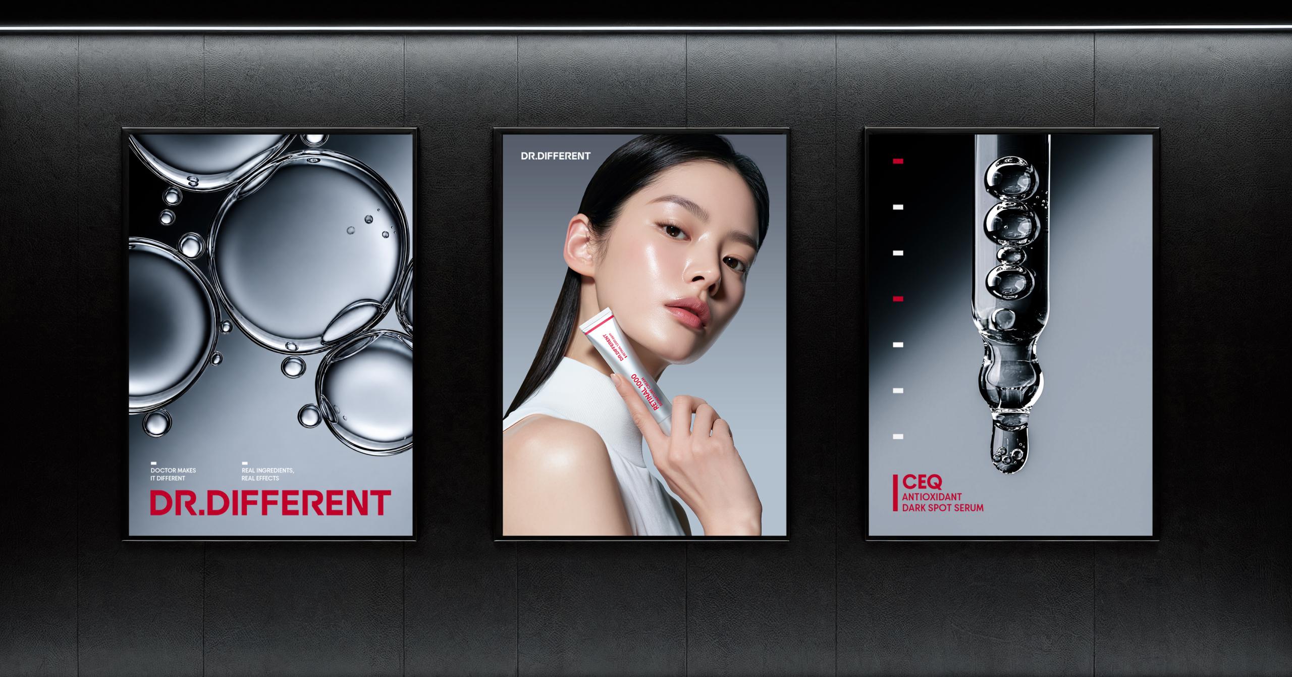
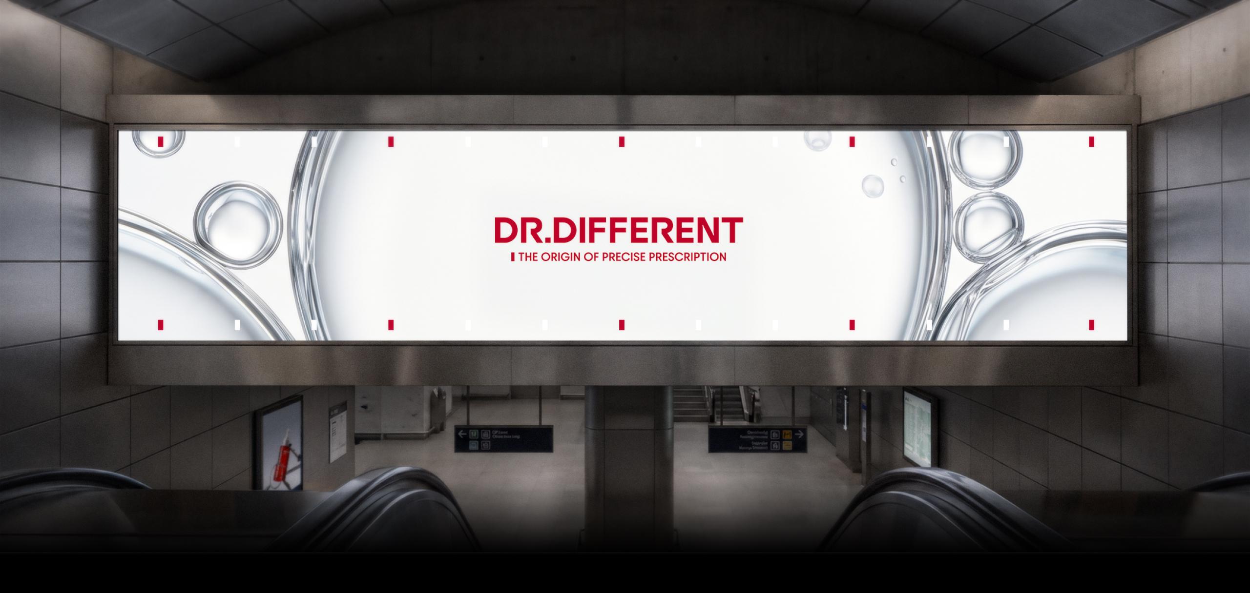
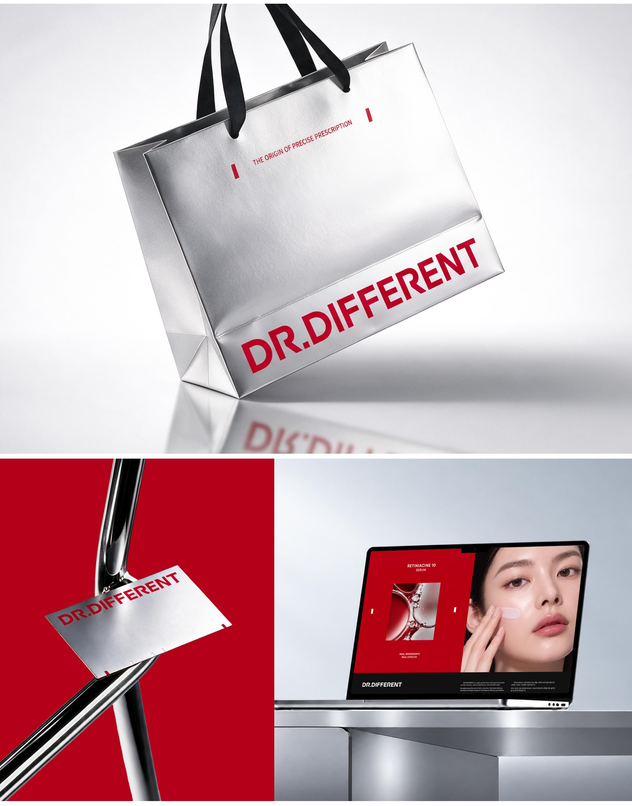
Inspired by laboratory scales, the key visual system expresses the brand’s core value of “accurate proportion.” Its flexible graphics combine with text to emphasize and organize information across media.
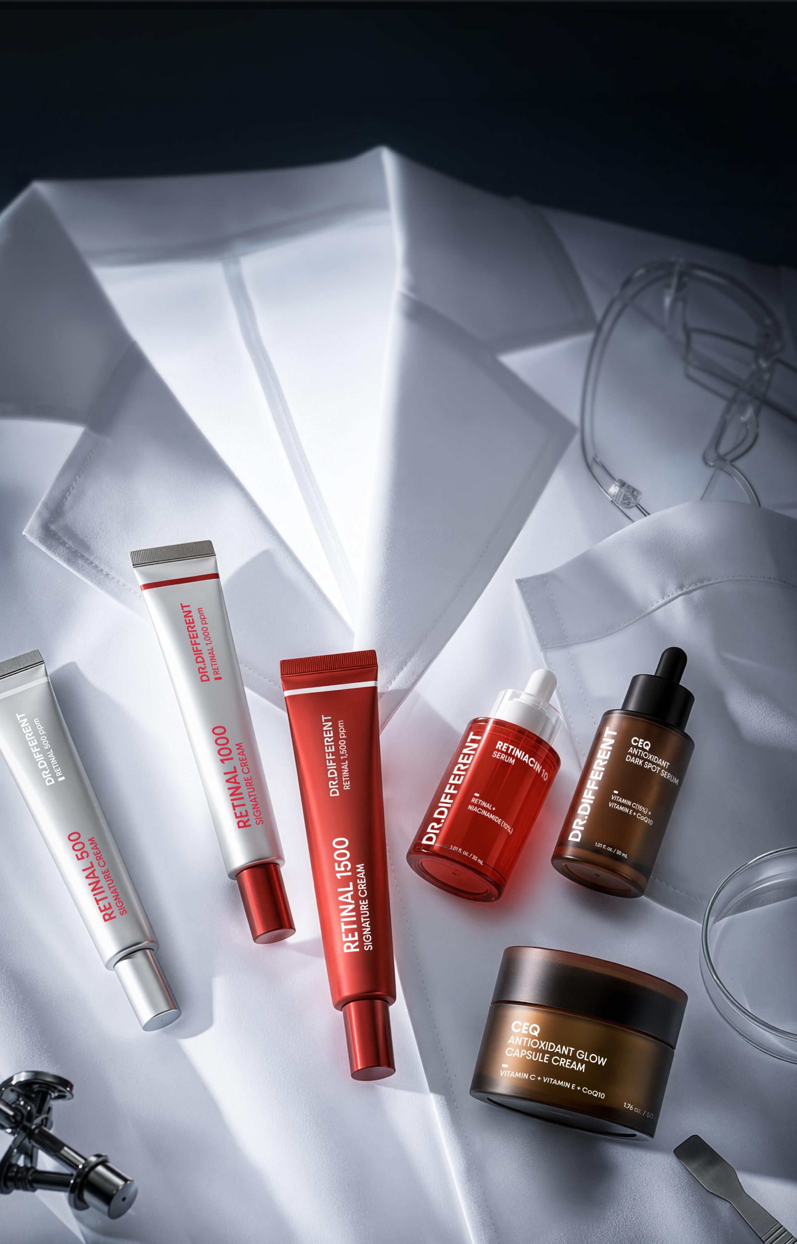
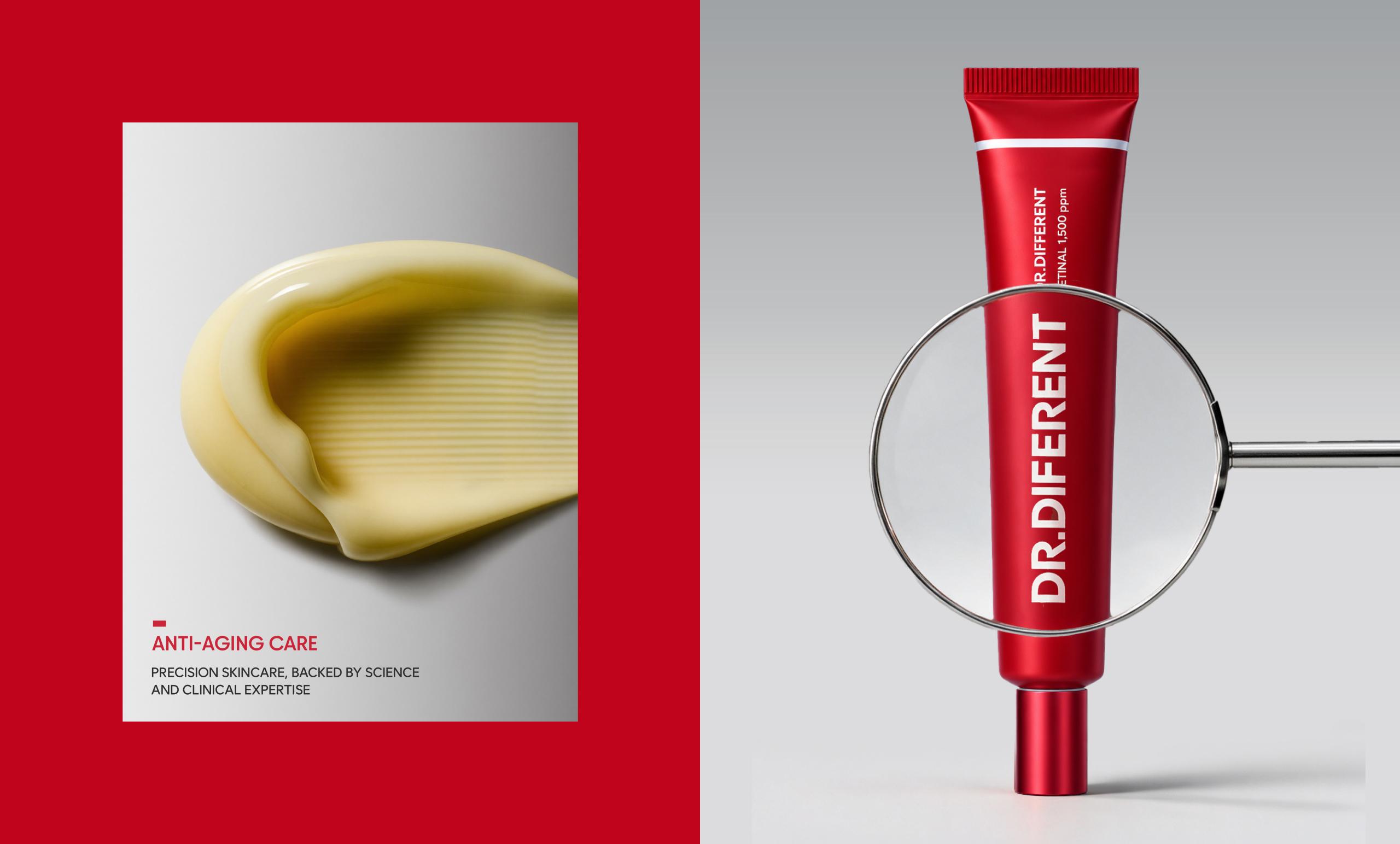
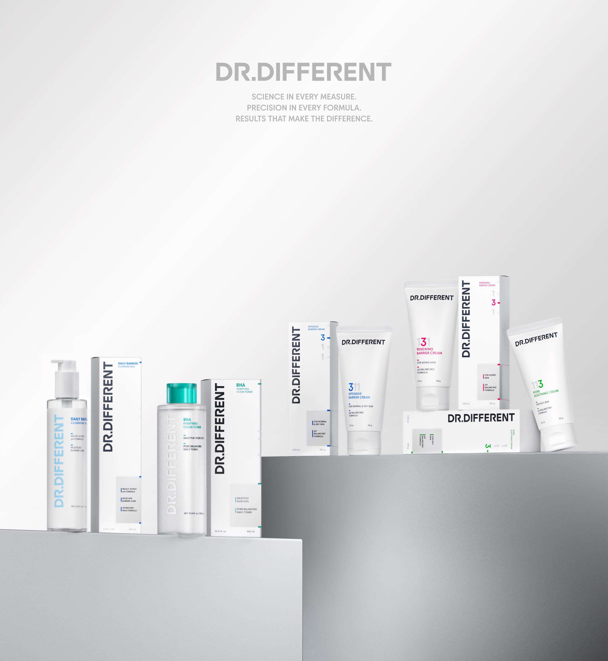
The brand color palette is built around “Lab Red” for a distinctive identity and “Lab Silver” for clinical expertise. Product-line colors reflect key ingredients and benefits, maintaining consistency while differentiating each line.
키비주얼 시스템은 실험도구의 눈금에서 영감을 받아 브랜드의 핵심 가치인 ‘정확한 비율’을 시각화했습니다. 눈금 그래픽은 콘텐츠와 매체의 특성에 맞춰 텍스트와 유연하게 결합하며, 주요 정보를 강조하고 구분합니다.
브랜드 컬러는 선명한 정체성을 나타내는 ‘Lab Red’와 임상적 전문성을 상징하는 ‘Lab Silver’를 중심으로 구성했습니다. 제품별 성분과 효능에 맞는 라인 컬러를 더해 통일된 체계 안에서 각 제품의 특징을 명확하게 전달합니다.

Packaging Design
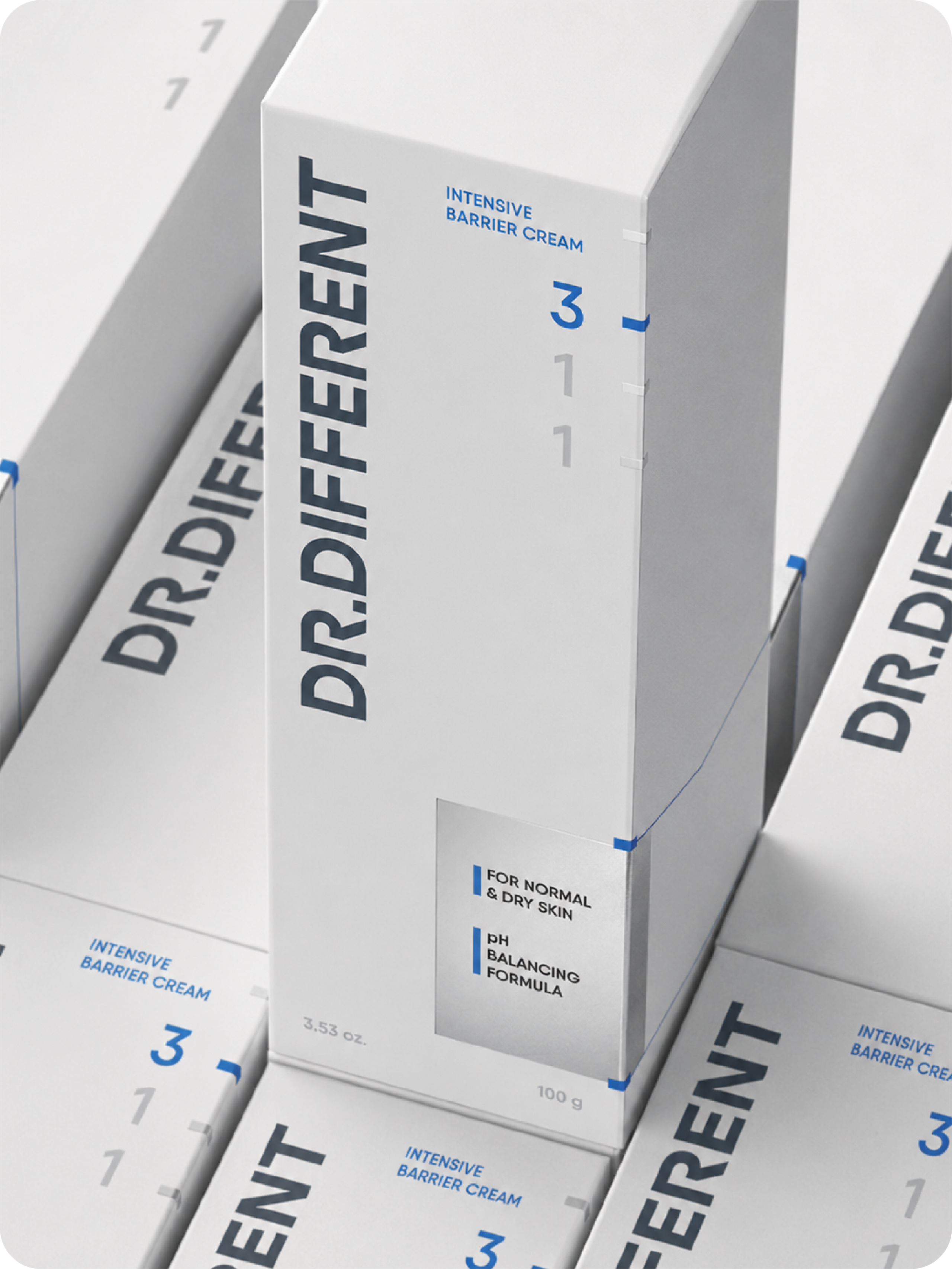
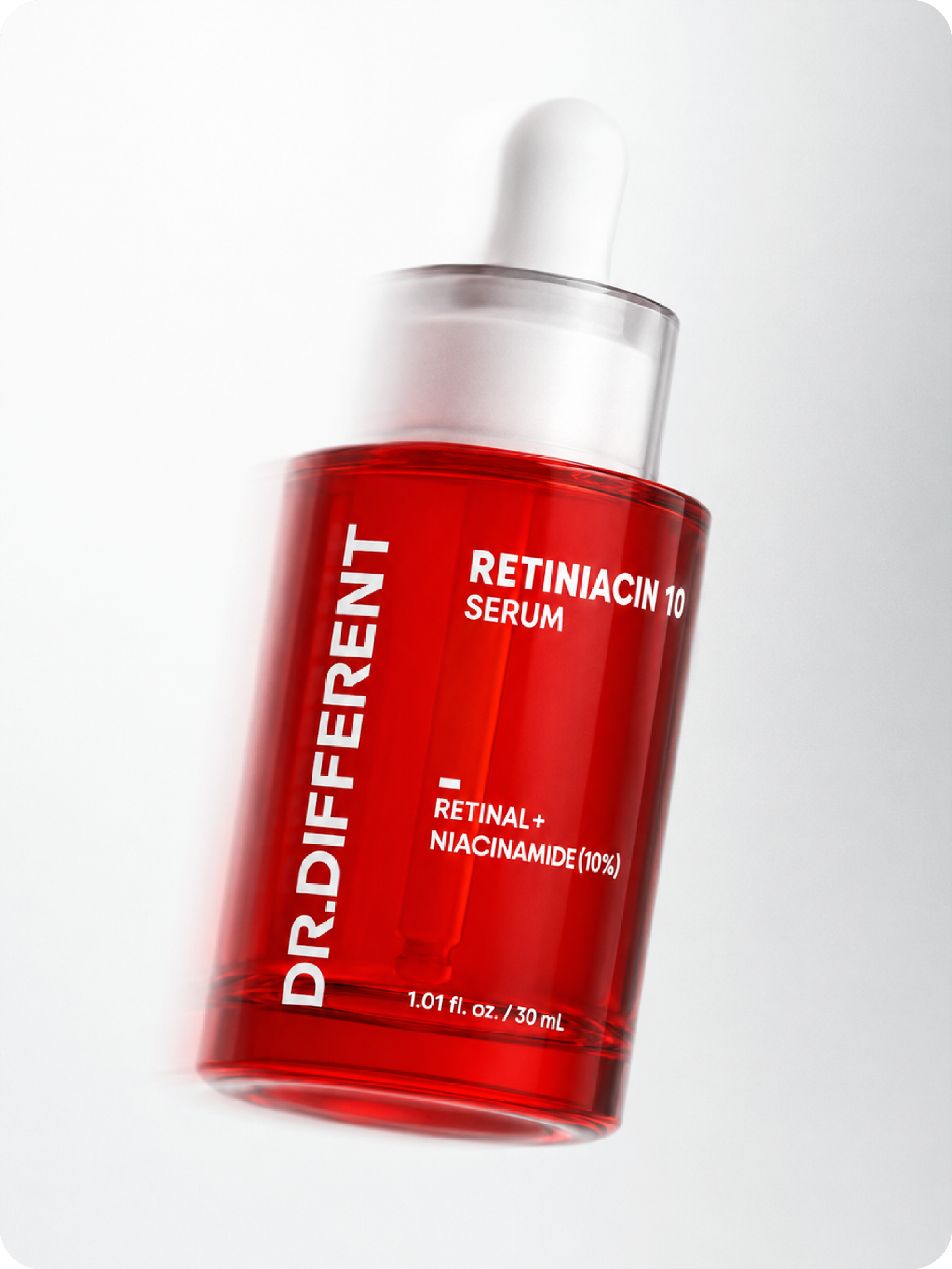
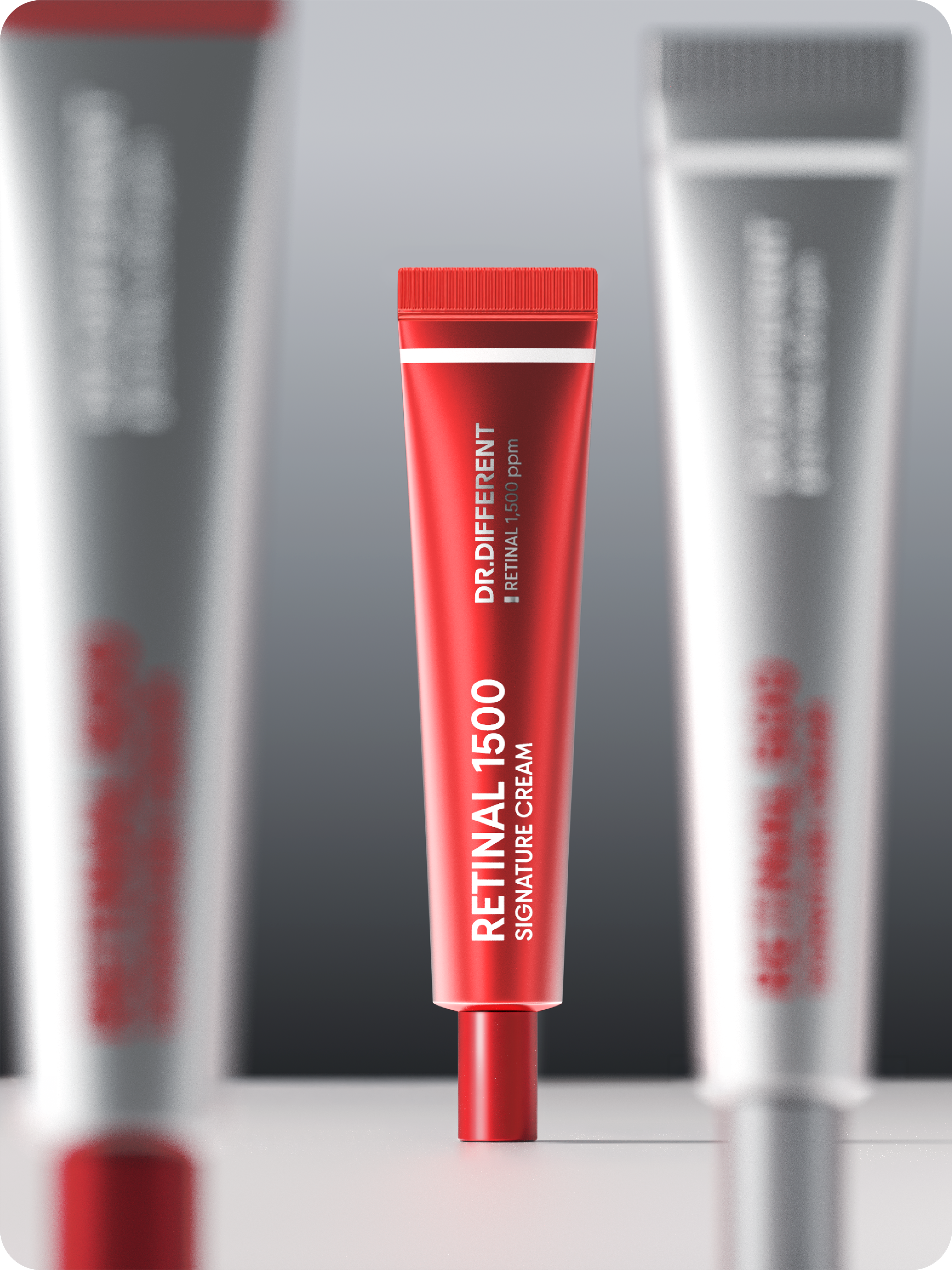
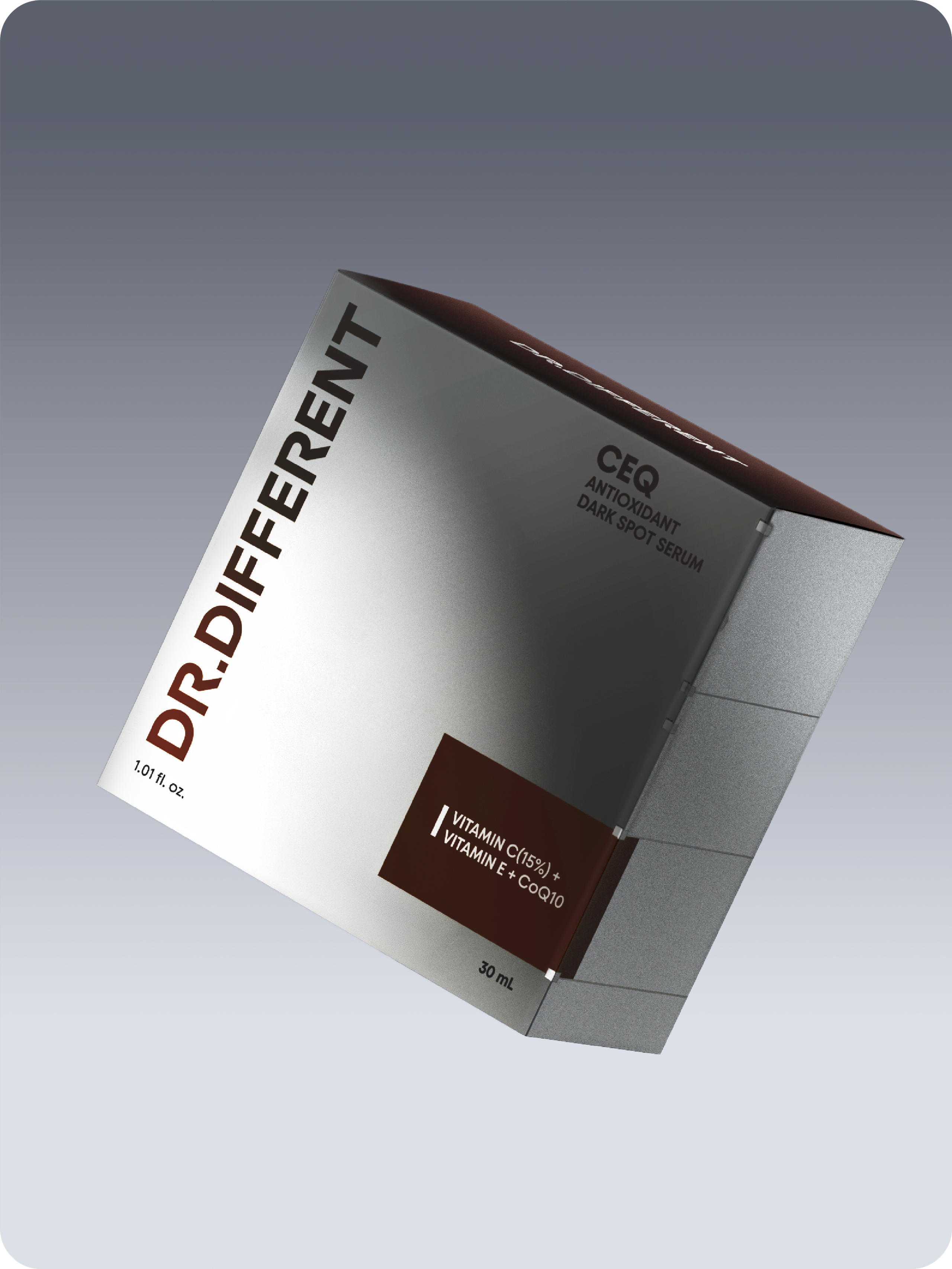
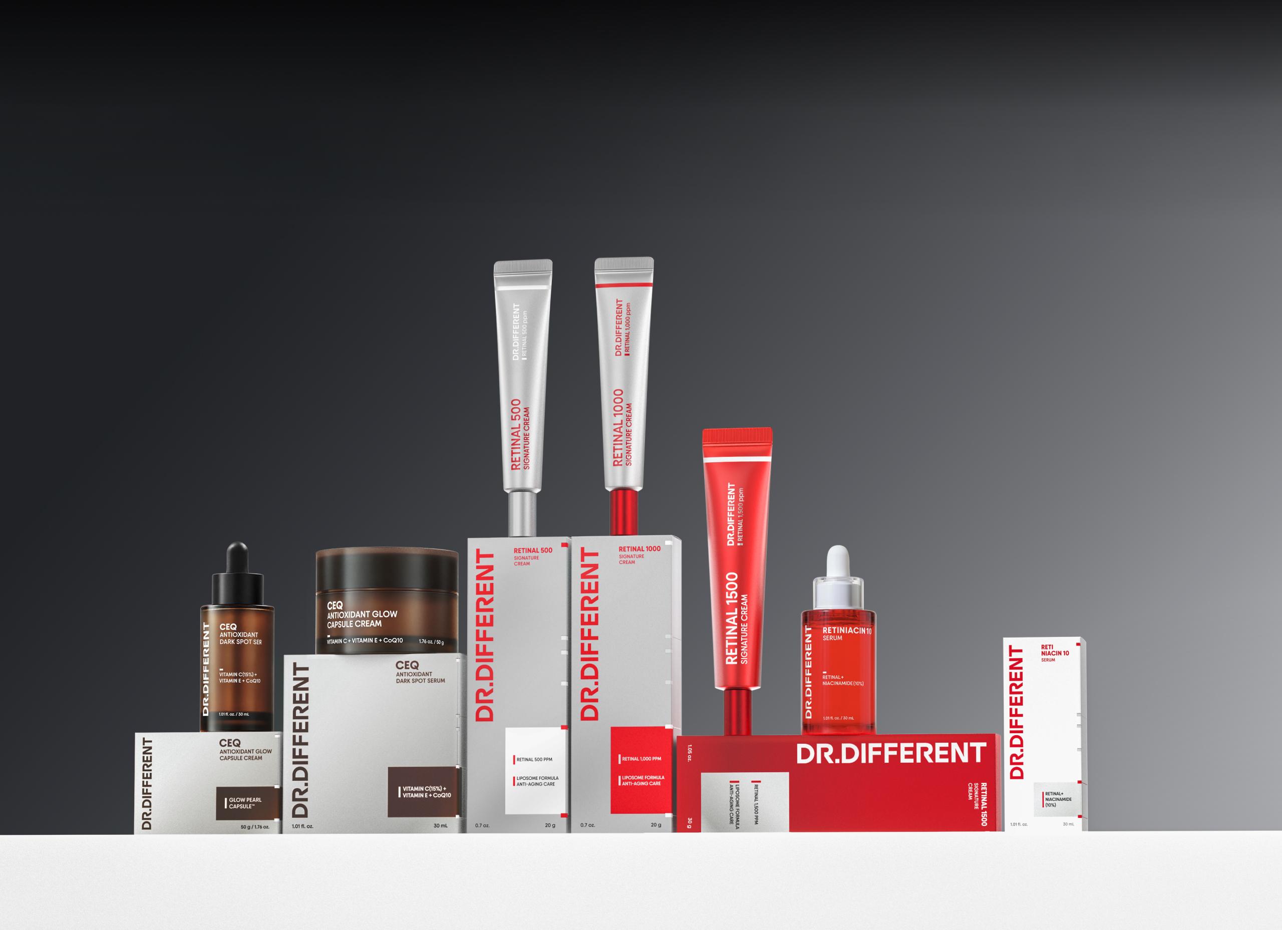
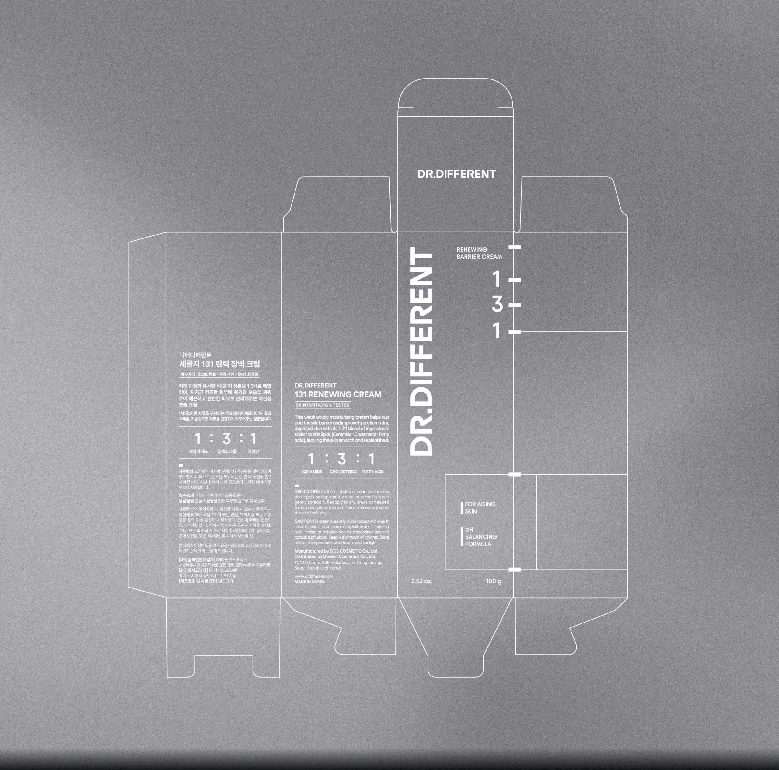
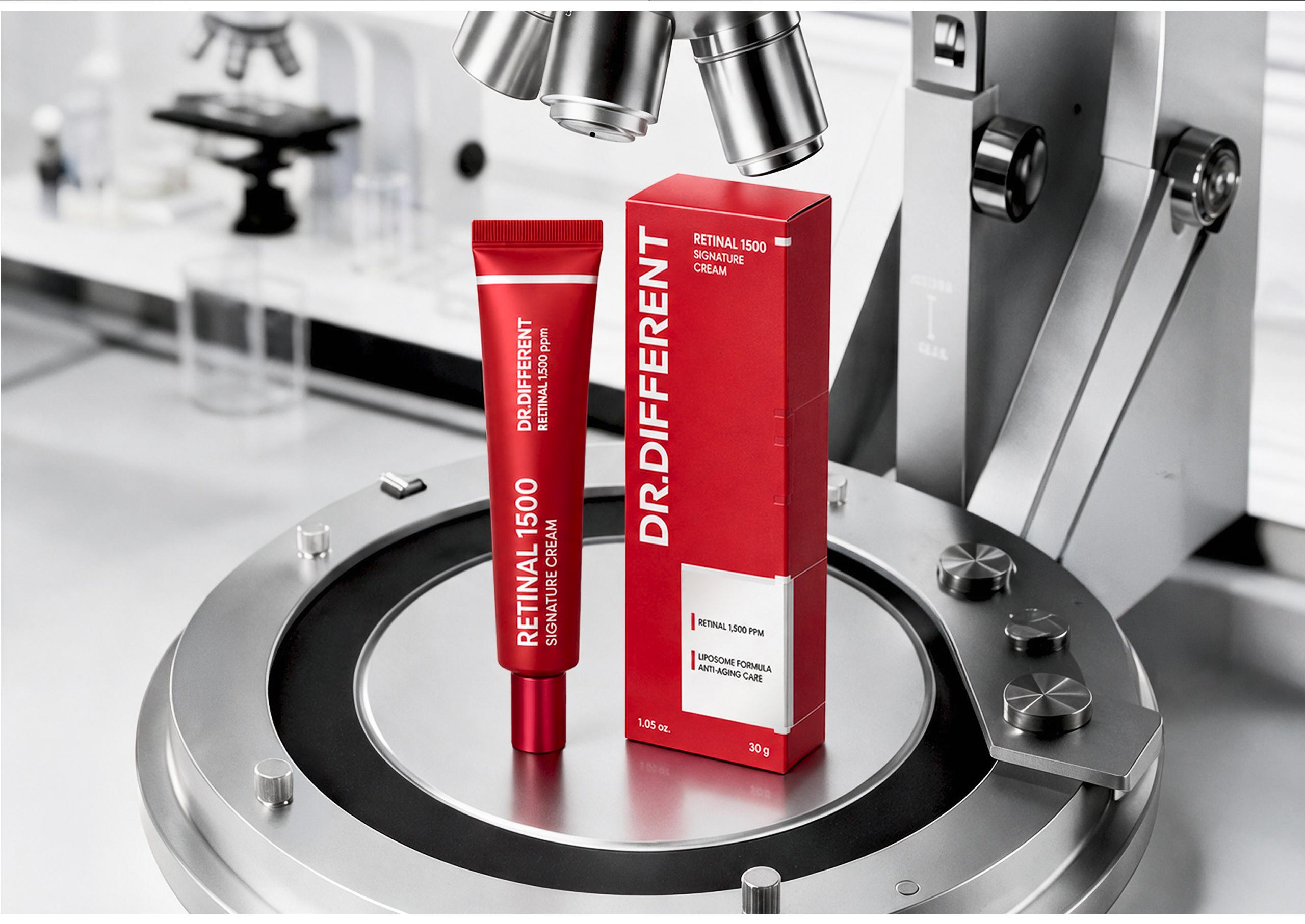
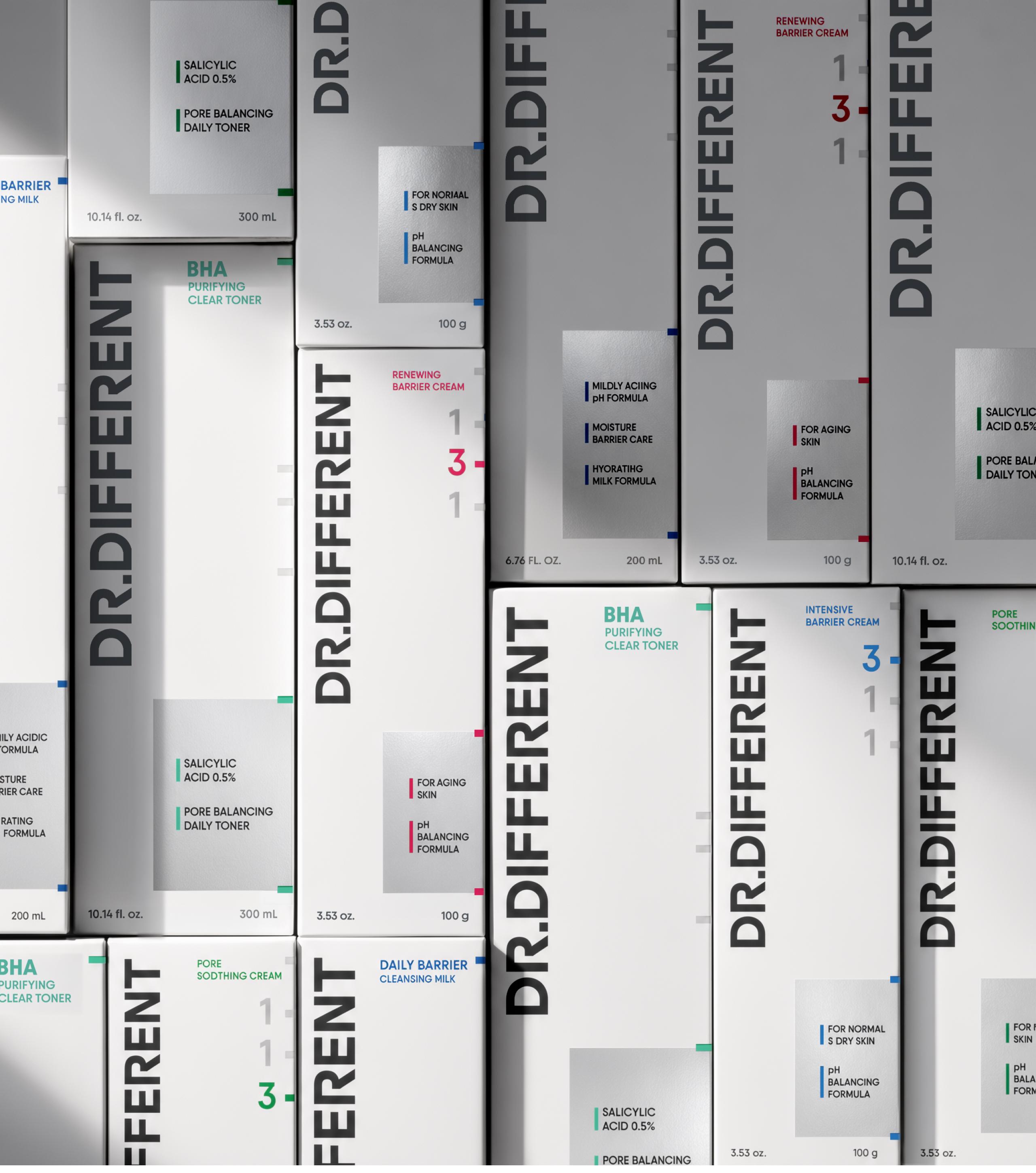
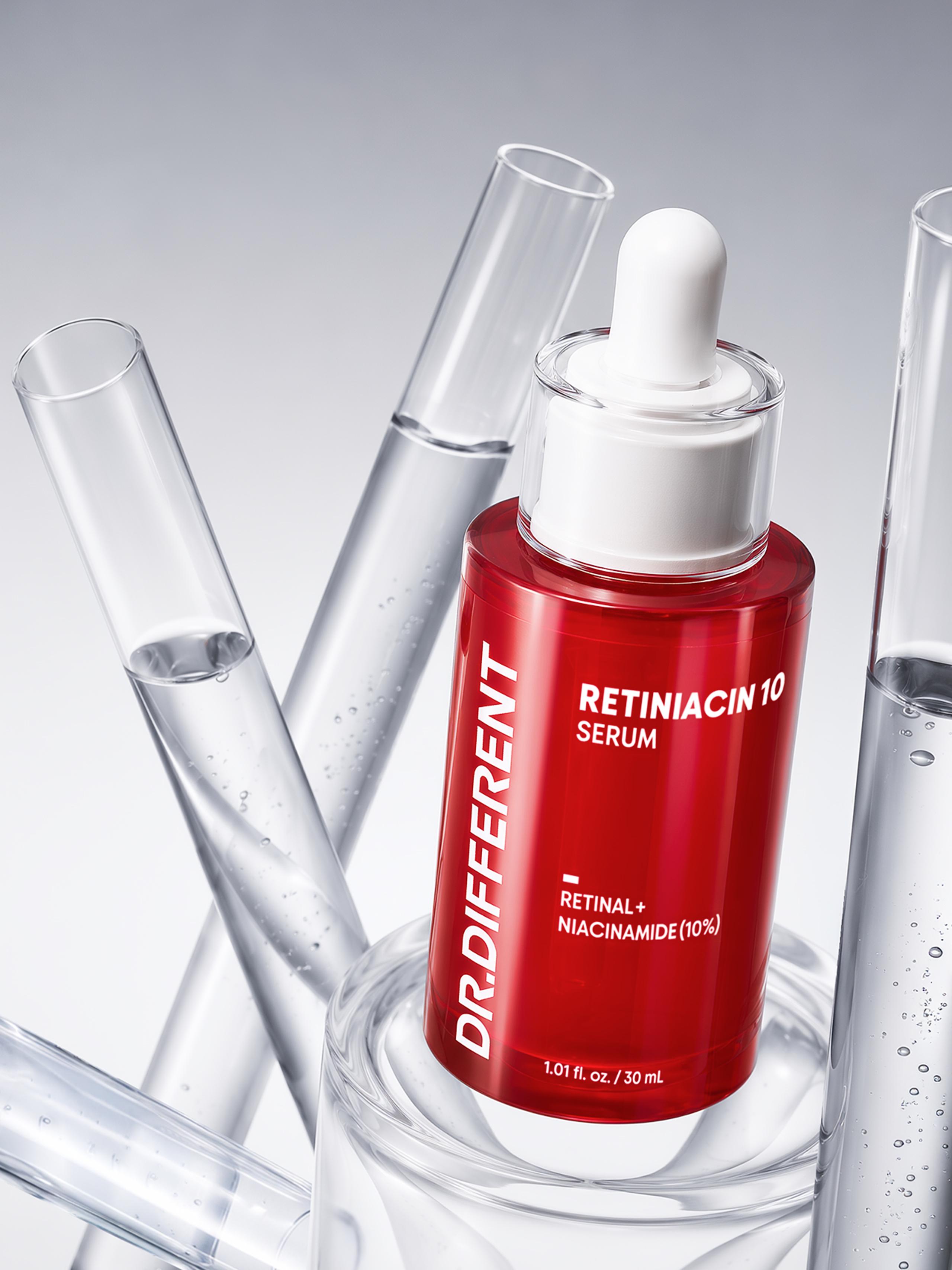
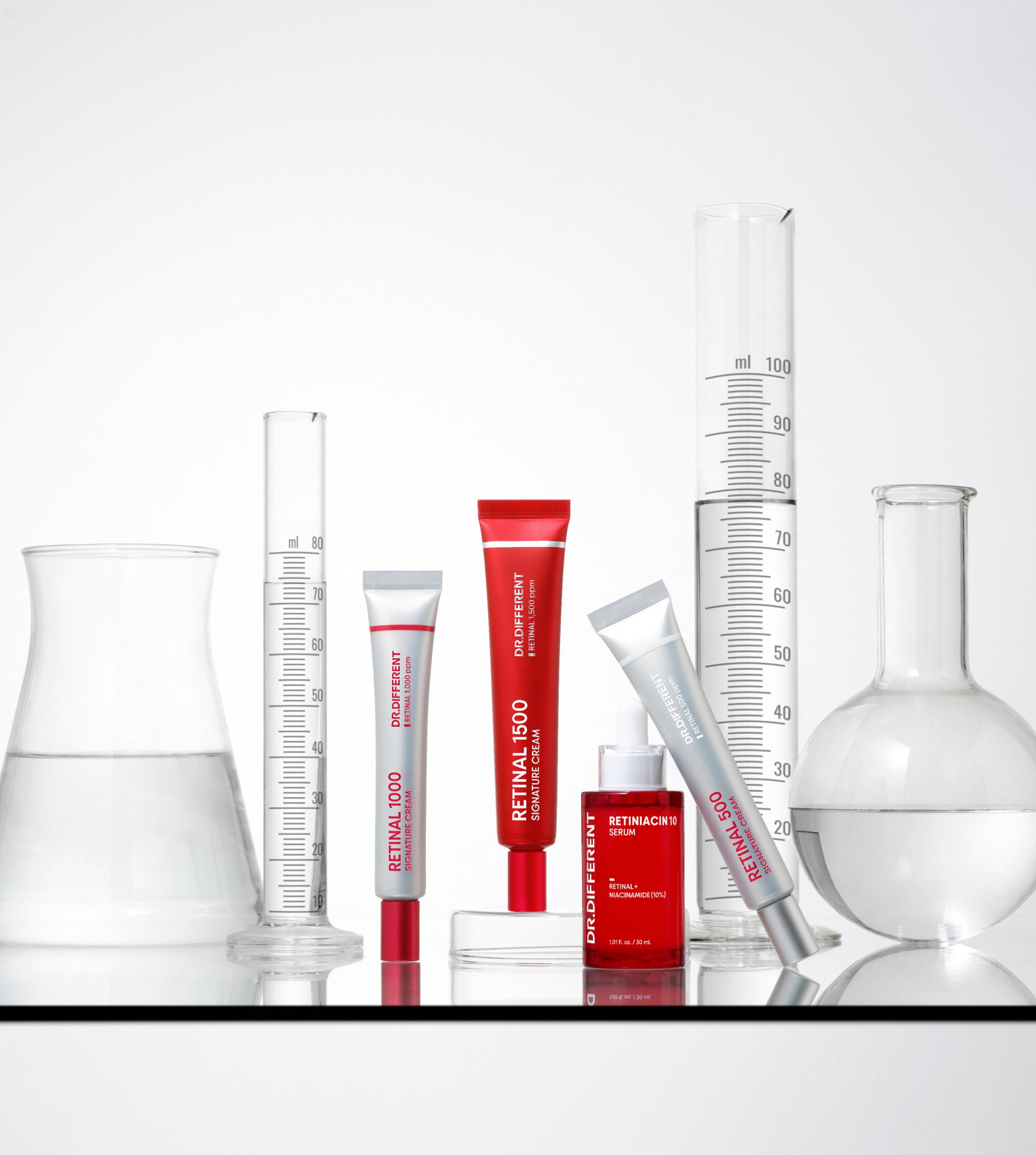
The packaging system translates the brand’s commitment to precise formulation and dermatological credibility into a consistent visual language. Graphic elements inspired by measurement scales extend across the front and sides, creating a structured grid that conveys precision and expertise.
The front label highlights key ingredients and benefits, while the minimal layout and consistent information system create a clinical and trustworthy identity.
패키지 시스템에는 브랜드가 지향하는 정밀한 처방과 과학적 신뢰감을 일관된 시각 언어로 담아냈습니다. 실험 도구의 눈금에서 착안한 그래픽을 패키지 전면과 측면에 걸쳐 연결해 정교한 그리드 구조를 만들고 제품의 전문성을 직관적으로 전달합니다.
전면의 라벨 영역에는 성분과 효능 정보를 표기해 각 제품의 성격을 강조했습니다. 간결한 구성과 일관된 정보 체계를 바탕으로 닥터디퍼런트만의 미니멀하고 신뢰감 있는 패키지 시스템을 완성했습니다.
- Project Manager 박윤제
- Brand Master 이정아
- Lead Designer 구송이
- Designer 심다민, 김은빈, 이승연
- 3D/ Motion Designer 김채연, 최은지

ONPACE