It's well
CJ freshway
2022
CJ 프레시웨이의 마스터 브랜드로, Food Business Partner로서의 기업 페르소나를 계승하기 위한 새로운 브랜드 아이덴티티를 구축하고자 합니다. 마스터 브랜드의 아이덴티티를 강조하기 위해 이츠웰의 아이덴티티를 카테고리 전반에 일괄되게 적용합니다. 이를 통해 반복적으로 브랜드 자산을 노출하여 하위 카테고리 브랜드의 인지도 상승을 기대할 수 있습니다.
- 인터뷰
- 시장조사
- 경쟁사 조사
- 브랜드 가치 개발
- 브랜드 아이덴티티
- 브랜드 무드 제안
- 브랜드 응용물 개발
- 로고 디자인
- 포장 디자인
- 브랜드 디자인 가이드
Project overview
CJ 프레시웨이의 마스터 브랜드로, Food Business Partner로서의 기업 페르소나를 계승하기 위한 새로운 브랜드 아이덴티티를 구축하고자 합니다. 마스터 브랜드의 아이덴티티를 강조하기 위해 이츠웰의 아이덴티티를 카테고리 전반에 일괄되게 적용합니다. 이를 통해 반복적으로 브랜드 자산을 노출하여 하위 카테고리 브랜드의 인지도 상승을 기대할 수 있습니다.
We are looking to establish a new brand identity for CJ Freshway as the master brand, inheriting the corporate persona as a Food Business Partner. To emphasize the identity of the master brand, we will uniformly apply It's Well's identity across the entire category. Through this, we anticipate an increase in brand recognition for the sub-category brands by consistently exposing brand assets.

It’s Well
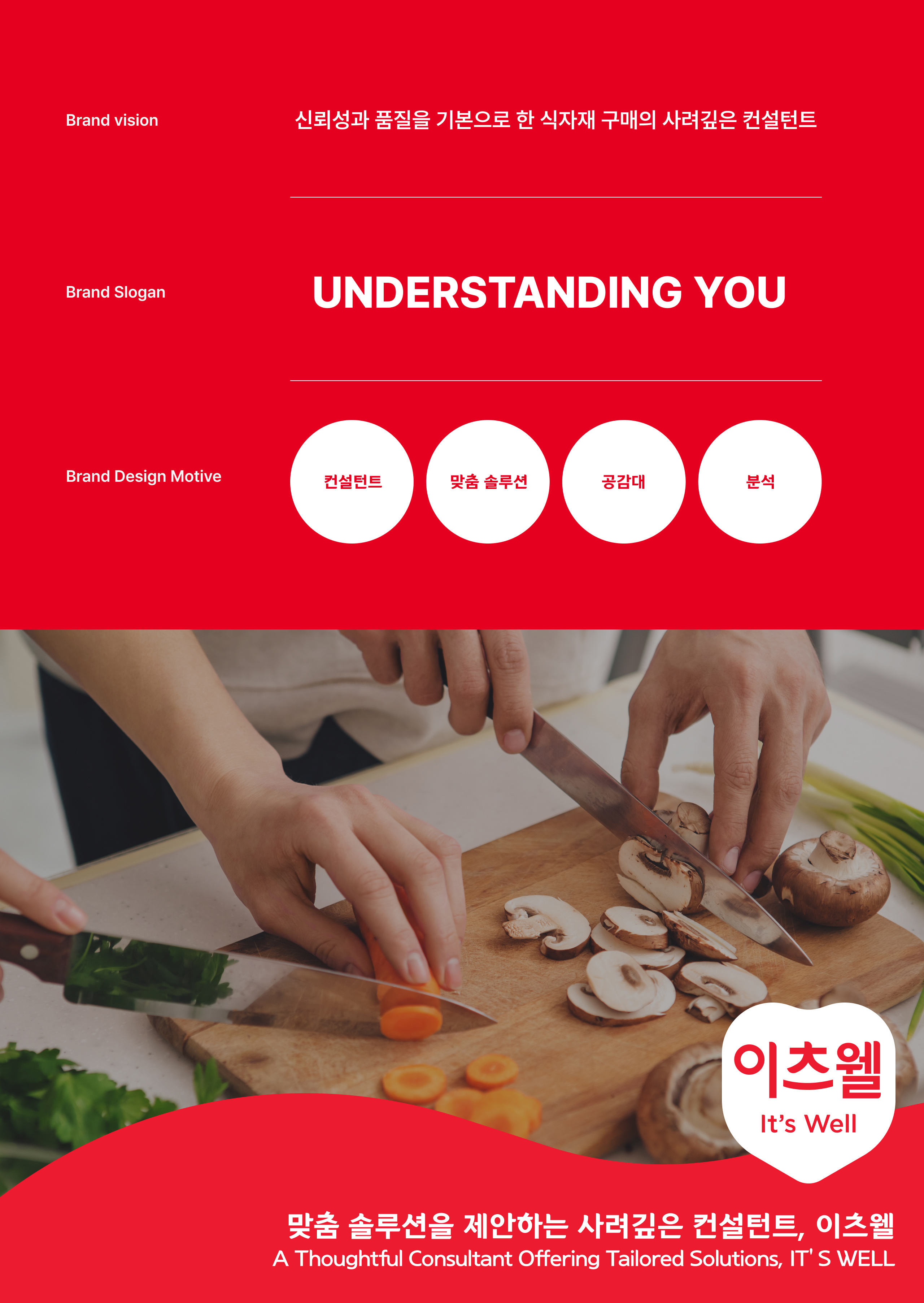
이츠웰은 CJ 프레시웨이의 PB 마스터 브랜드로서 데이터 기반 노하우로 고객 니즈에 맞는 솔루션을 제안하는 식품유통 전문 브랜드 입니다. 믿을 수 있는 품질과 브랜드에 대한 신뢰를 바탕으로 신선식품부터 가공식품까지 다양한 제품군으로 식품 비지니스 파트너들과의 꾸준한 관계를 맺고 있습니다. 또한 키즈, 시니어, 급식, 한우 등 특화된 타겟층을 위한 서브 브랜드를 함께 선보이고 있습니다.
"It's Well" is the private brand (PB) master brand of CJ Freshway, a specialized food distribution brand that offers data-driven expertise to propose solutions tailored to customer needs. Building trust on dependable quality and the brand, It's Well maintains consistent relationships with food business partners, offering a wide range of products from fresh to processed foods. Moreover, It's Well has introduced sub-brands tailored for specialized target groups, including kids, seniors, catering, premium Korean beef, and more.


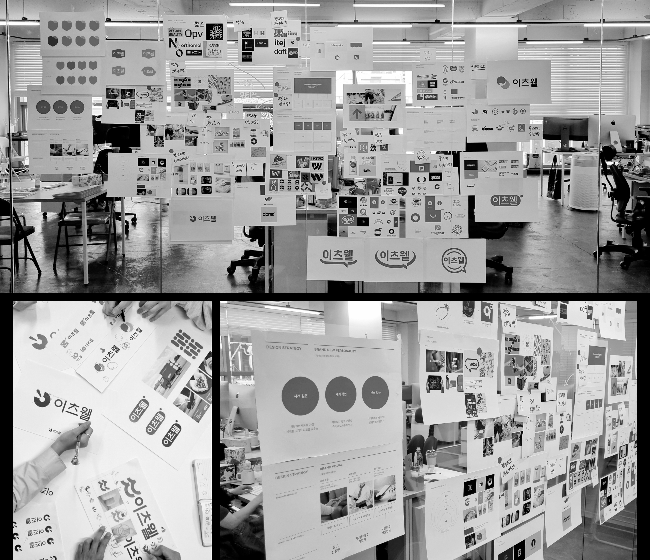
Work Progress
데이터와 노하우, 경청하는 태도를 기반으로 필요를 넘어 세세한 기대가치까지 헤어려 맞춤 솔루션을 제안하는 이츠웰이라는 브랜드 비전과 기존의 헤리티지를 계승하여 브랜드를 새롭게 정의합니다. 그리고 다양한 제품군에 새롭게 정의한 브랜드 아이덴티티가 녹아 들 수 있도록 패키지와 아이콘 등의 시스템을 진행하며 이를 통해 객관화된 변화를 보여줄 수 있습니다.
We redefined the brand by inheriting the existing heritage and aligning it with It's Well's brand vision, which is centered on data, expertise, and a listening attitude to provide tailored solutions that go beyond just meeting needs to address detailed expectations. To ensure that the newly defined brand identity permeates various product categories, we have developed a system for packaging, icons, and more. This allows us to showcase a tangible transformation.

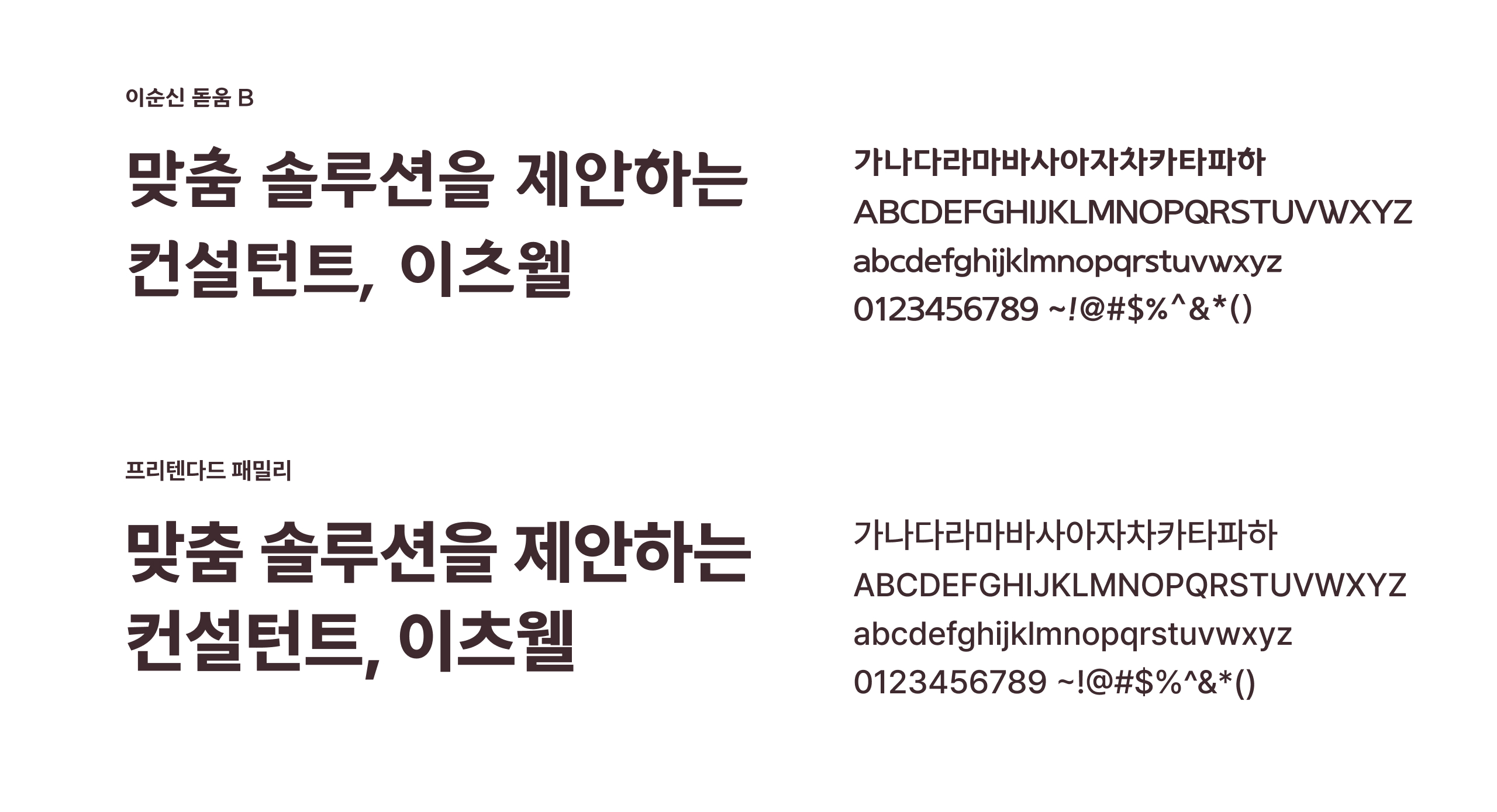
Typeface
사려깊은 컨설턴트에 어울리도록 부드러우면서 신뢰감을 느낄 수 있는 서체를 메인으로 사용합니다. 서브 서체로는 가독성을 위해 프리텐다드 패밀리 서체를 사용합니다. 일관된 브랜드 아이덴티티를 전달하기 위해, 아래와 같은 전용 서체를 디자인 시스템 내에서 사용합니다.
To complement the thoughtful consultant persona, we primarily use a soft and trustworthy typeface. For enhanced readability, we employ the Pretendard family typeface as a secondary option. To convey a consistent brand identity, we use the dedicated typefaces within the design system.
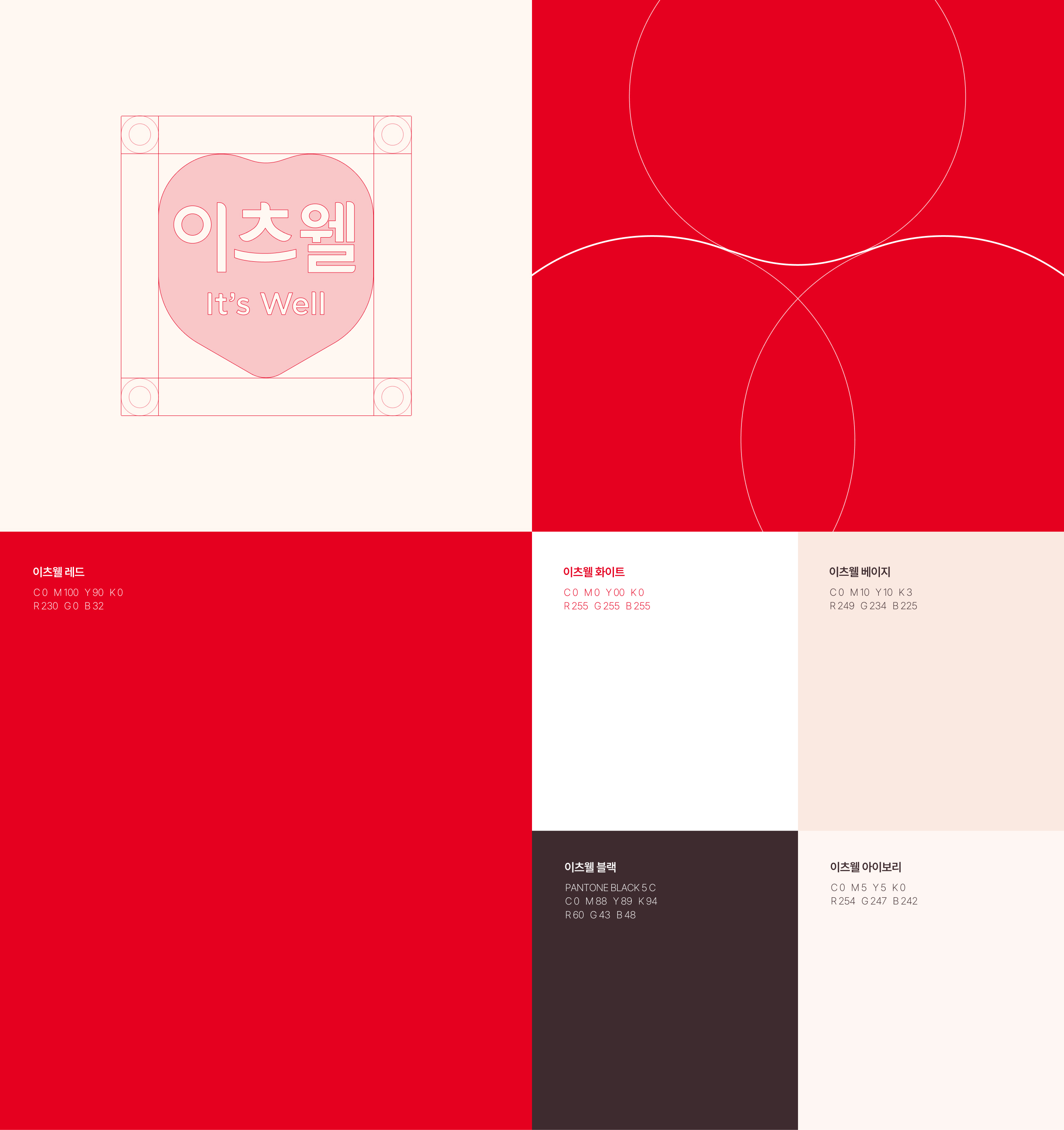
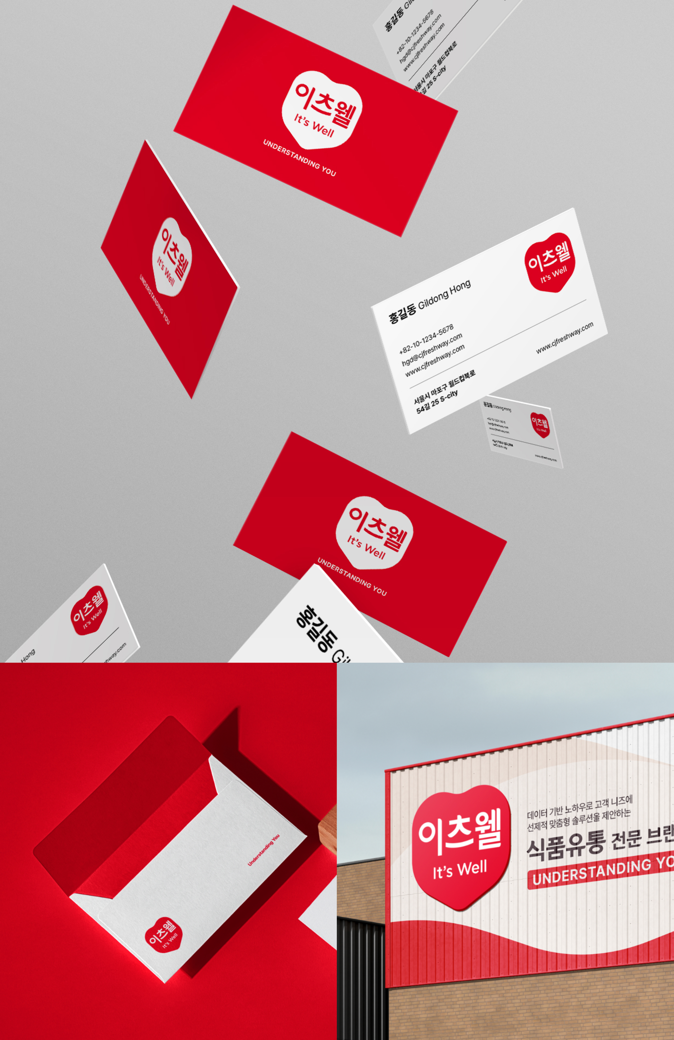
Logo
기존 이츠웰의 믿을 수 있는 품질과 신뢰를 상징하는 방패 형상 헤리티지를 계승하였습니다. 기존 브랜드 자산을 완전히 배제하지 않으면서, 고객을 향한 따뜻하고 사려깊은 컨설턴트의 마음을 상징합니다.
We have inherited the shield-shaped heritage, symbolizing the trusted quality and reliability of the existing It's Well brand. While not completely discarding the existing brand assets, this represents the warm and thoughtful consultant's heart towards the customers.
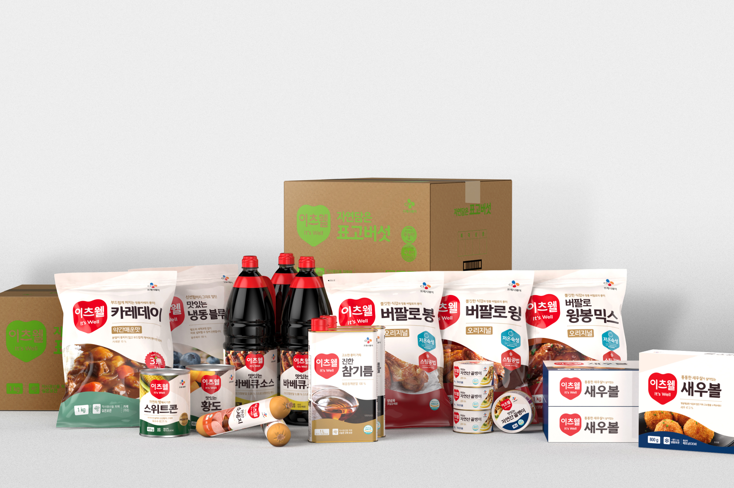
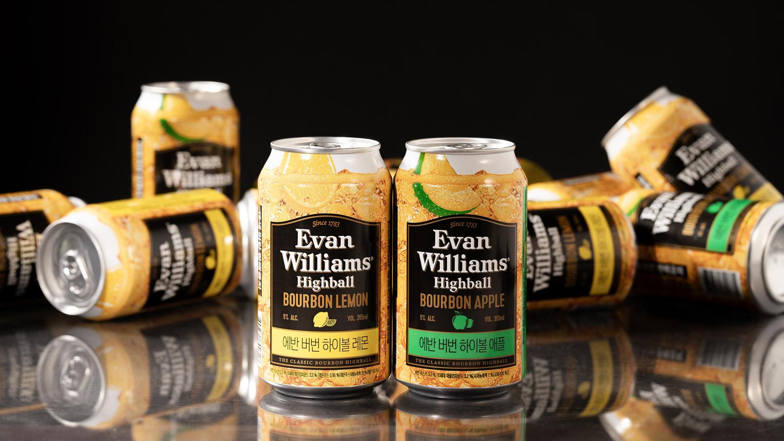
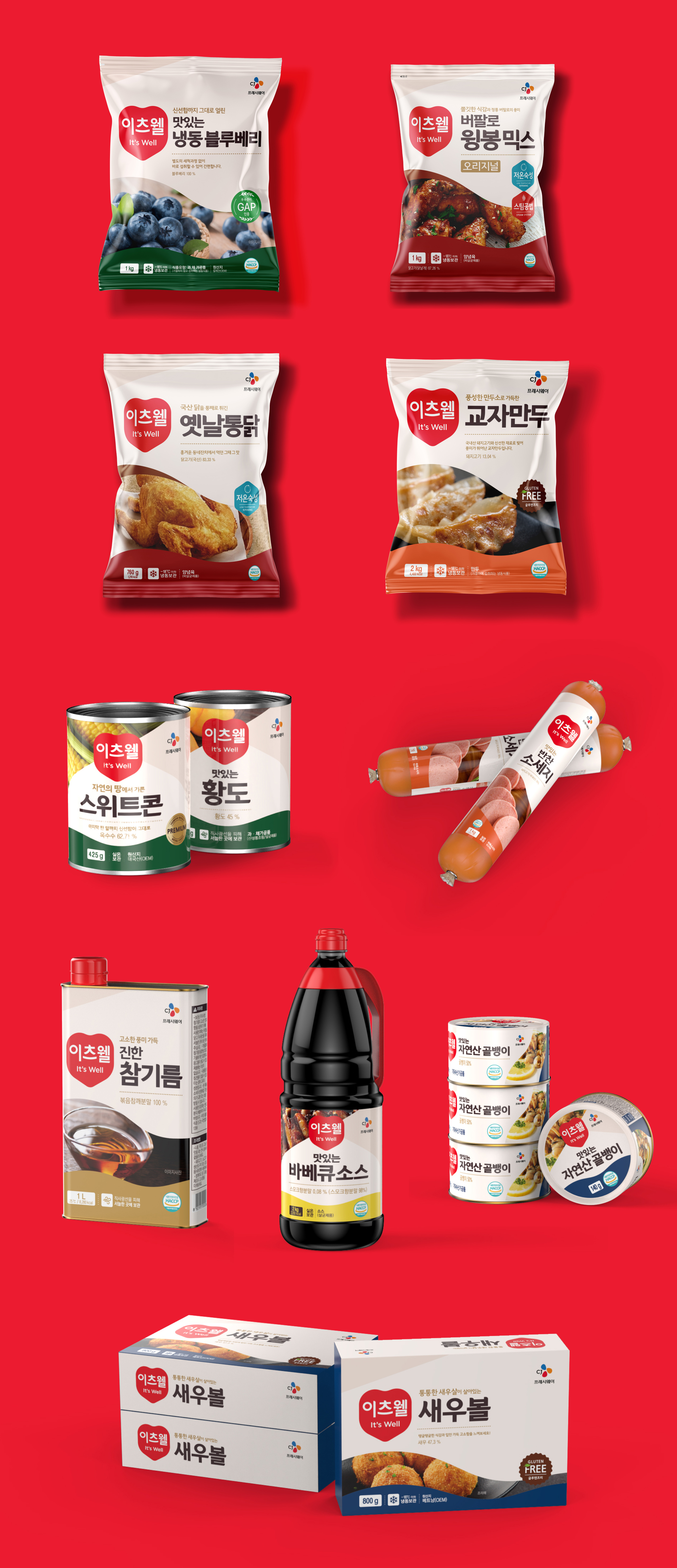
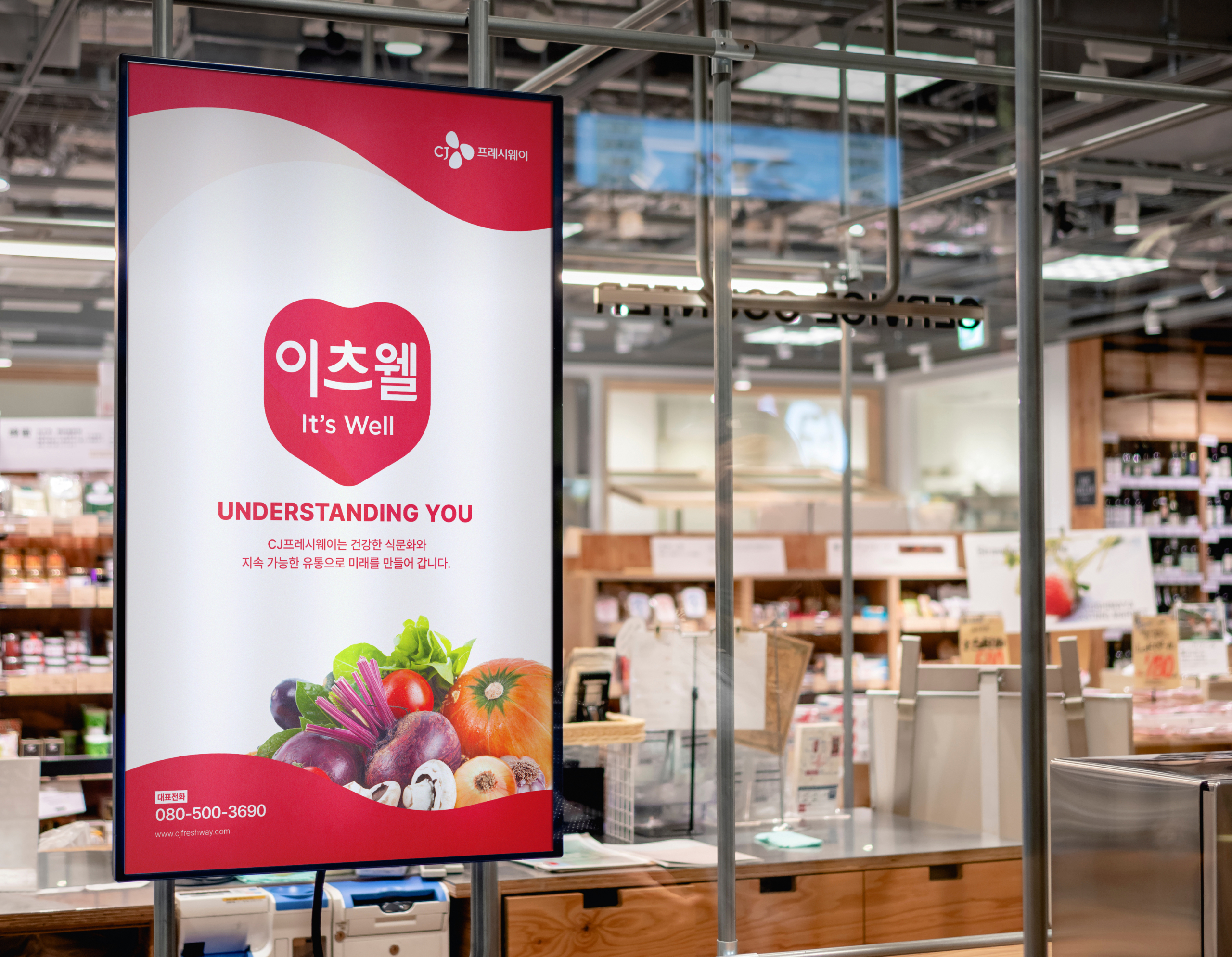
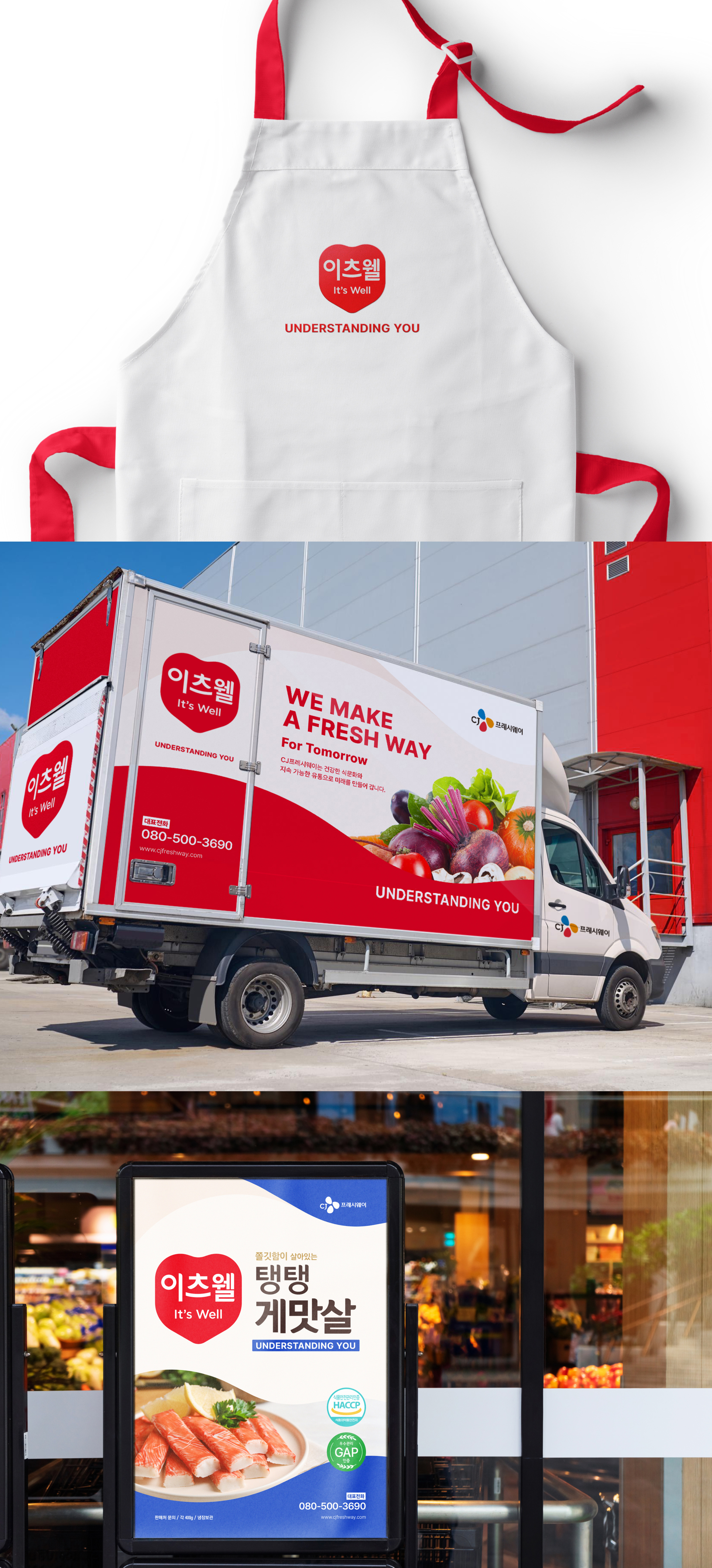
Package System
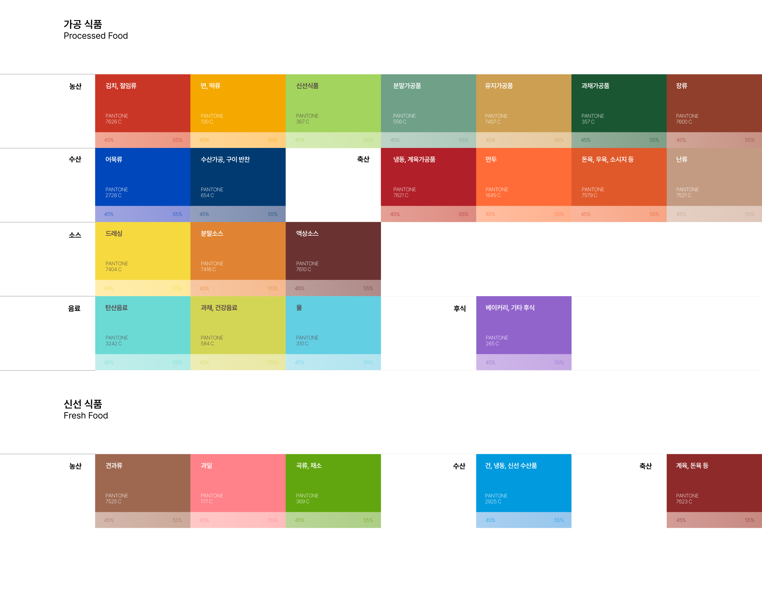
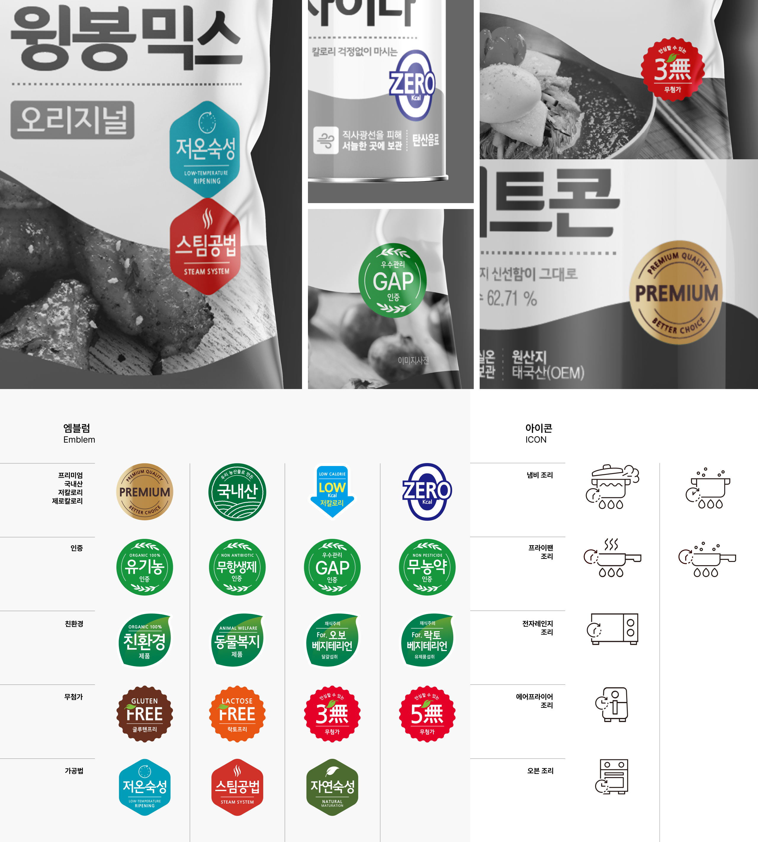
진중한 색감과 함께 전용서체가 먼저 눈에 띌 수 있도록 하여 신뢰감을 느끼게 합니다.기존의 패키지보다 높은 가독성과 정보가 쉽게 눈에 들어 올 수 있도록 레이아웃을 구성합니다. 다양한 제품군에 따른 다양한 형태에 따라 유연하게 변화하되 강한 일관성을 유지합니다. 레이아웃 뿐 아니라 다양한 제품군의 카테고리를 재정의하여 컬러시스템을 구축하였으며 아이콘과 엠블럼 또한 가이드 내에서 활용 할 수 있도록 하였습니다.
We ensure that the dedicated typeface is prominently visible, along with a sophisticated color palette, to instill a sense of trust. The layout is designed for higher readability and easy information consumption compared to the previous packaging. It remains flexible to adapt to various forms depending on the diverse product categories while maintaining a strong sense of consistency. Not only in layout but also in the redefinition of categories for various product groups, we have established a color system. Icons and emblems are also made available within the brand guidelines.


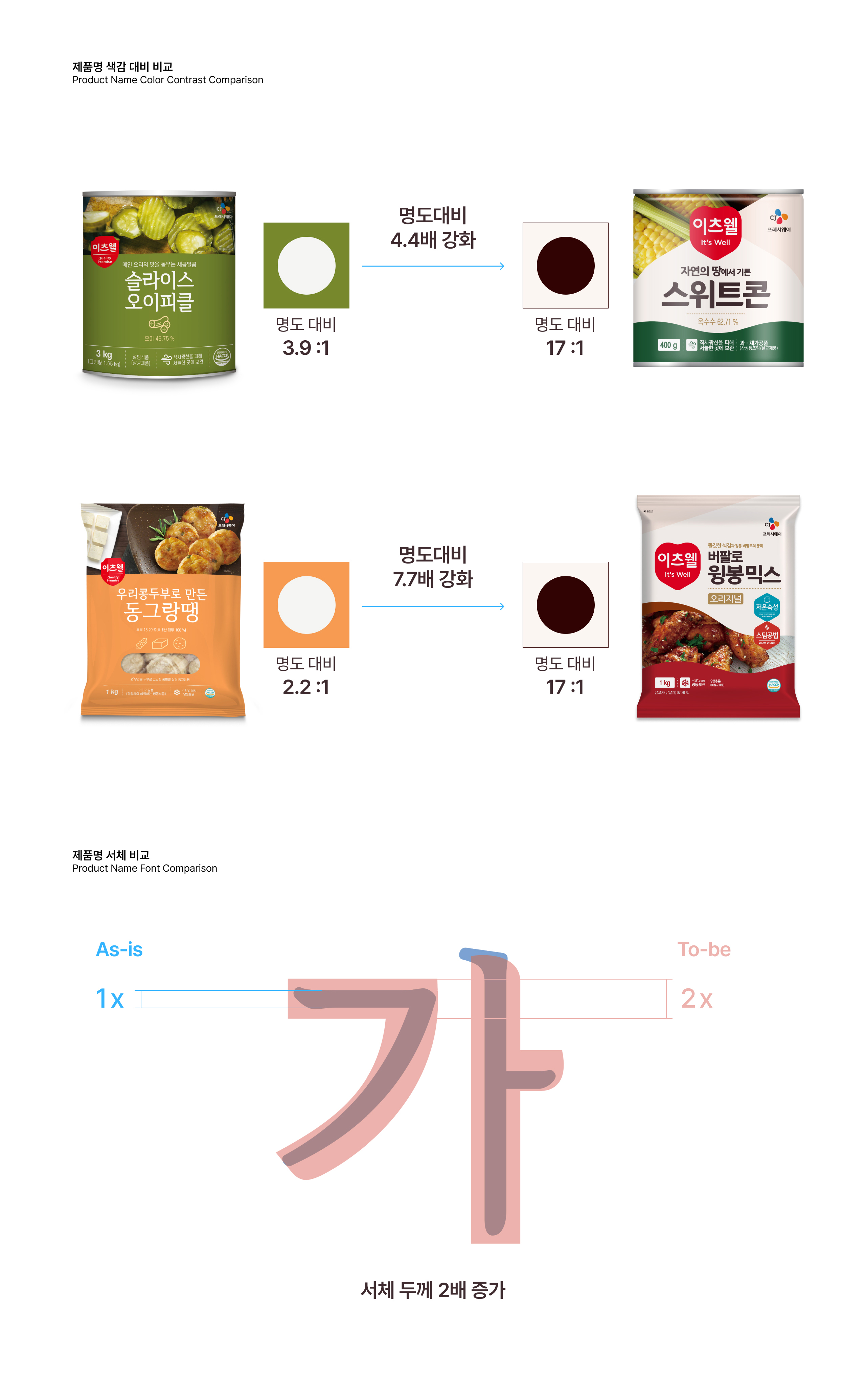
As is To be
다양한 제품군에 기존의 헤리티지를 계승하면서도 이츠웰의 새로운 아이덴티티와 브랜드 자산을 효과적으로 노출하기 위해 전면부 레이아웃의 변화와 로고 사이즈의 확대, 명도 대비, 서체의 굵기 변화등의 변화를 택했습니다. 그리고 이 변화는 수치적으로도 명확히 보여줄 수 있습니다.
To effectively showcase It's Well's new identity and brand assets while inheriting the existing heritage across various product categories, we opted for changes in the front layout, logo size enlargement, contrast adjustments, and font weight changes. These changes are clearly evident in numerical terms.

ohSeven
- Executive director 배수규
- Project Manager 박윤제, 연보연
- Brand Designer 오유진, 김채린, 이자희, 장필규
- 3D/ Motion Designer 김채연, 윤성웅
CJ freshway
- Designer 김정표, 이현주
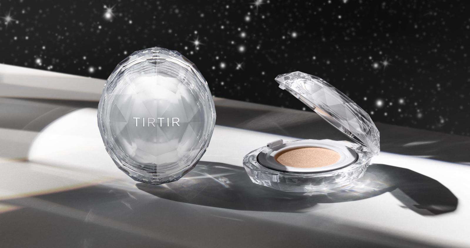
TIRTIR Crystal mesh cushion