ONPACE
오세븐
2026
Overview
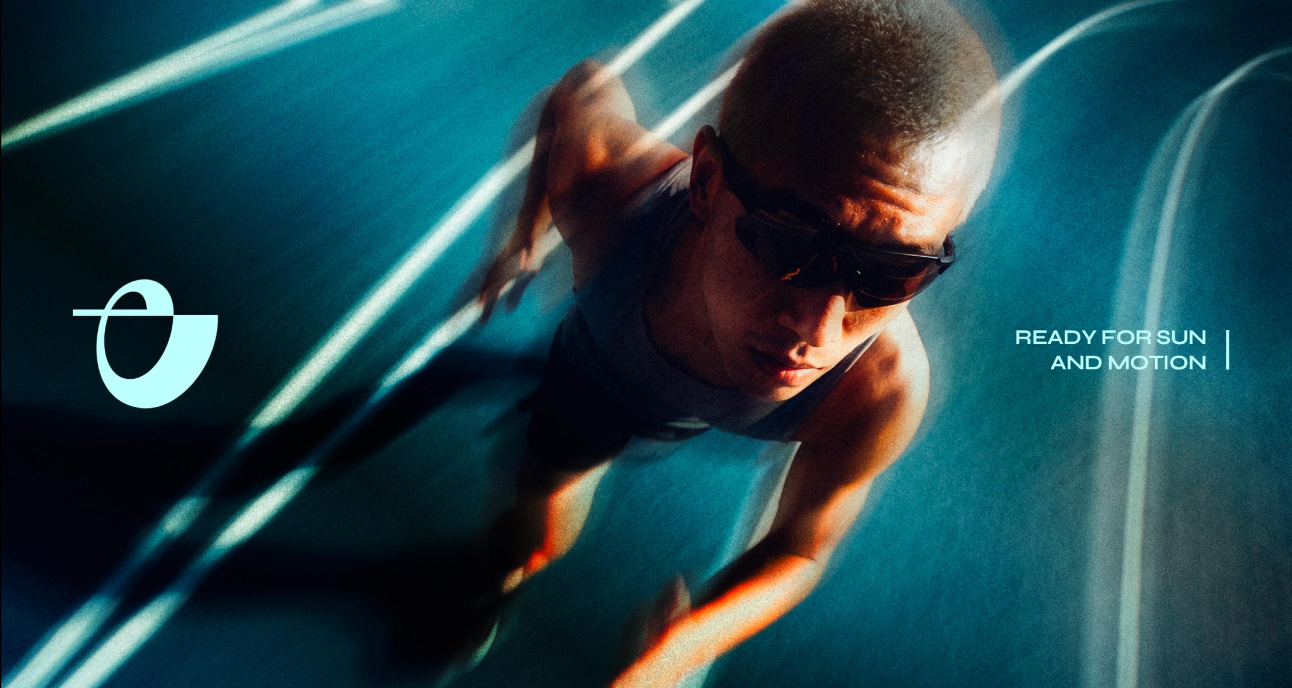
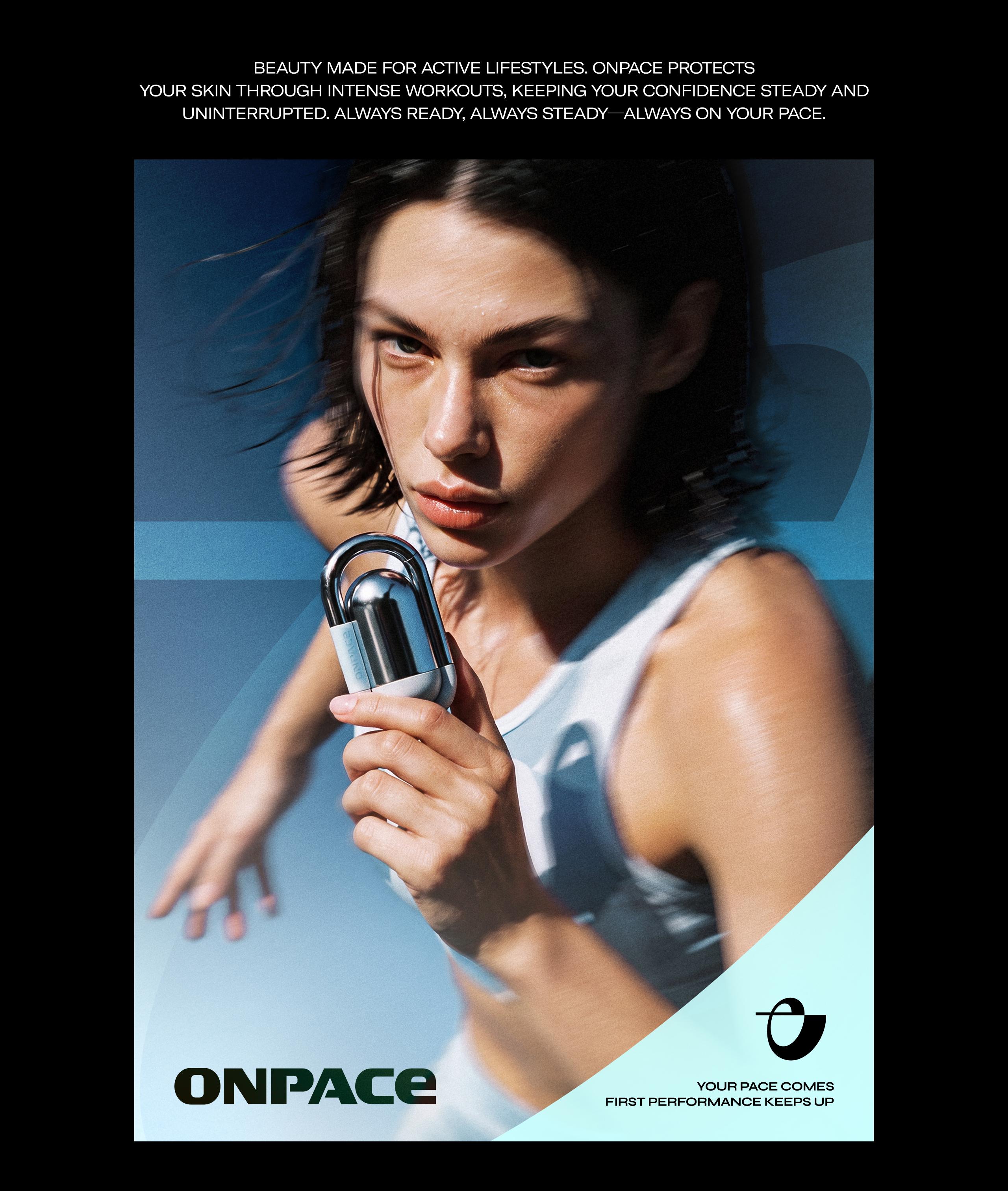
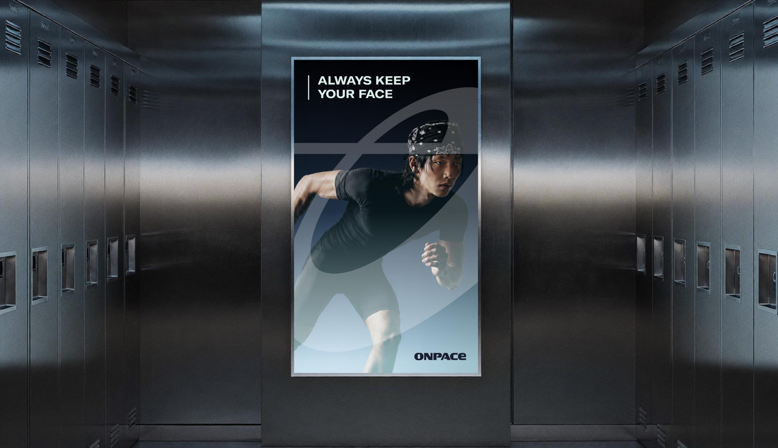
As active lifestyles become more prevalent, the importance of sun care continues to grow. However, the market has lacked products that seamlessly combine sun protection, style, and portability, while conventional color cosmetics often fall short in durability and adherence during outdoor activities. ONPACE is a sport-gender beauty brand created for active lifestyles, offering portable sun-care makeup, long-lasting formulas, and accessory-inspired designs that help users maintain their own pace—Pace and Face—along with their style and confidence in every moment of movement.
활동적인 라이프스타일이 확산되면서 선케어의 중요성 또한 높아지고 있습니다. 하지만 기존 시장에서는 자외선 차단 성능과 스타일, 휴대성을 함께 갖춘 제품을 찾기 어려웠으며, 일반 색조 제품 역시 야외 활동에서 요구되는 지속력과 밀착력이 부족했습니다. ONPACE는 액티브한 일상을 위한 스포츠 젠더 뷰티 브랜드로, 휴대성 높은 선케어 메이크업과 강한 지속력, 패션 액세서리처럼 활용할 수 있는 디자인을 통해 움직이는 순간에도 자신만의 페이스(Pace, Face)와 스타일, 자신감을 유지할 수 있도록 합니다.
Core Value
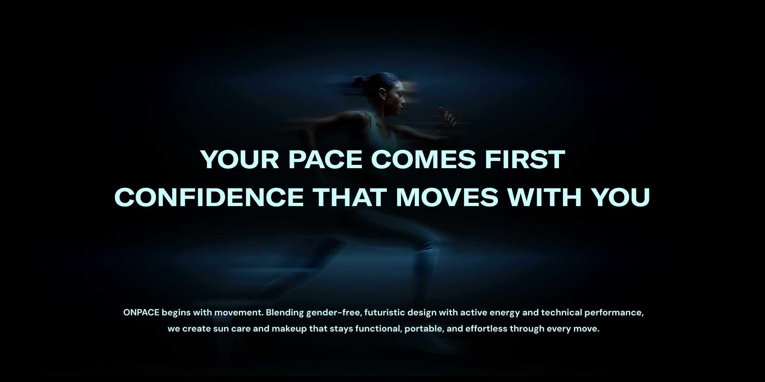
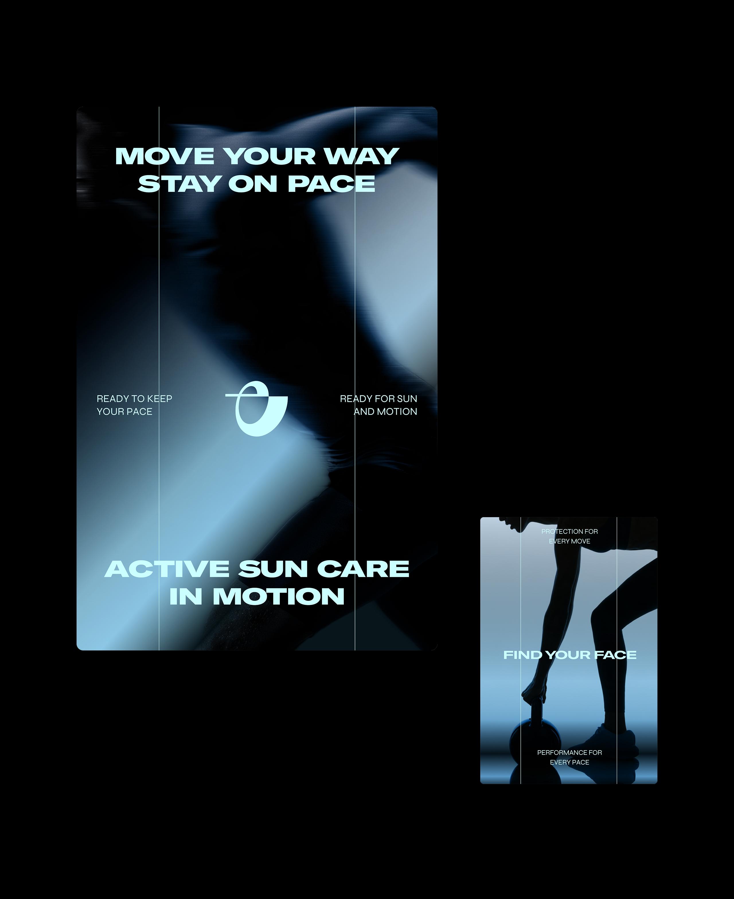
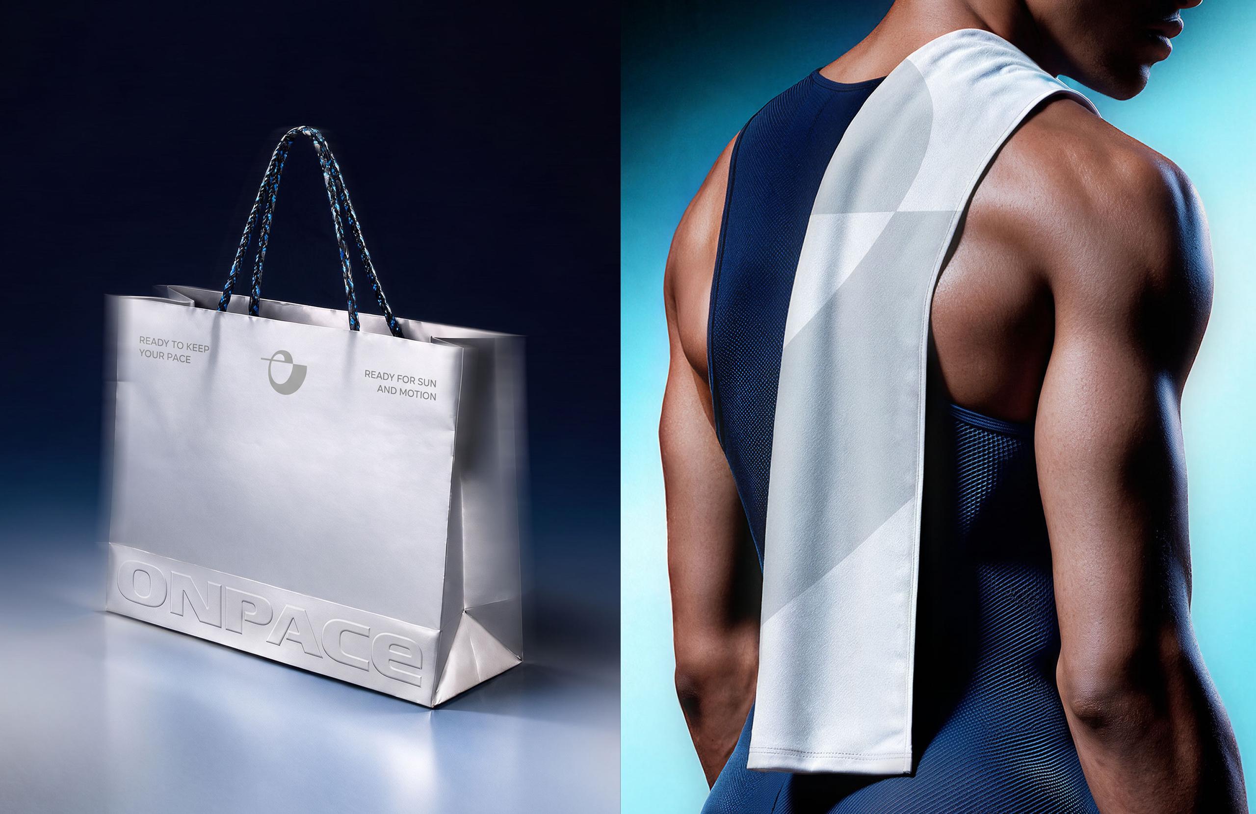
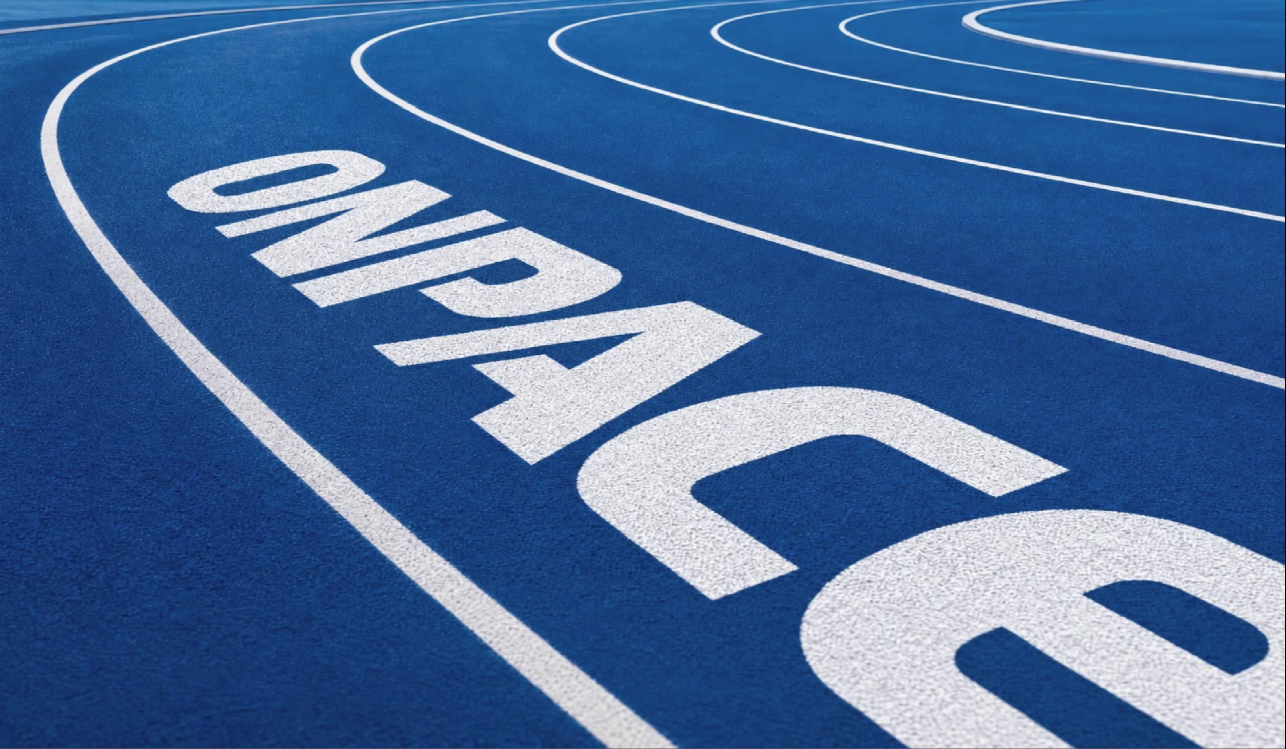
ONPACE builds its identity around three core values: Gender Futuristic, Energy Active, and Tech Functional. Combining a gender-neutral, forward-looking perspective with the dynamic energy of sports and the technical precision of functional design, these values shape a cohesive brand identity—from motion-inspired graphics to sports gear-inspired products.
ONPACE는 성별의 경계를 넘어서는 미래지향적 감각, 스포츠에서 비롯되는 역동적인 에너지, 기술적 정교함과 기능성을 바탕으로 브랜드 아이덴티티를 구축합니다. 세 가지 가치는 젠더 뉴트럴한 브랜드 이미지부터 움직임을 표현한 그래픽, 스포츠 기어에서 영감을 받은 제품 디자인까지 일관되게 연결되며 ONPACE만의 스포츠 뷰티 경험을 만들어갑니다.
Logo & Symbol
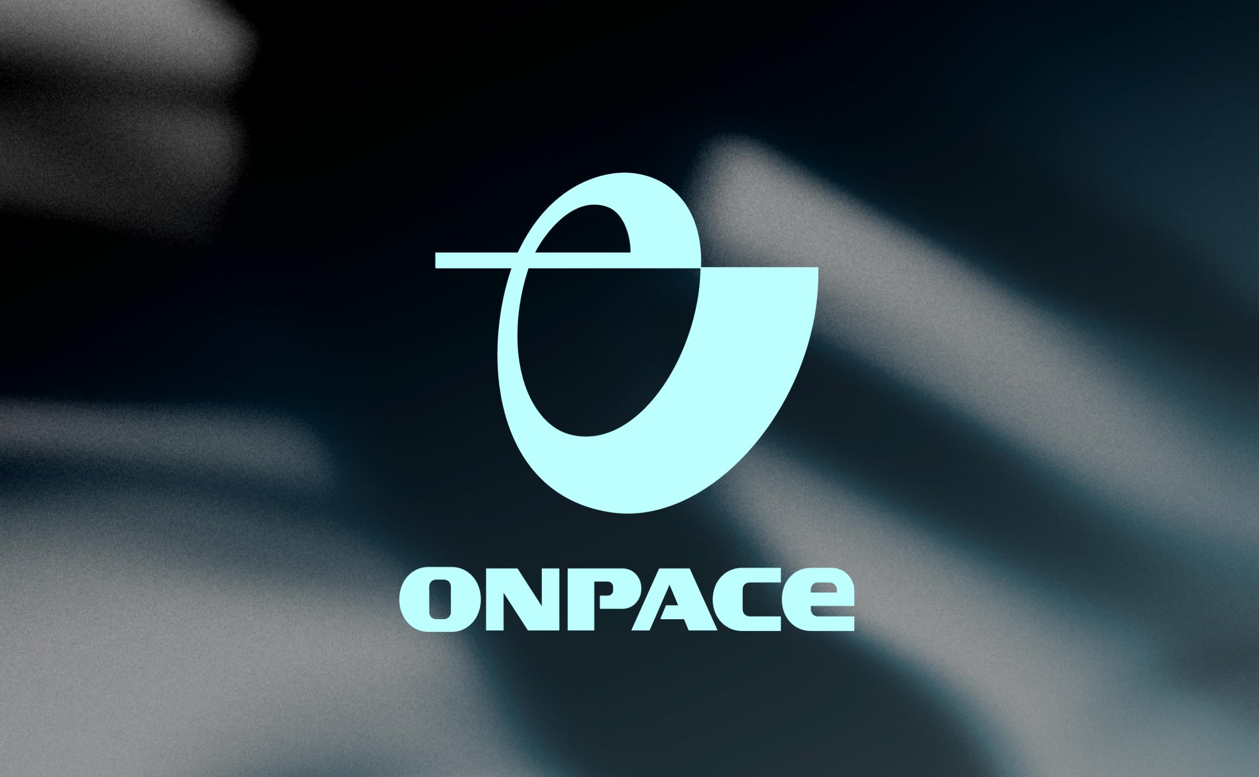
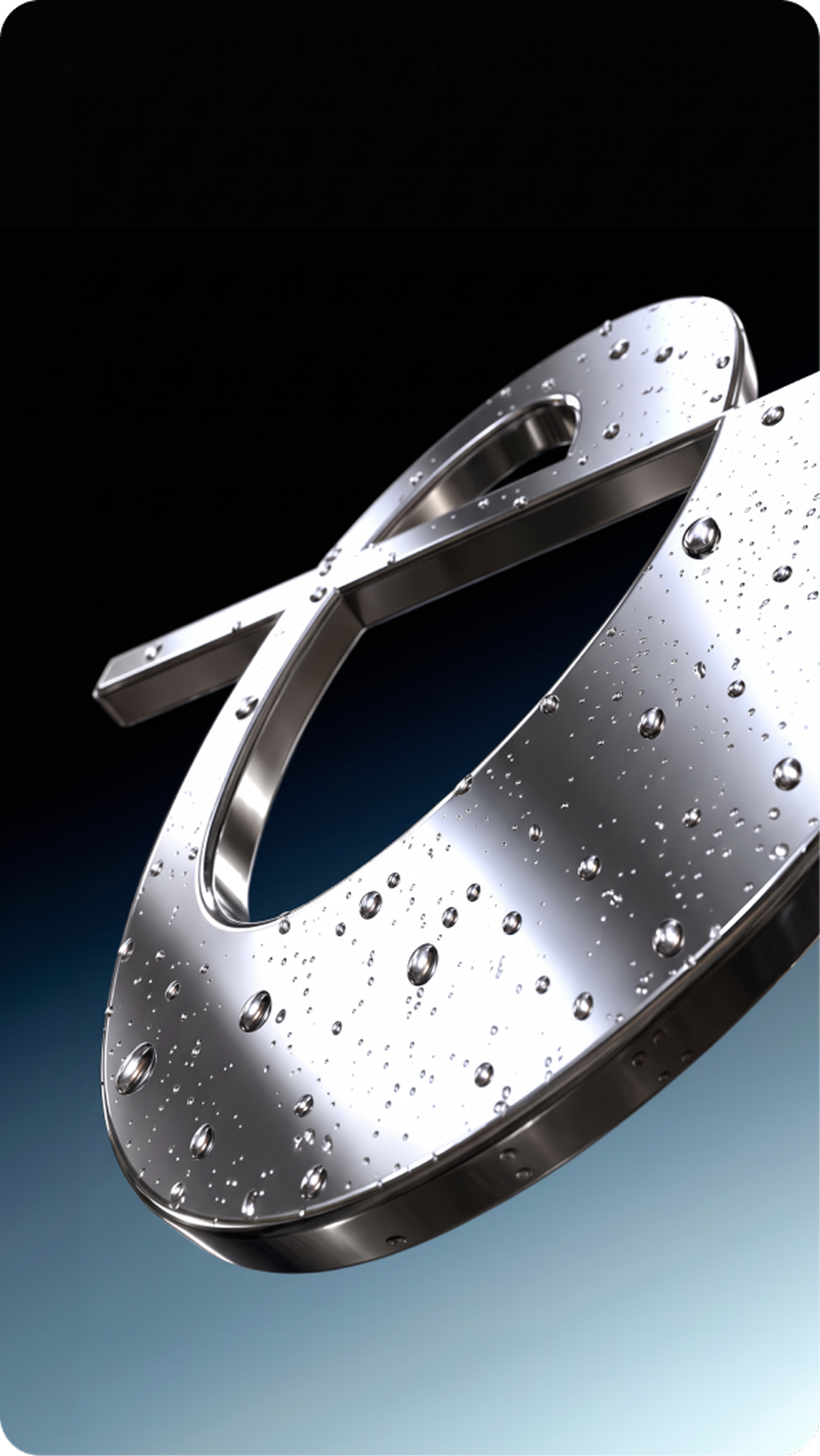
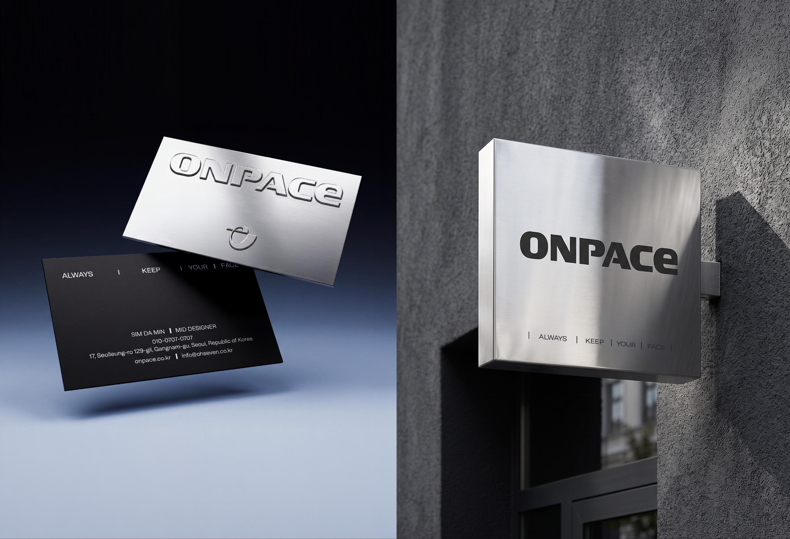
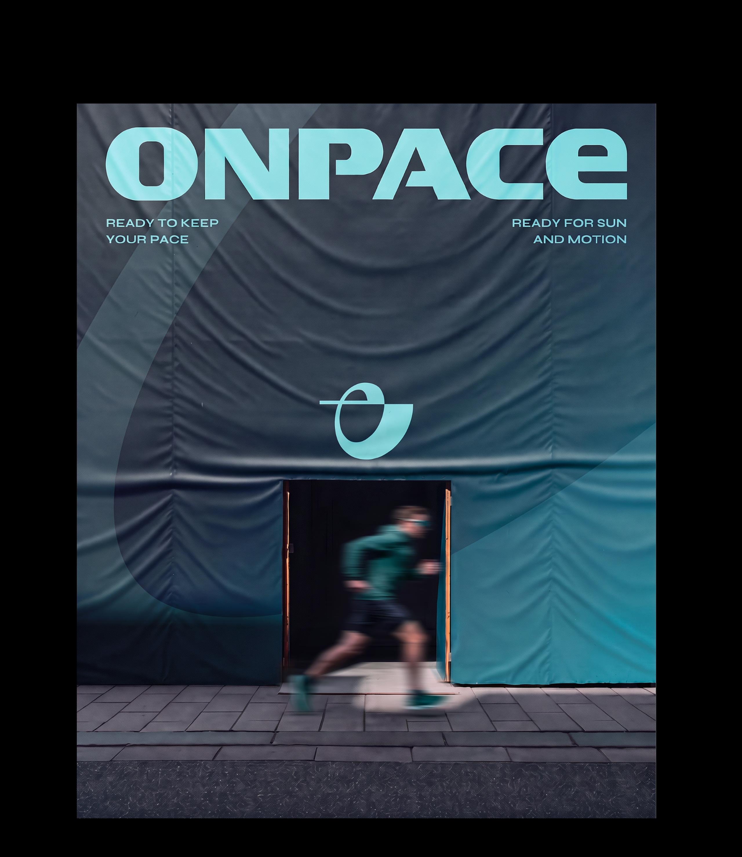
The logotype features bold, geometric letterforms that express ONPACE’s functional identity. By minimizing unnecessary decorative elements, its clean and refined structure creates a technical and contemporary brand impression. The symbol combines the ‘O’ at the beginning and the ‘E’ at the end of ONPACE into a single form, visually representing the brand philosophy of maintaining your own pace from start to finish. Its continuous form symbolizes constant movement and the ONPACE attitude of staying true to your own rhythm.
로고타입은 볼드한 획을 기반으로 한 기하학적 형태를 통해 ONPACE가 지향하는 기능적인 이미지를 표현합니다. 불필요한 장식을 최소화한 간결한 구조로 브랜드의 테크니컬하고 현대적인 브랜드 인상을 완성했습니다. 심볼은 ONPACE의 시작인 ‘O’와 끝인 ‘E’를 하나의 형태로 결합하여, 처음의 페이스를 잃지 않고 끝까지 나아가는 브랜드의 철학을 시각적으로 표현합니다. 하나로 이어지는 형태를 통해 지속적인 움직임과 자신만의 리듬을 유지하는 ONPACE의 태도를 상징합니다.
Product Design
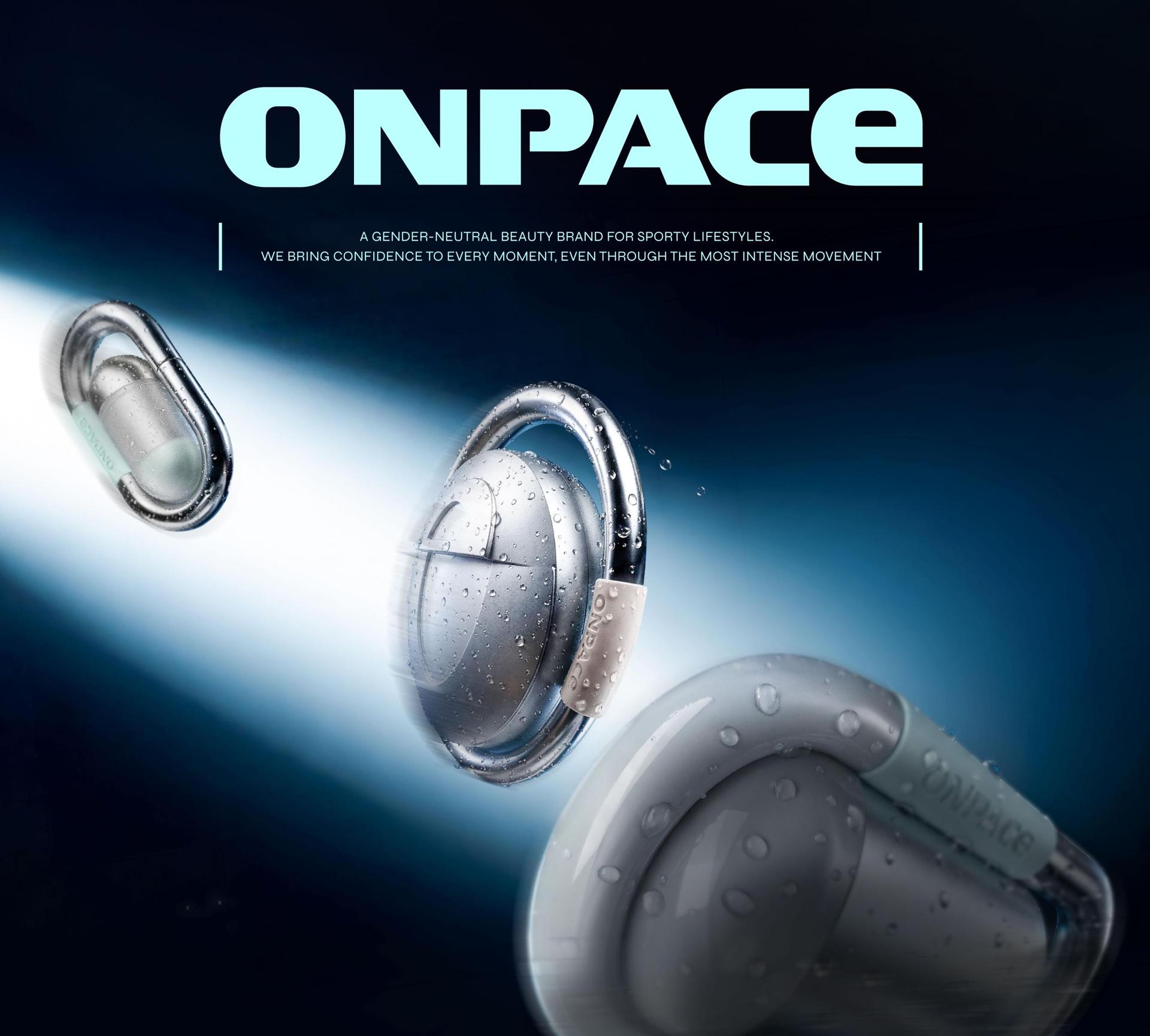
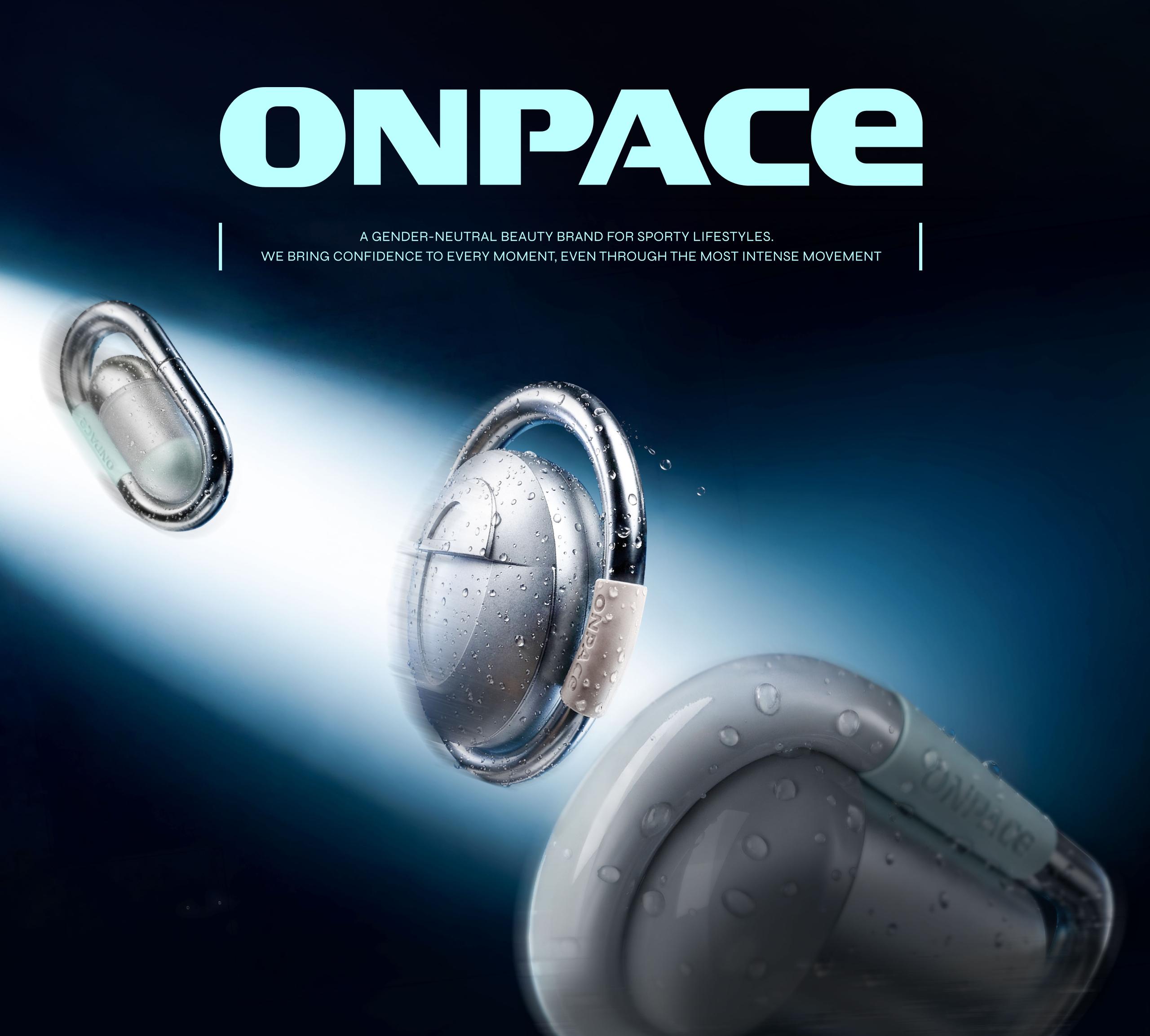
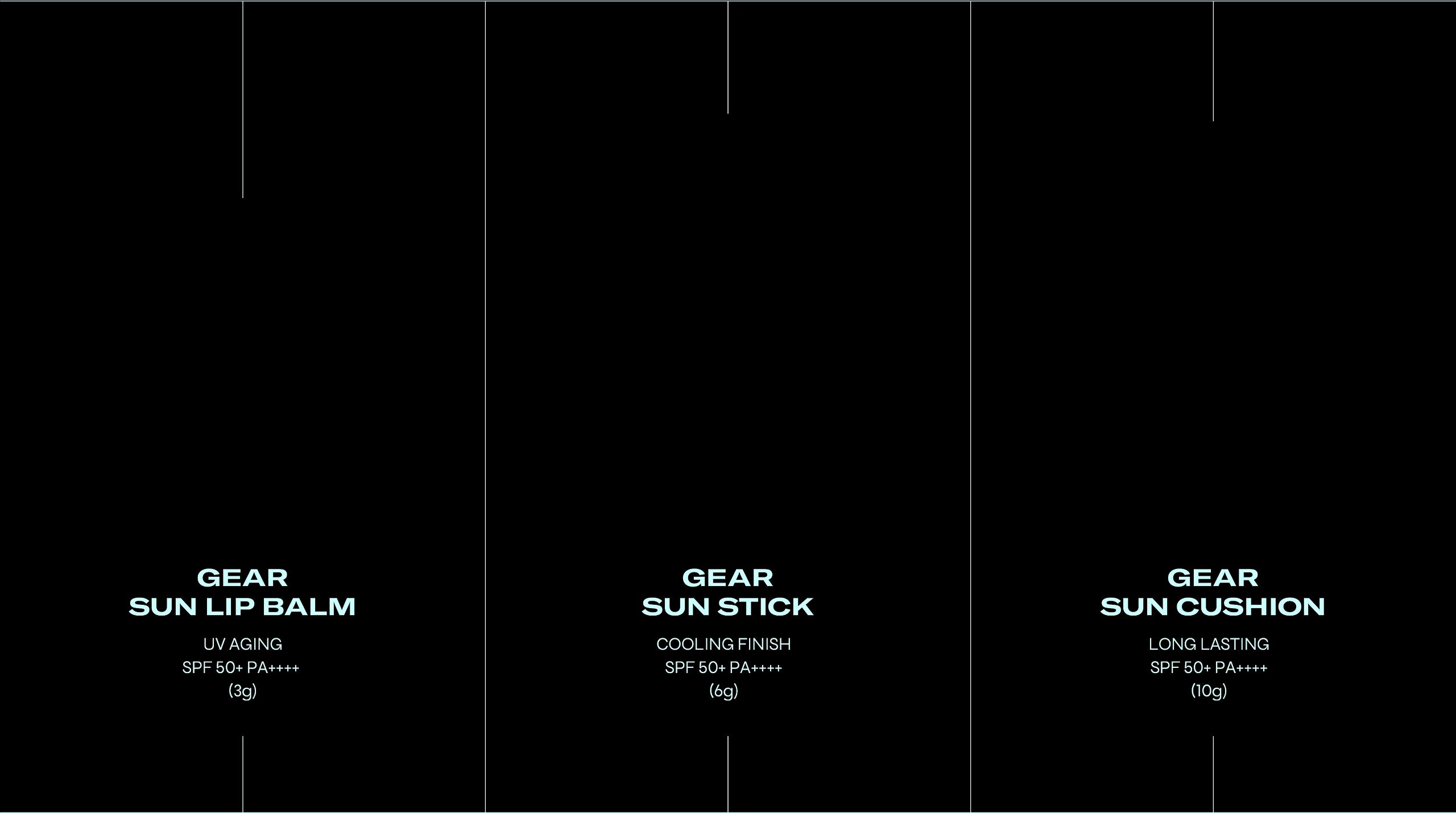
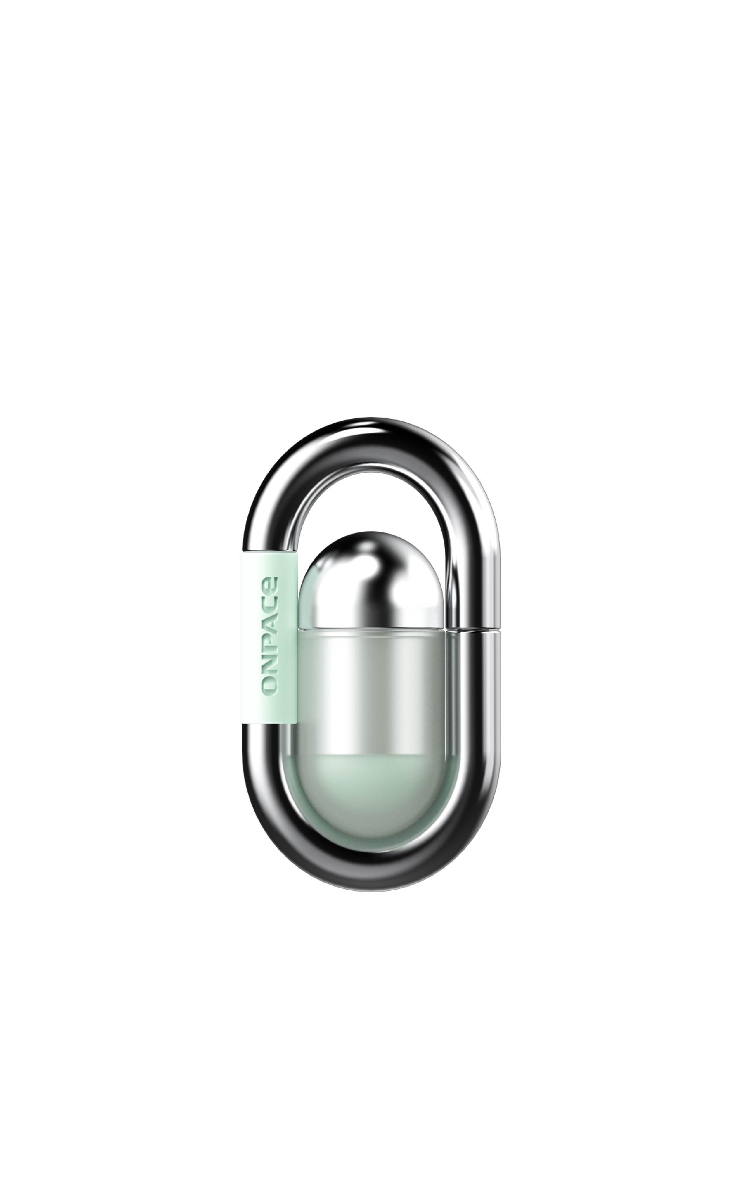
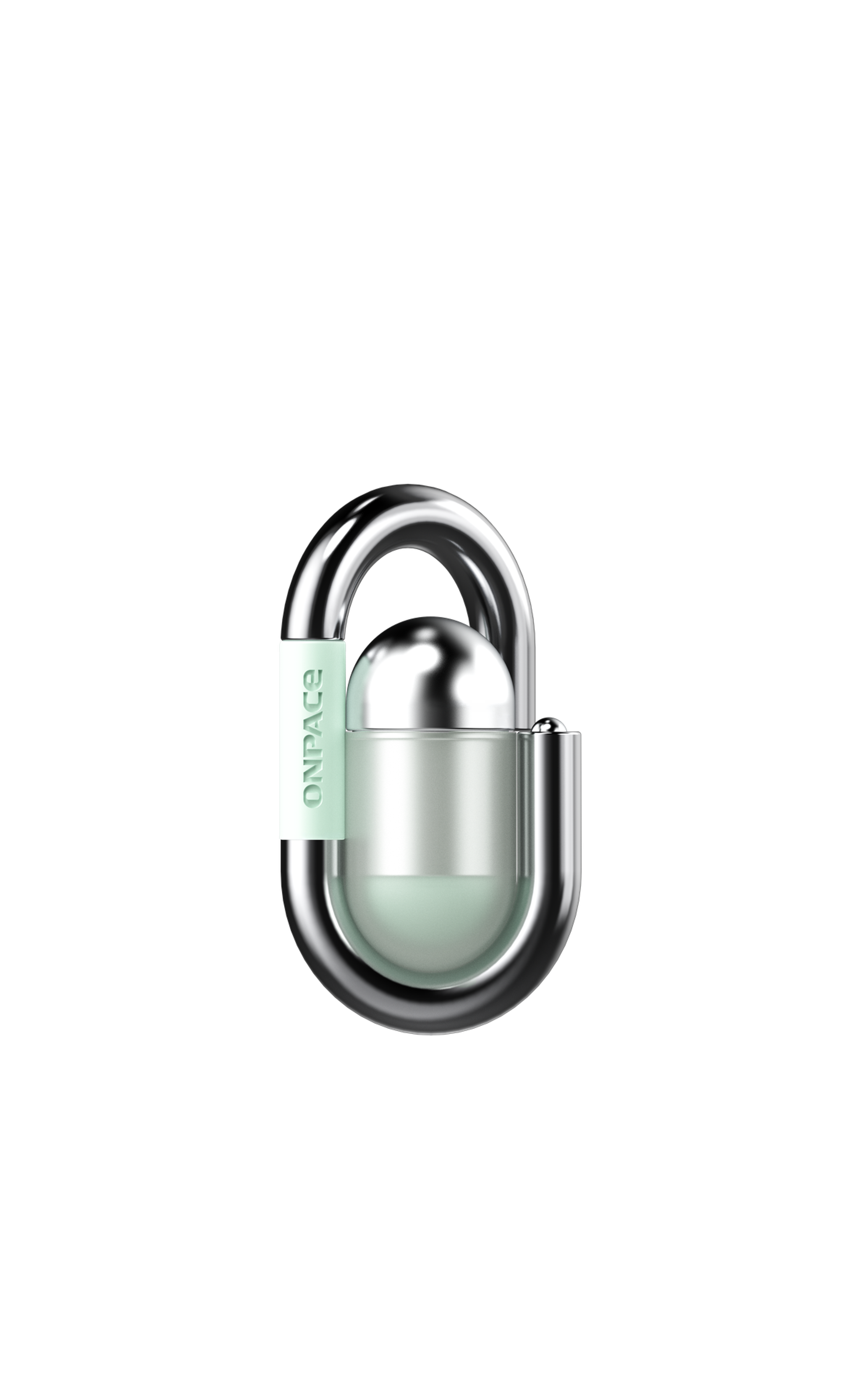
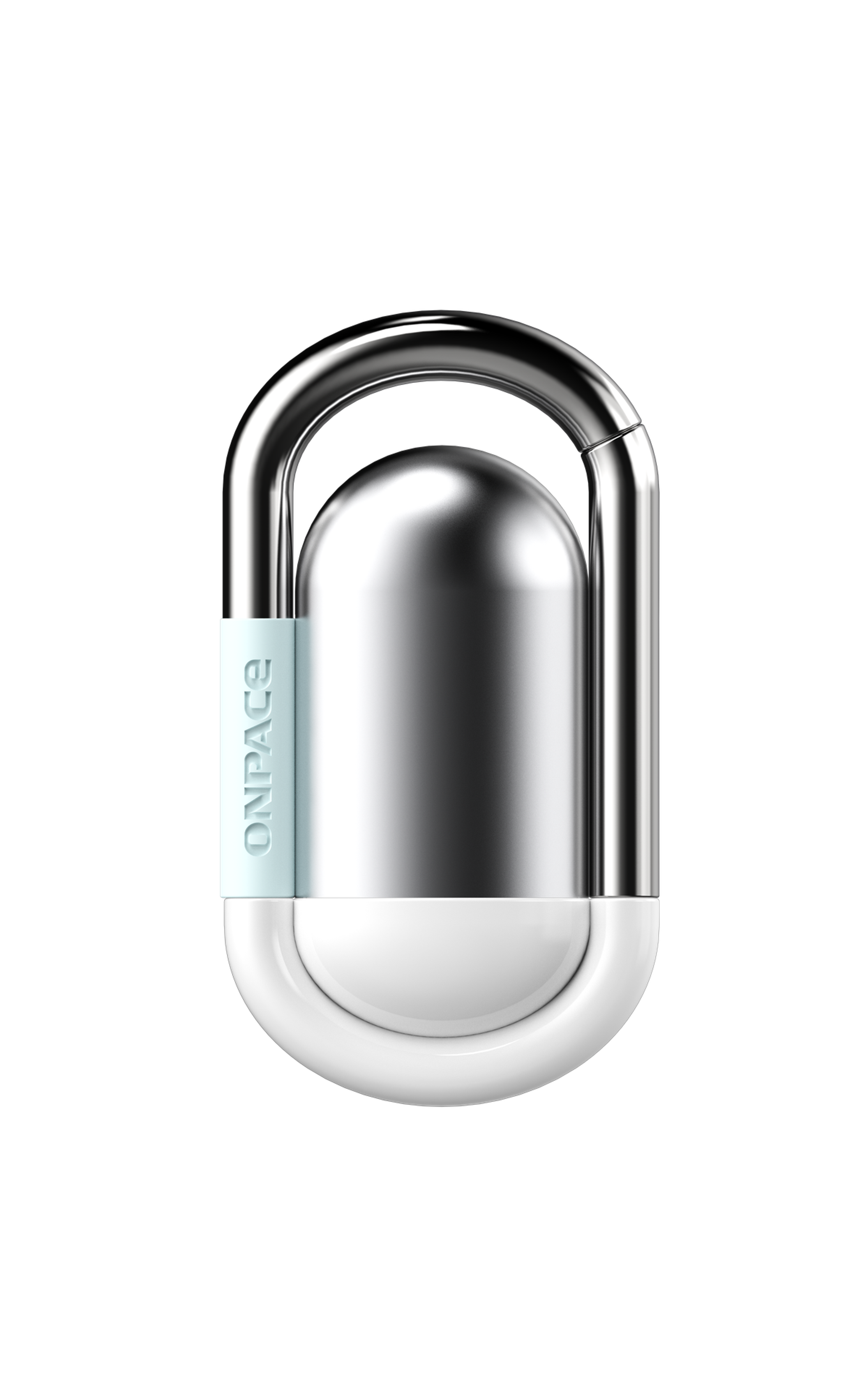
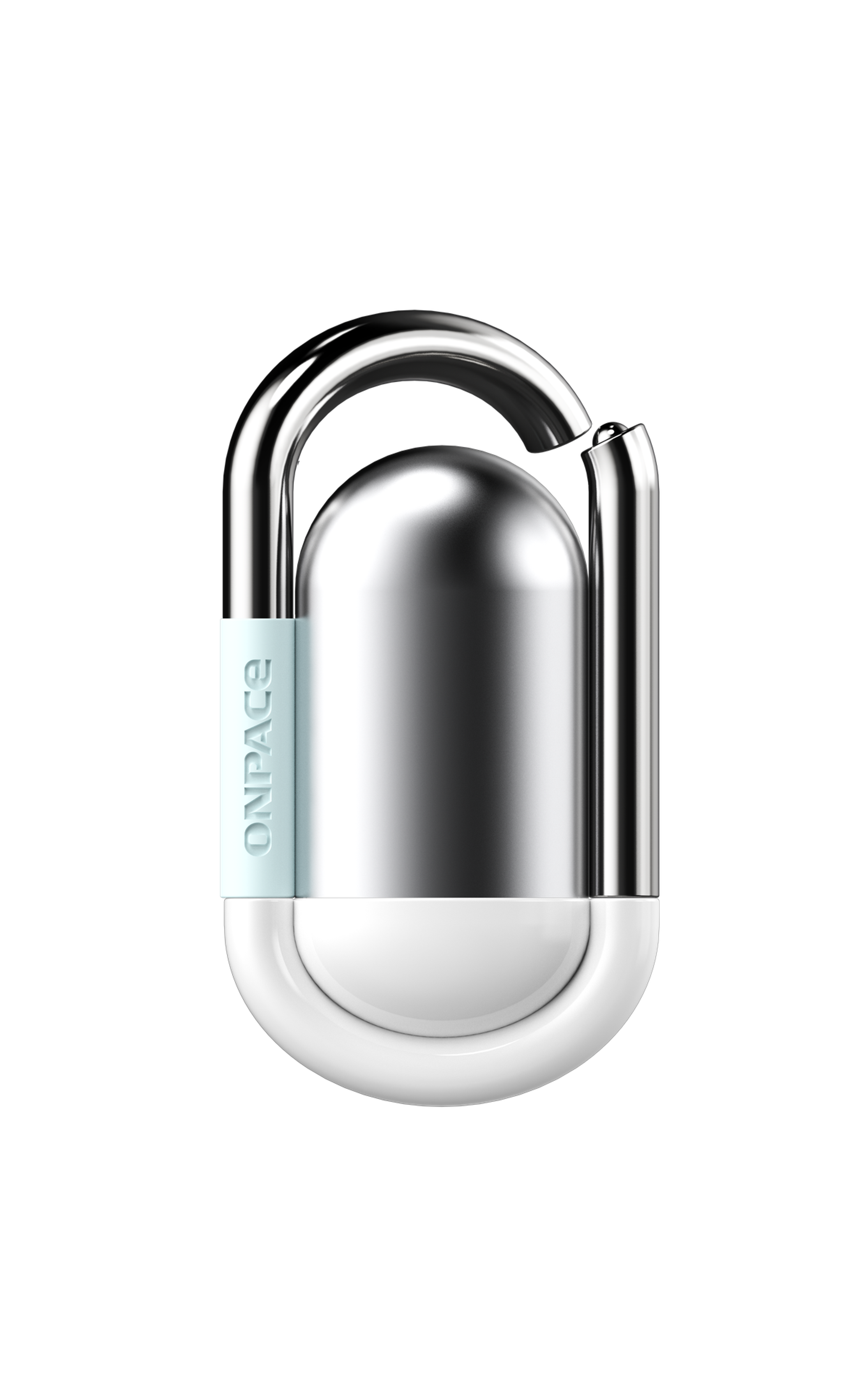
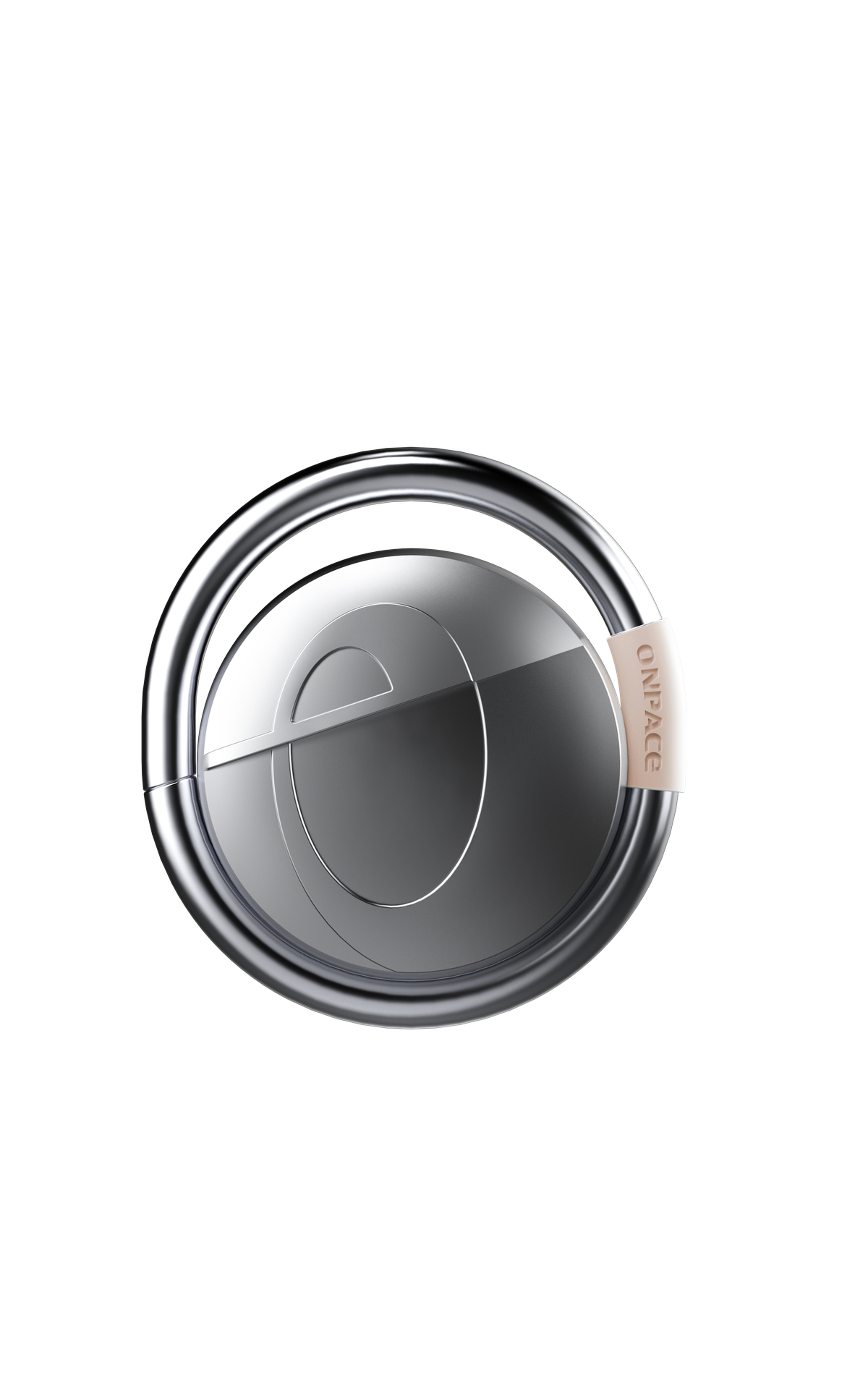
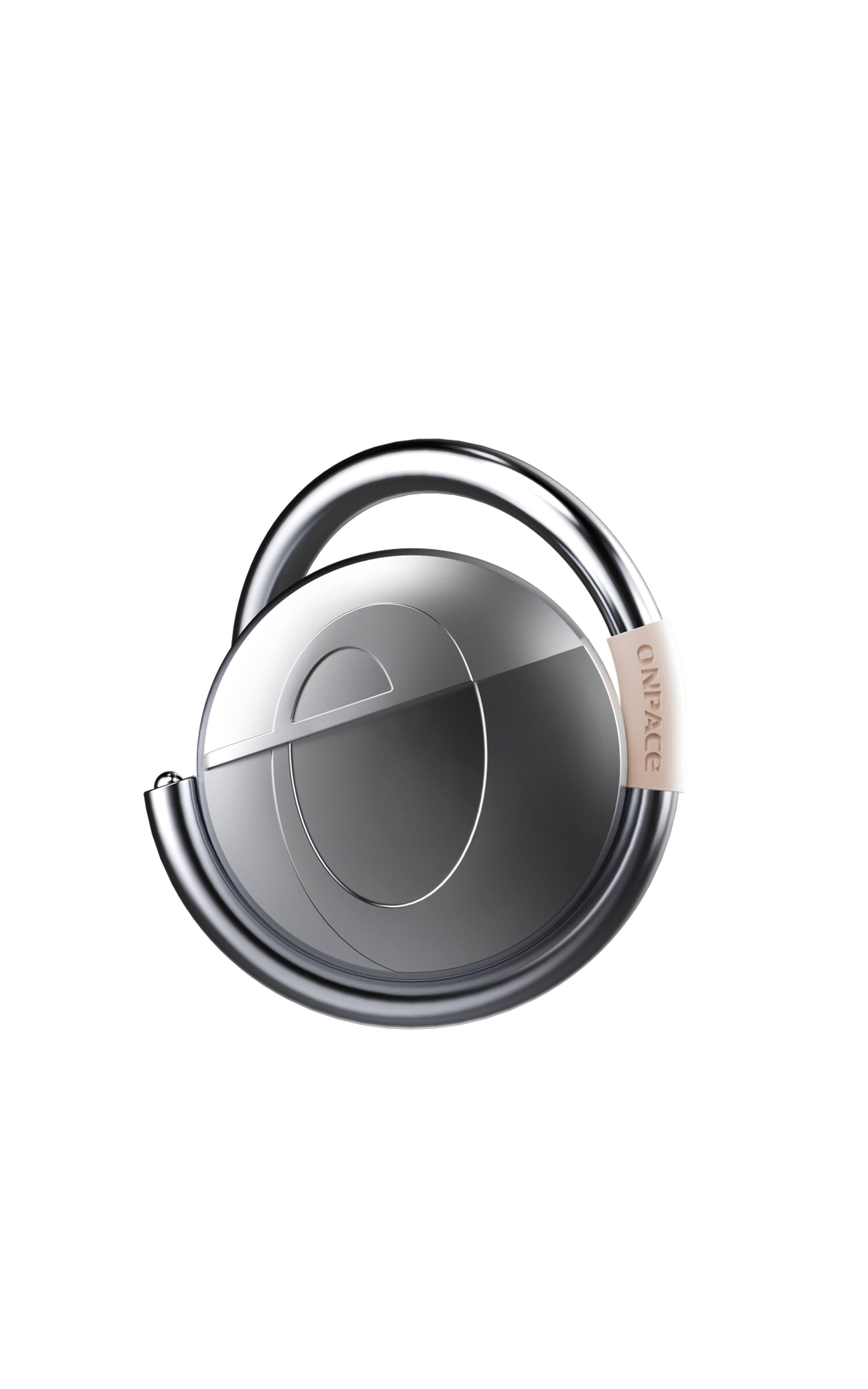
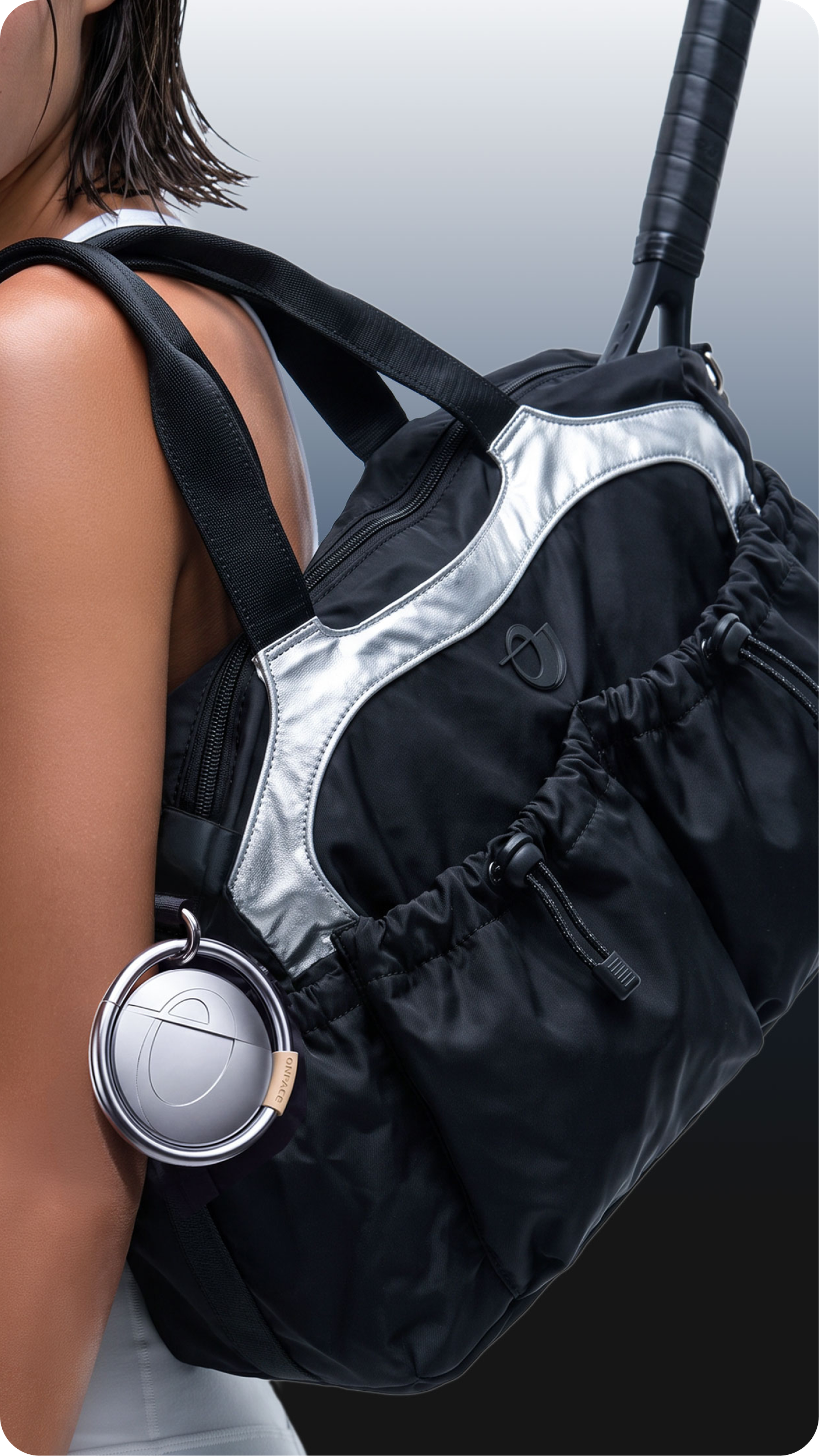
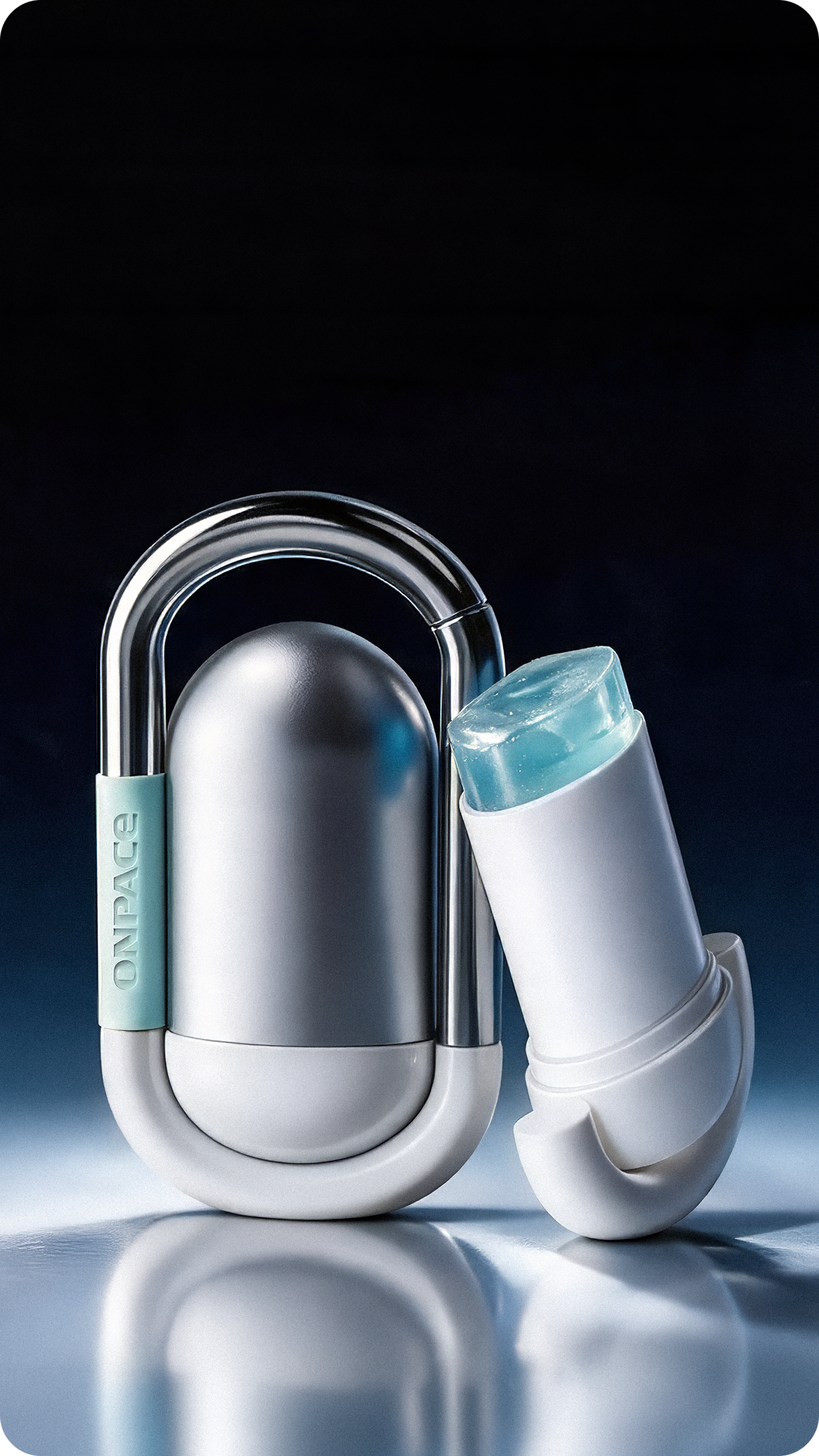
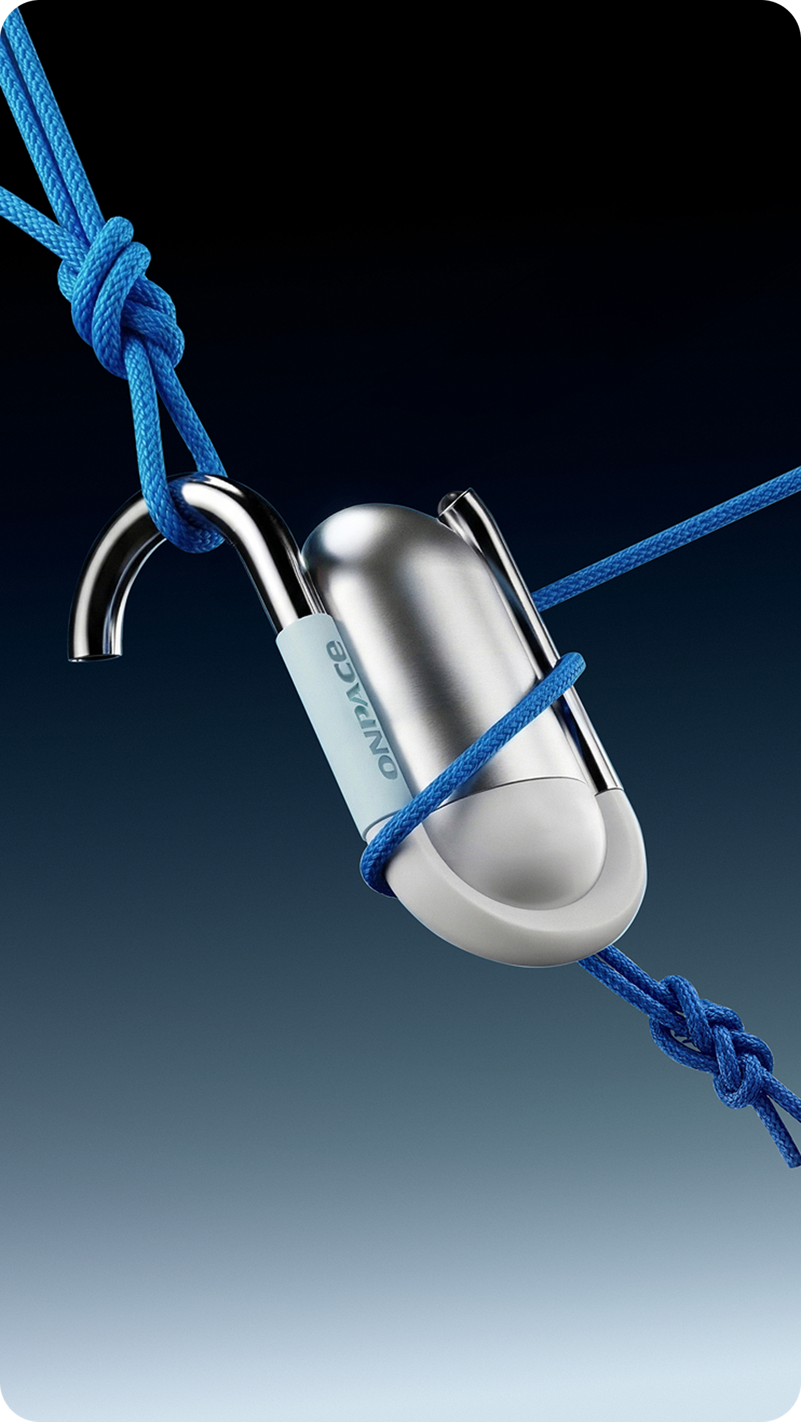
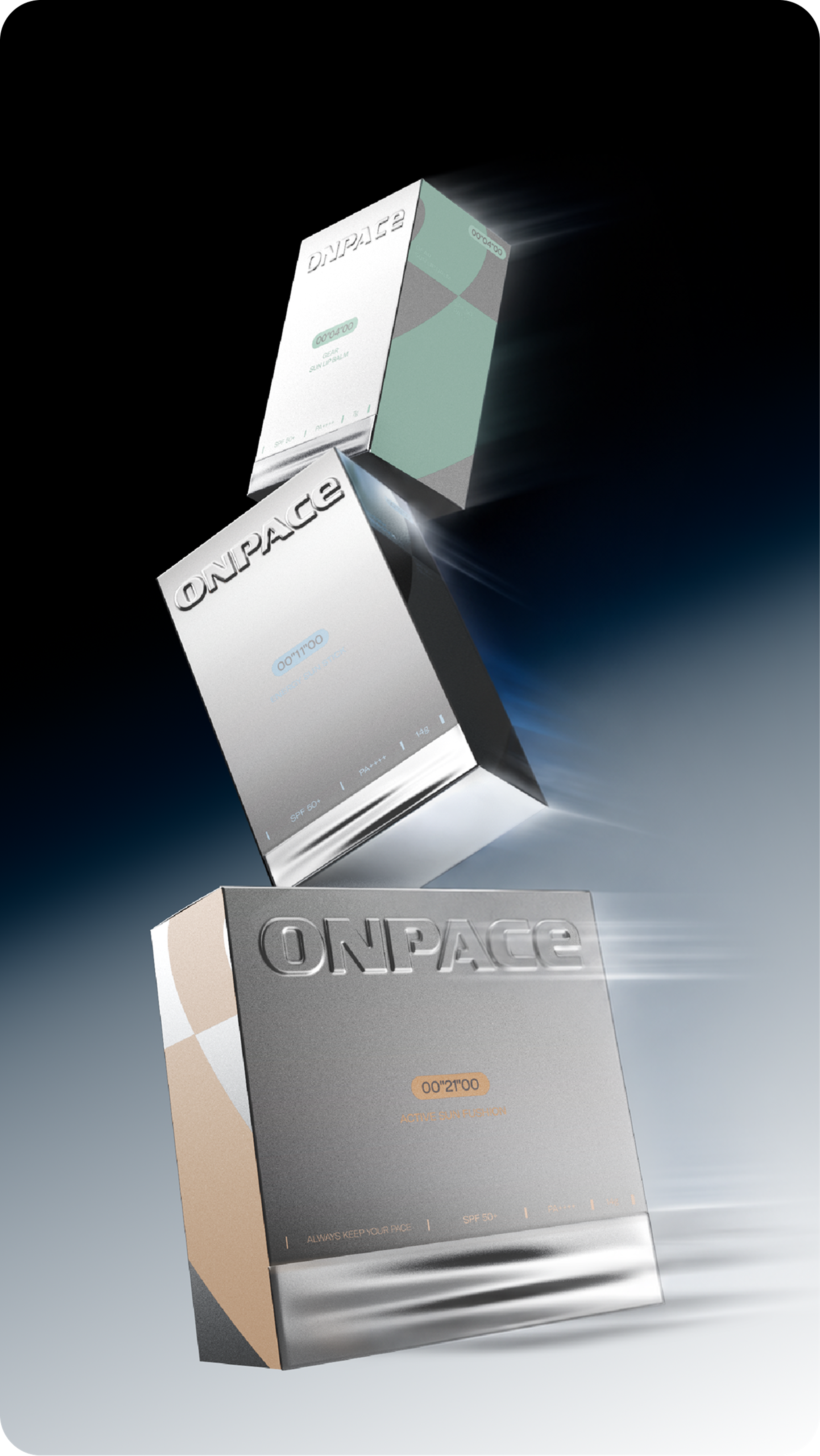
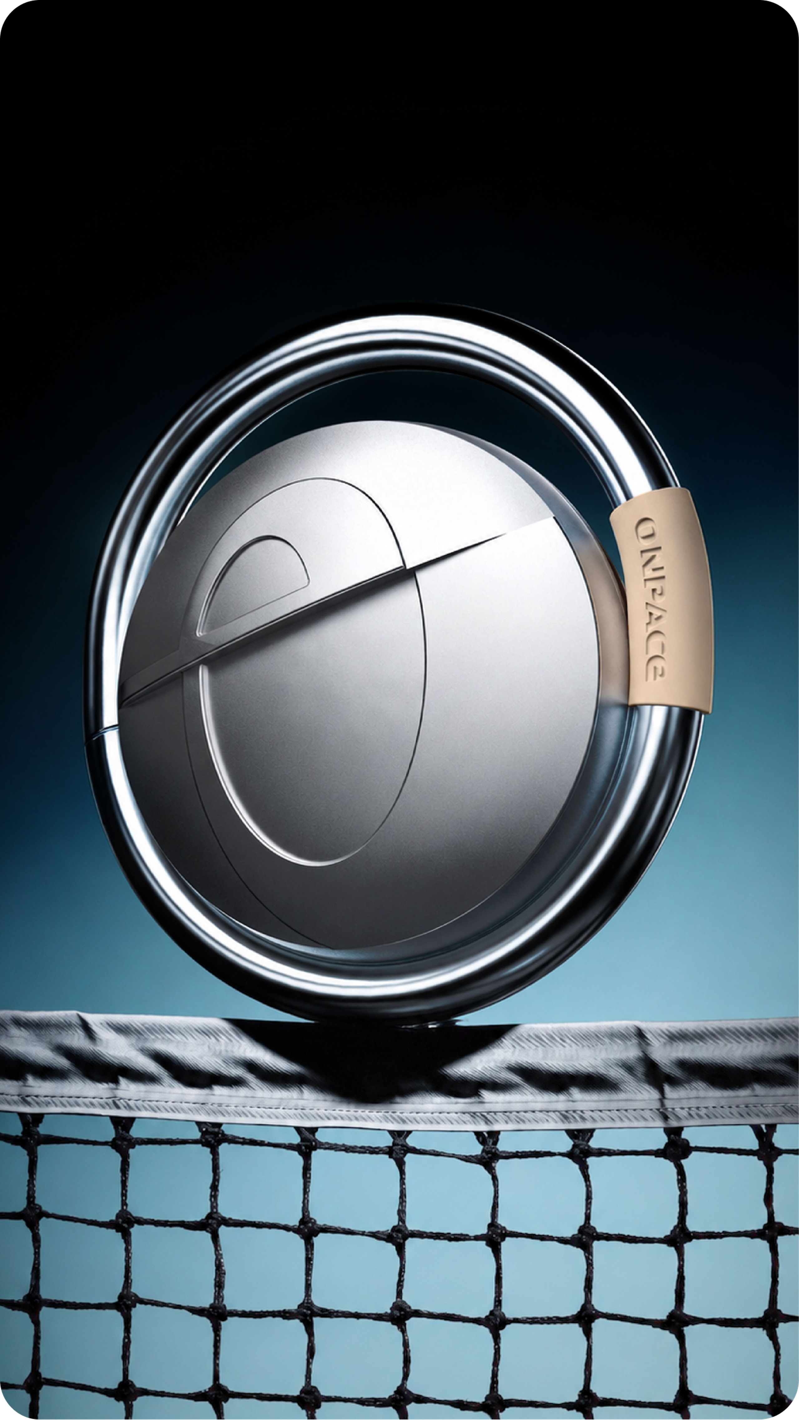
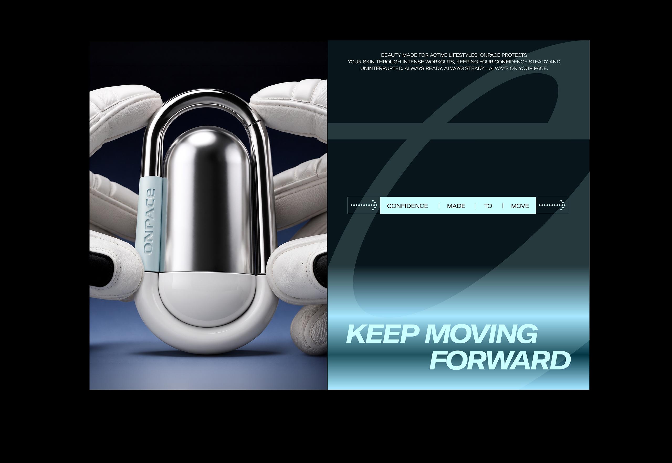
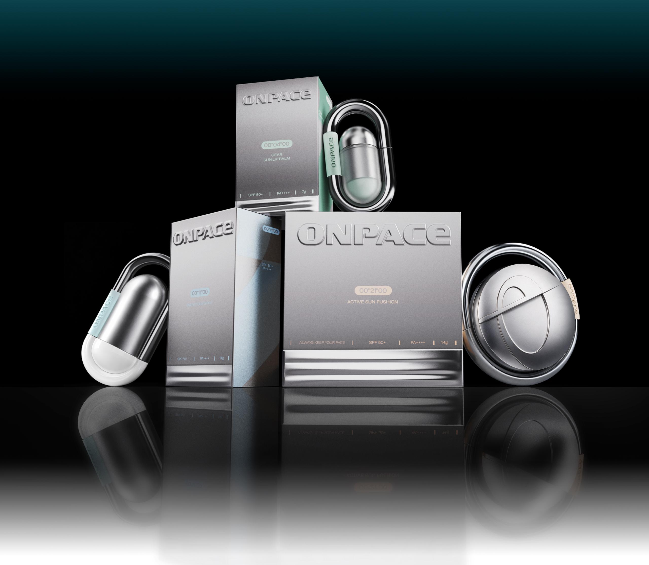
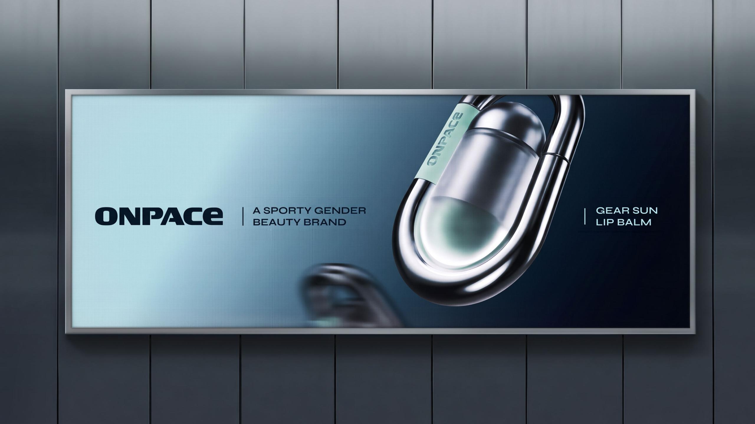
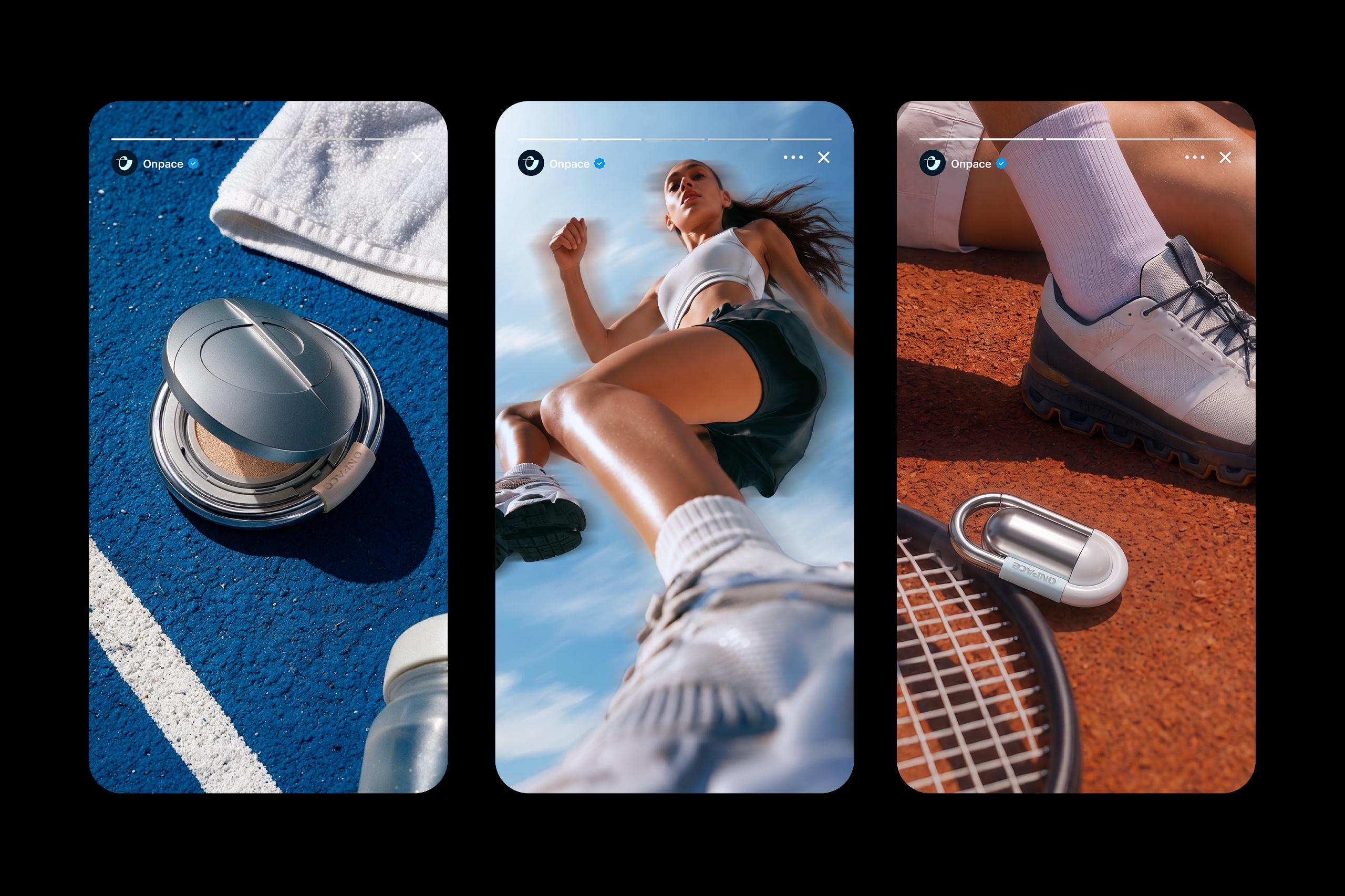
Inspired by sports gear, ONPACE products combine functionality, portability, and style in a distinctive sun-care design. The carabiner-inspired ring structure creates an accessory-like form designed for convenient everyday carry, while metallic finishes and smooth curves express the brand's technical and futuristic identity.
스포츠 기어에서 영감을 받은 형태를 바탕으로, 카라비너를 연상시키는 링 구조를 공통적으로 적용해 운동 중 간편한 휴대와 액세서리 같은 활용성을 고려했으며, 메탈릭한 소재감과 곡선적인 형태를 통해 브랜드의 테크니컬하고 미래지향적인 이미지를 표현했습니다.
OHSEVEN
DR.DIFFERENT
