Plu
zivon cosmetic
2023
플루 제품 카테고리 확장으로 인한 제품라인의 위계와 타겟 구분을 명확하게 하기 위한 디자인 시스템 구축 국내에서 가장 오래된 바디스크럽 브랜드 플루. 소비자와의 접점에서 브랜드의 헤리티지를 효과적으로 전달하기 위해서 제품라인의 위계와 타겟 구분이 불명확한 점을 개선하고 일관성있는 브랜드 커뮤니케이션을 위해 디자인 시스템을 구축했습니다. 헤리티지 스킨케어 브랜드 이미지를 강화하고 이를 통해 제품의 기능적 이점과 감성적 이점을 온-오프라인 접점에서 효과적인 비쥬얼 커뮤니케이션을 가능하게 합니다.
- 포장 디자인
- 그래픽 디자인
- 제품 디자인
- 사진 감독

Project overview
플루는 국내에서 가장 오래된 바디 스크럽 브랜드로 누적 판매량이 4500만개를 돌파했습니다. 하지만 소비자 접점에서 브랜드의 헤리티지가 효과적으로 전달되지 못하고 있습니다. 브랜드가 성장하며 다양한 카테고리의 확장으로 제품 라인의 위계와 타겟 구분이 불명확한 점을 개선하고 일관성 있는 브랜드 커뮤니케이션을 위해 디자인 시스템을 구축합니다.
PLU is the oldest body scrub brand in Korea, and its accumulative sales exceeded 45 million. Still, brand heritage is not effectively delivered in the consumer touchpoints. PLU established a design system for consistent brand communication and improvement of product line hierarchy and unclear targets due to brand growth and category expansion.

Situation & Direction
많은 사람들이 플루의 제품을 경험해봤지만 일관성 없는 브랜드 커뮤니케이션으로 플루’라는 브랜드 인지도는 떨어지는 상황이었습니다. 또한 오프라인 판매 채널에서 제품의 기능적 이점과 감성적 이점이 효과적으로 전달되지 못하고 있었습니다.
Although many people experienced PLU products, the brand awareness was dropping due to inconsistent brand communication. Furthermore, the product’s functional and emotional benefits of the product were not delivered effectively in offline sales channels.
Project Goal
자연주의 개념을 넘어 자연 애호가들을 위한 헤리티지 스킨케어 브랜드 이미지를 강화하고 제품 계층을 고려한 브랜드 아이덴티티를 구축하는 것을 목표로 한다. 이를 통해 온-오프라인 접점에서 효과적인 비쥬얼 커뮤니케이션을 가능하게 합니다.
The goal is to go beyond the concept of nature, strengthen image as heritage skin care brand for nature lovers, and establish brand identity in consideration of product hierarchy. This enables effective visual communication in online-offline touchpoints.

Brand core value
플루는 자연을 사랑하는 사람들이 오랜 시간 사용해 온 스킨케어 제품 브랜드입니다. 천연 원료에 대한 끊임없는 탐구로 인간의 피부에 최적화된 포뮬러를 개발해 자연유래성분을 자극없이 전달합니다.
Plu is a skincare product brand that has been used by nature enthusiasts for a long time. Through continuous exploration of natural ingredients, we have developed formulas optimized for human skin, delivering natural components without irritation.

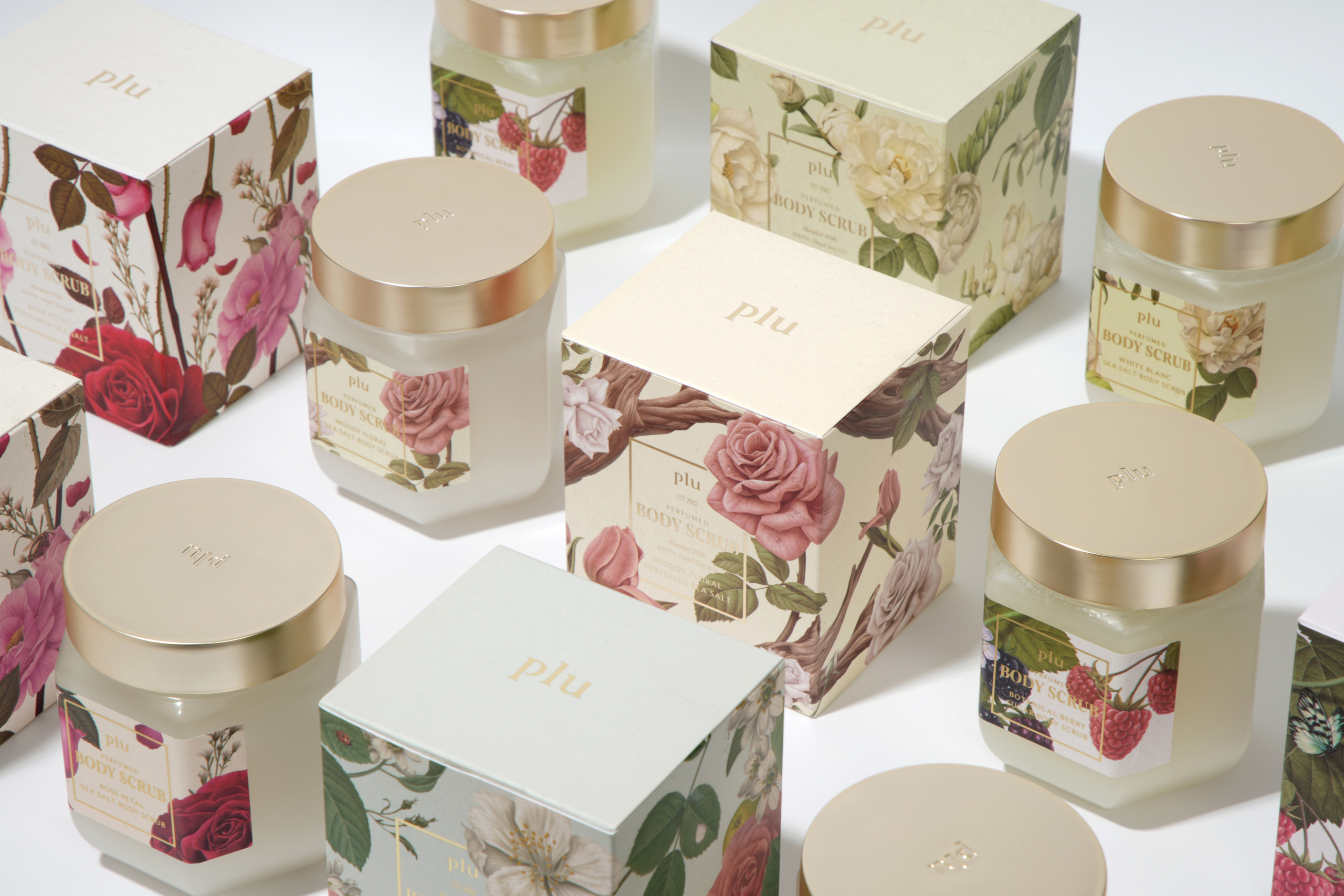
The Secret Garden Laboratory
플루의 비주얼 컨셉은 자연을 사랑하는 사람들이 가꾸는 비밀의 정원 실험실입니다. 식물 성분을 기반으로 아포테커리를 연상시키는 타이포그래피와 일러스트 스타일, 용기 디자인을 통해 20년 넘게 바디 스크럽을 연구해 온 플루만의 감성과 헤리티지를 전합니다.
PLU’s design concept is a secret garden laboratory gardened by people who love nature. Its apothecary-themed plant ingredient typography, illustration styles, and container designs deliver heritage and styles of PLU that has been researching on body scrubs for over 20 years.

Color
플루의 컬러 팔레트는 정원에서 볼 수 있는 꽃, 블랙베리, 나비, 푸른 하늘에서 영감을 받았습니다. 자연에서 영감을 받은 부드러운 파스텔 톤을 통해 제품 사용 후 느껴지는 은은하고 포근한 느낌을 비유적으로 전달합니다.
PLU’s color palette is inspired by garden flowers, blackberries, butterflies, and blue sky. The soft pastel tones inspired by nature deliver delicate and cozy feelings metaphorically.

Illustration
플루 특유의 감성과 헤리티지를 느낄 수 있는 일러스트입니다. 식물도감을 연상시키는 빈티지한 컬러의 일러스트입니다. 어린 시절 블랙베리를 핥았던 추억, 피어난 장미 정원, 싱싱한 풀과 이슬방울의 풍부한 향기를 일러스트를 통해 직관적으로 전달합니다.
The illustration show PLU’s original styles and heritages in illustrated plant book-inspired vintage colors. The childhood memory of licking a blackberry, blooming rose garden, and rich fragrance of fresh grass and dewdrops are delivered intuitively in illustrations.

Package shape
용기 디자인은 온실의 건축적 특징에서 영감을 받았습니다. 따뜻한 온실속에서 식물들이 조화를 이루며 하나의 향기를 만들듯이,플루 퍼퓸드 역시 온실을 닮은 용기 속에서 여러 성분들이 만든 조화로운 향이 담겨있습니다. 메탈릭한 질감과 불투명한 용기를 사용하여 고급스러운 느낌을 더해줍니다.
The container design is inspired by the architectural characteristics of a greenhouse. Just like how plants at warm greenhouse create a scent in harmony, PLU perfumed also features harmonious scents created by various ingredients in the greenhouse-inspired container. The metallic and opaque textures also make the container design more luxurious.

Typography
새로운 디자인 시스템이 적용된 플루의 제품은 ‘Pensum Display’ 와 ‘Beafort Pro’ 서체를 사용합니다. 세리프 타입 서체는 기존 서체에 비해 플루의 헤리티지를 반영해 빈티지한 분위기를 효과적으로 보여줄 수 있습니다.
The new design system applied to Plu's products uses the 'Pensum Display' and 'Beafort Pro' typefaces. The serif typeface effectively reflects Plu's heritage and conveys a vintage atmosphere compared to the existing fonts.

Grid System
고객 접점에서 일관된 브랜드 아이덴티티를 전달하면서 효과적으로 정보를 제공할 수 있도록 그리드 시스템을 설계했습니다.
The grid system is designed to deliver the consistent brand identity and provide information more effectively at customer touch points.


ohSeven
- Executive director 배수규
- Project Manager 박윤제
- Package Designer 김진주, 김채린
- 3D/ Motion Designer 김채연, 윤성웅
zivon cosmetic
- Designer 김대건
BEAUTIQLO